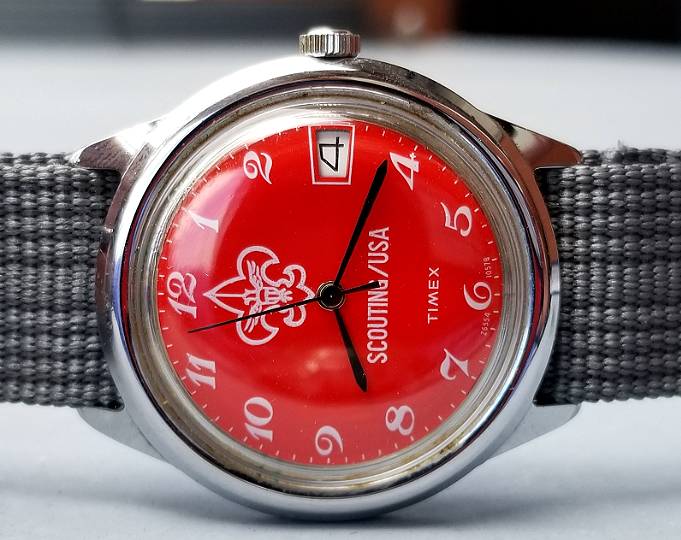
TIMEX Boy Scouts watch, 1978
"Scouting/USA"
/end
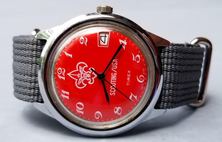
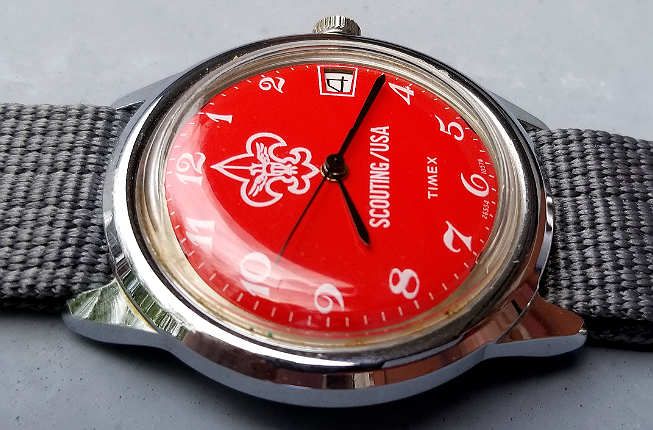
Here is a really great watch, from 1978. It is a mechanical TIMEX made for Boy Scouts. The watch is a pretty good size, about 38 mm diameter without the crown. The most notable feature of the watch is the BRIGHT RED dial. (This bright red was part of a "rebranding" by Boy Scouts of America. More below.)
The red makes for a really striking looking watch. The hands are black, and there is pretty good dial-hands contrast, and easy readability of the time. Date feature is present (I can't ever be bothered to set the date correctly on any watch I own and always just ignore date windows. I just pretend like they don't exist, and I have found real peace, that way.)
The watch is on a grey NATO-style strap. I have long liked the combination of red and grey, and I like the combination here. Chrome plated case is in good condition, as is the acrylic crystal.
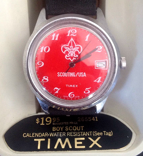
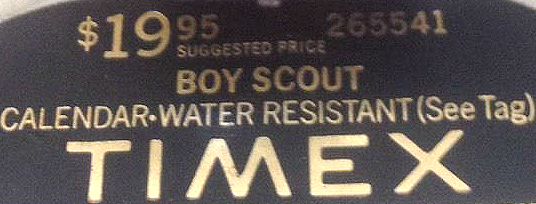
The watch sold for $19.95 in 1978. Model number 26554. (Photo from expired ebay).
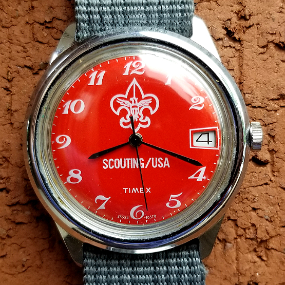
Let's take a look at some of the dial features. TIMEX, usually up top near the 12, has been displaced to the 6 position by the large Boy Scouts emblem, the fleur de lis with an eagle inside. I read btw that the fleur de lis is a type of iris, Iris pseudacoru, or Iris florentina. In a sans serif font, all caps, there is SCOUTING/USA.
Even though I don't care about the date, I do like date window design. I like the crisp white border to the window. That's not an artefact of the crystal, the window really does flare out peripherally. I'm still undecided if I think that's cool or annoying. The Girl Scouts TIMEX has that same feature.
The font for the hours numbers is pretty weird. Seems so retrograde, to me, and more like Grandpa's wooden pendulum clock than Boy Scouts. Look all the fancy flourishes on the 7.
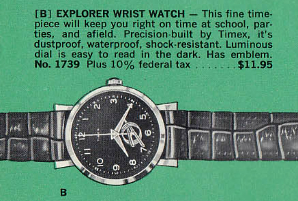
There were many Boy Scouts watches over the years, some from TIMEX, as well as from other makers. This is a TIMEX with the Boy Scouts Explorer logo on the dial. $11.95, in 1964, before the US changed from federal sales tax to individual state taxes.
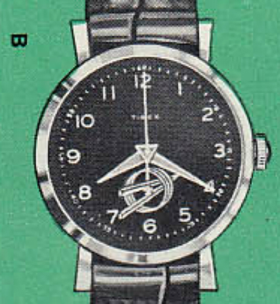
I really like the dial, feels modern. I think that's an equilateral triangle at the center post along the seconds hand? Hands are nice, and it's got the cool logo that looks like some aerospace industry logo. But I find flared lugs like this aesthetically displeasing and totally unacceptable, and I could therefore never wear this watch.

The bright red dial with SCOUTING/USA reflected a "rebranding" of Boy Scouts of America, in 1971. SCOUTING/USA was meant as a "communicative name."
The change was not universally well-received, including by the Girl Scouts. From the Wikipedia page: "The Girl Scouts were not happy.[1] Leaders with the GSUSA accused the BSA of chauvinism, moving forward with the name change without consideration to how it would affect the girls.[4] The GSUSA also claimed that the public would assume that GSUSA was a part of Scouting/USA, which it was not.[4]"
The SCOUTING/USA logo and initiative was abandoned in 1980.
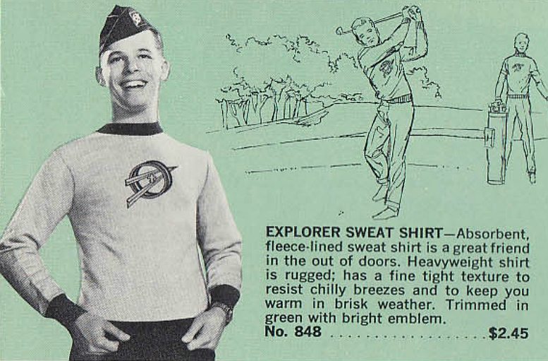
I would wear this nice, fitted sweatshirt, though. What a great logo. Contrast colored neck and cuffs. If someone made a detailed reproduction of this shirt, I would buy it in a minute. (1964).
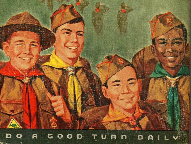
DO A GOOD TURN DAILY
1978 Boy Scouts mechanical watch in great condition, from TIMEX. Very red, with "SCOUTING/USA" colors and logo, reflecting a controversial and ultimately unsuccessful "rebranding" of Boy Scouts of America. This watch is very wearable in 2018, and is fitted to a grey nylon strap. Thank you for looking and reading. I hope you will like it.
Alan
Contact