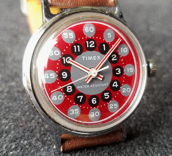
Timex x Todd Snyder "The Modern Art Watch."
An example of "Color Field" art, this is a very nice modern homage to a mysteriously rare 1974 European-market "boy size" Timex.
Hi. This is Alan. Thank you for reading, and for your interest in these reviews. My contact information is at the bottom. Here is a very attractive watch from Timex and Todd Snyder, released October 2021. The dial and hands are flawless reproductions of a 1974 Timex that was almost certainly a "Sprite" model, and appears to have been sold only in Europe, possibly only in Italy.
/end
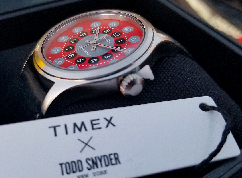
In its presentation box, plastic grommet still in place.

Here it is, the original 1974 model.
I have been looking at vintage Timex watches since 1999 and I've never seen this watch show up on the seller markets until I saw it on an auction from the UK, in 2018. It felt like I had spotted a unicorn. The seller called it "Timex Women's wrist watch Vintage Mechanical Genuine item working," and it seemed to have gone under the radar. I won the auction for £17.66.
When I showed the watch on Instagram and on my site, virtually nobody seemed to have ever seen/had it either, maybe one or two collectors. Soon after, I obtained an ad for this watch, from the June 16, 1974 edition of the Italian kids' magazine, Topolino (volume 968). From this ad, it is clear the original watch was made for / marketed to children.
With time, as collectors became aware of this model and sought it out, others acquired pieces.
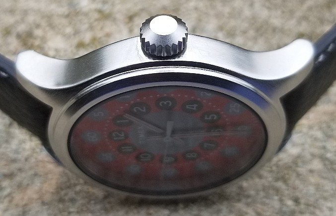
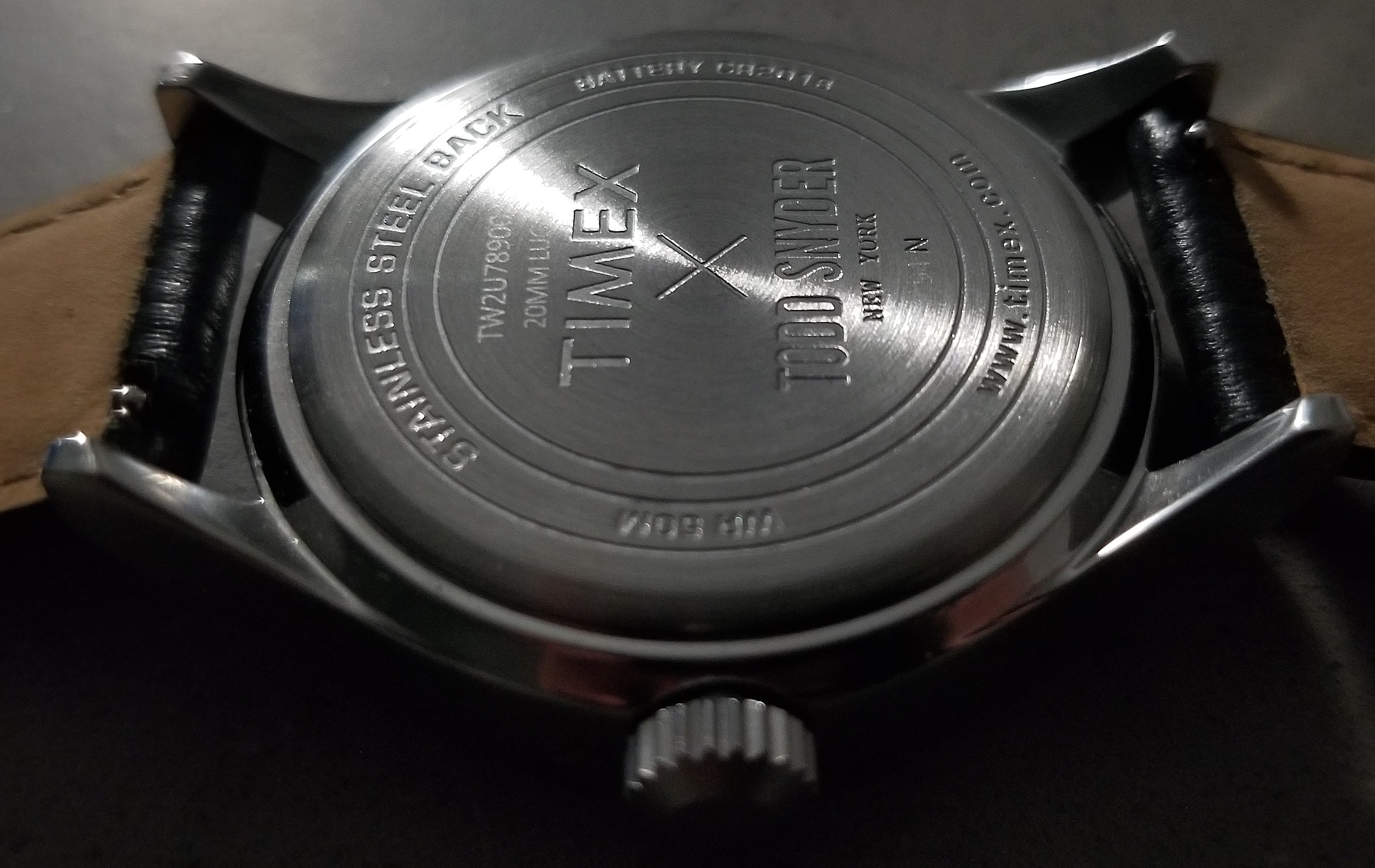
Side of the case and crown. Stainless steel case has a kind of "lustrous matte" finish, very nice. I love that they made the crown proportionate in size to the case. Some quartz watches, I guess assuming that you don't have to use the crown to wind it daily, tend to minimize its size. I've seen watches even larger than this, with tiny crowns, and it just looks off. Case on the modern model is 40 mm (20 mm lugs). The original 1974 Sprite is much smaller, 30.5 mm and 16 mm lugs.
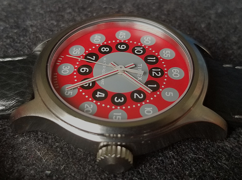
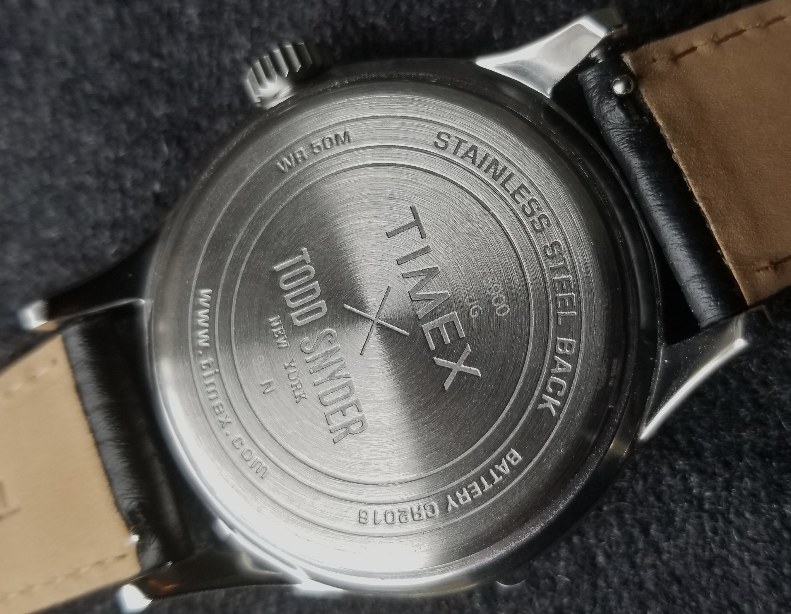
Engraved signed steel back. The leather strap is really good (more below.)

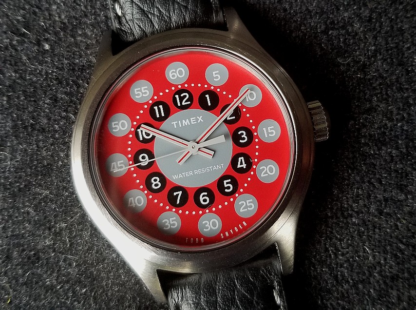
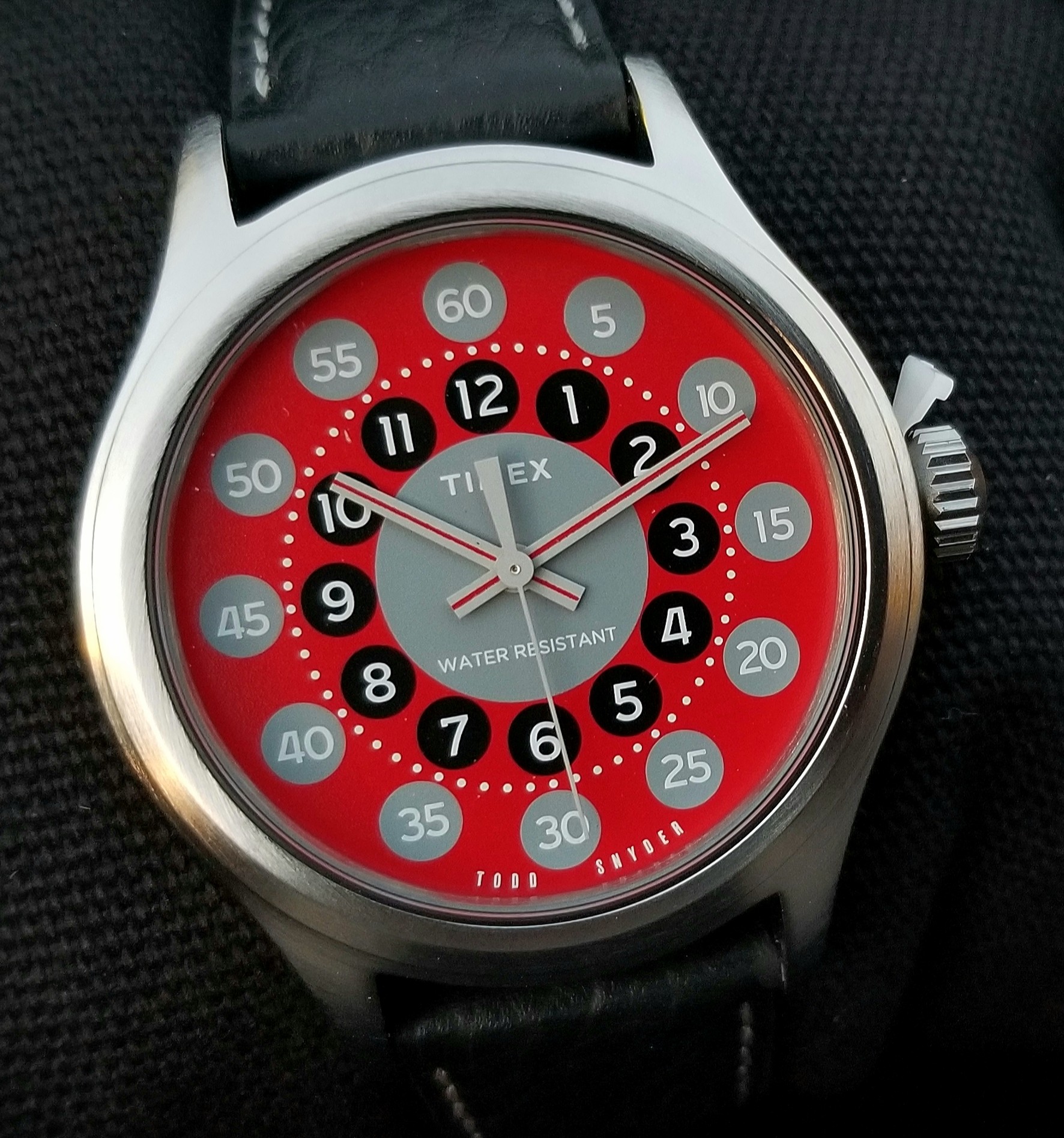
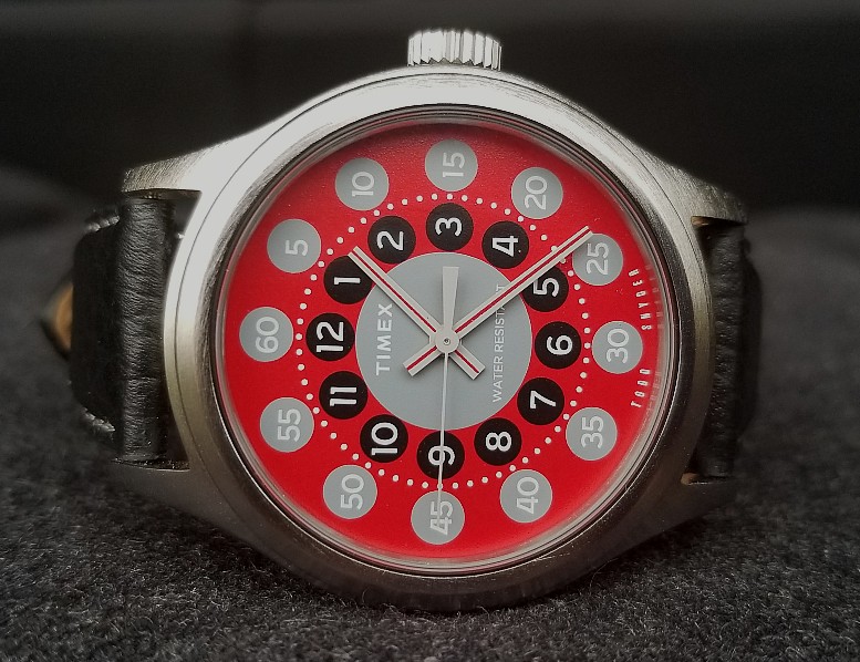
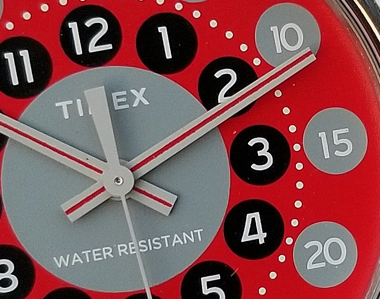
Let's take a deep dive into this dial and hands. Above is a huge picture.
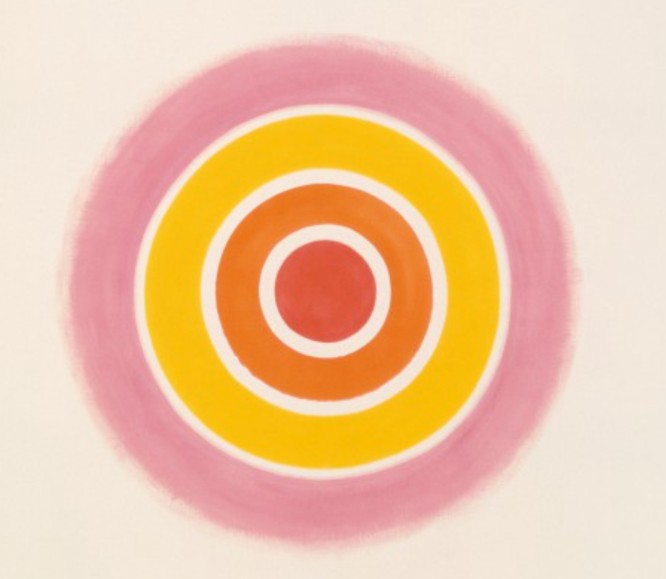
It is hard to know the exact influences, motivations and intentions of the original 1970s designer / design team, but what is clear is that this design is one that is thoroughly Modern with a capital M, world's apart from a "traditional" watch designs of the first half of the 20th century. For this collaboration, the term "Color Field" is used to describe the appearance of the dial. Color Field was a "tendency of painting within Abstract Expressionism," that was totally devoid of figure, forms, gesture, brushstroke, or other form of "painterly expression." More on this below.
The only actual color here is red. The rest of grayscale: white, grey, black. The red is a very good red, deep and saturated. I think what appeals the the eye/brain so much about this is the sharp contrasts, and that there are many of them. No borders are indistinct. Against the vivid red, there is the central grey circle with TIMEX and WATER RESISTANT. Black circles for the 1-12 hours, with. balanced size and placement of white numerals. Sixty white dots separate the black circles from slightly larger grey circles, which contain the 5-60 minute/second indications. (The original dial also had a white circle at the far periphery of the dial.
There is a real beauty to this dial. The grey/black/grey alternation of the circles as you go outward, with the red background and white accents creates a kind of visual stimulation. I would not be surprised if it causes a tiny surge of endorphin molecules to be released, not kidding!
Numerals have a few "serifs" here and there, but generally have a modern feel. The hands, white with a red stripe, reproduce the original perfectly, in a scaled-up size. There was no way these hands existed a stock item and had to be made bespoke for the release.
Here is an inset from the 1974 Italian ad showing the original 30.5 mm Sprite. The original strap seemed to be this fabric zig-zag in red and black. Notice the dial on this drawing say WATERPROOF. Mine says WATER RESISTANT, and the handful of people who I know have this watch also have WR. None have WATERPROOF. Either WATERPROOF on the artwork is a mistake (I have seen examples of mistakes before, in ad or catalog artwork) or there is an even more rare version of this watch with WATERPROOF on the dial. If you. have one with WATERPROOF, please let me know!
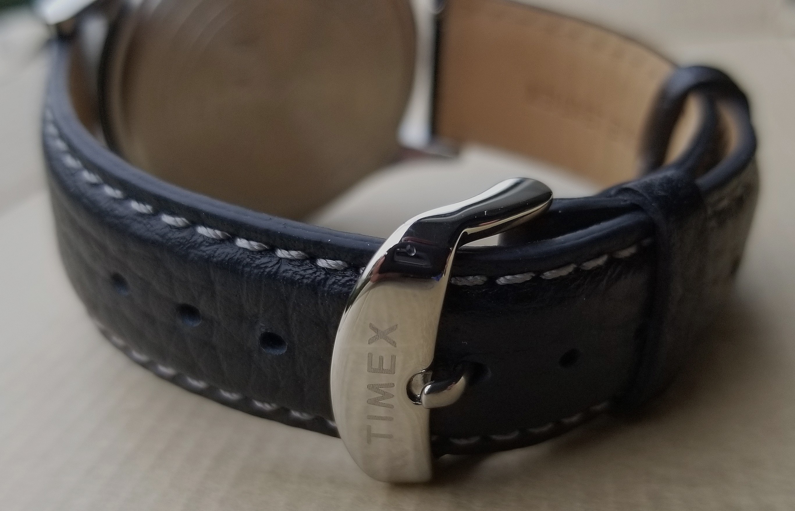
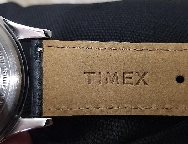
Here is the strap on the Timex Todd Snyder. Quality leather with a grain pattern, TIMEX signed steel buckle, and TIMEX signed along the inside leather lining, Notice that the exposed stitching isn't white (which might overpower the look,) but is a grey color that works great with the dial. The little details... Pic below shows the quick-release spring bards, but I'm in no hurry to replace the strap.
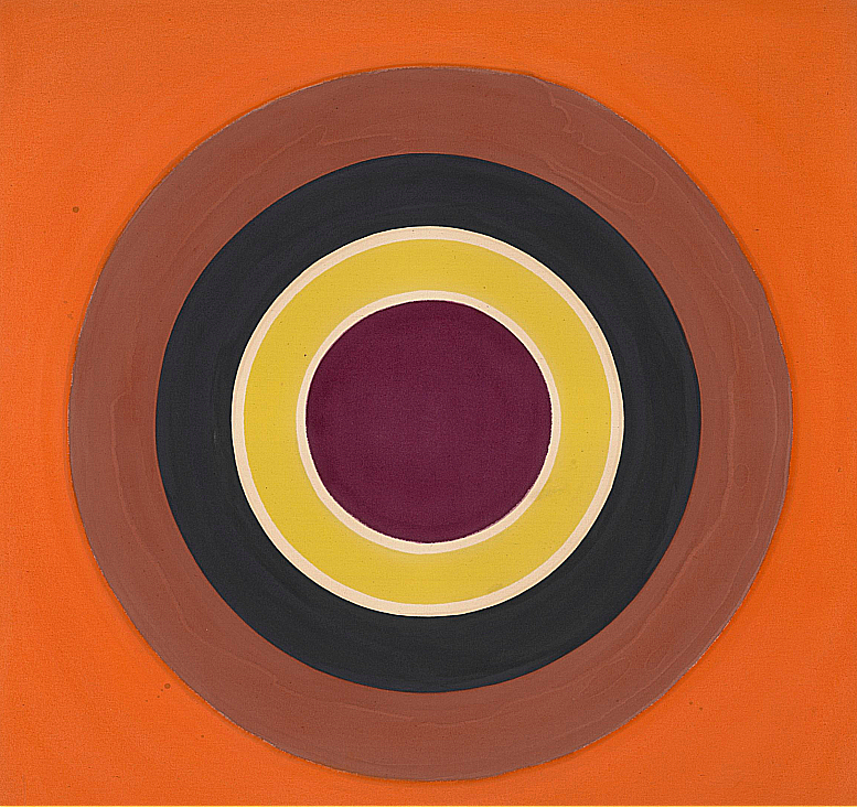
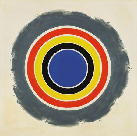
Example of Color Field art, by Kenneth NoIand, 1960s.
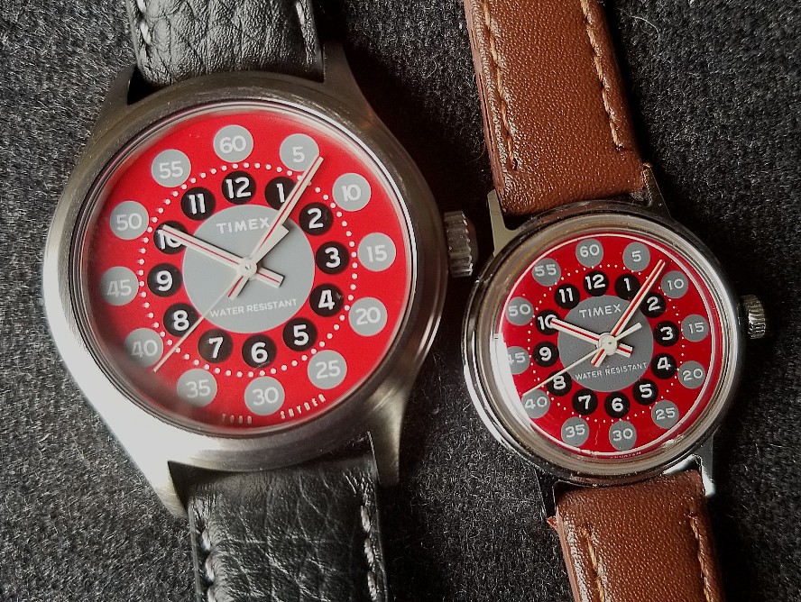
Here they are, next to each other. The October 2021 Timex Todd Snyder "Modern Art Watch," and the 1974 Timex Sprite. Notice how much they differ size. Notice the highly faithful re-creation of the dial and hands.
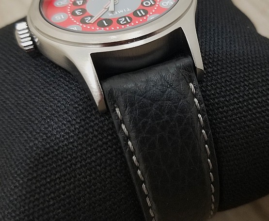
Good look at the case, lugs, and the strap with its grey stitching. Case has a little "step" at the bezel, a nice look I think.
What an amazing dial. I mean, it does look like modern art...
About Color Field, from the Web. (Bold emphasis added)
"Color field painting is a style of abstract painting that emerged in New York City during the 1940s and 1950s. It was inspired by European modernism and closely related to abstract expressionism, while many of its notable early proponents were among the pioneering abstract expressionists. Color field is characterized primarily by large fields of flat, solid color spread across or stained into the canvas creating areas of unbroken surface and a flat picture plane. The movement places less emphasis on gesture, brushstrokes and action in favor of an overall consistency of form and process. In color field painting color is freed from objective context and becomes the subject in itself." (Wikipedia)
"...around 1960 a more purely abstract form of colour field painting emerged.. it differed from traditional abstract expressionism in that these artists eliminated both the emotional, mythic or religious content of the earlier movement, and the highly personal and painterly or gestural application associated with it." (tate.org)
"...distinct from gestural abstraction, or Action Painting, they abandoned all suggestions of figuration and instead exploited the expressive power of color by deploying it in large fields that might envelope the viewer when seen at close quarters. (theartstory.org)
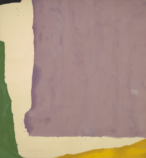
HeIen FrankenthaIer, "Mauve District" 1966
Not at all being an art critic or art historian, I can say that from what I have read about Color Field, this dial appears to fit with the "post-painterly" description of that "tendency" within Abstract Expressionism. Regardless, it has a decidely modern and artful appearance. I think if MoMA needed a huge clock to hang on the wall in one of its massive spaces, they could not go wrong with this face.

Before the Todd Snyder Timex came out, I regarded the grey/black/red/white together as having a "vintage fashion" look. See the stock pattern above, and the real cardigan below. Don't you think?

Another look at the original, above, and the modern version below. Both are vividly sharp, striking in their contrasts and overall design, and a pleasure to look at. When I first saw that Todd Snyder and Timex came out with this watch, I was quite pleased but not at all surprised. I thought it would be only a matter of time before this watch saw light again. A true reissue would be too small. After all, the original was literally a watch for kids. See this kid as a reminder of that.
This new Todd Snyder model is very good, and I'm quite pleased with it.

By Kenneth NoIand, 1960s.
By Kenneth NoIand, 1960s