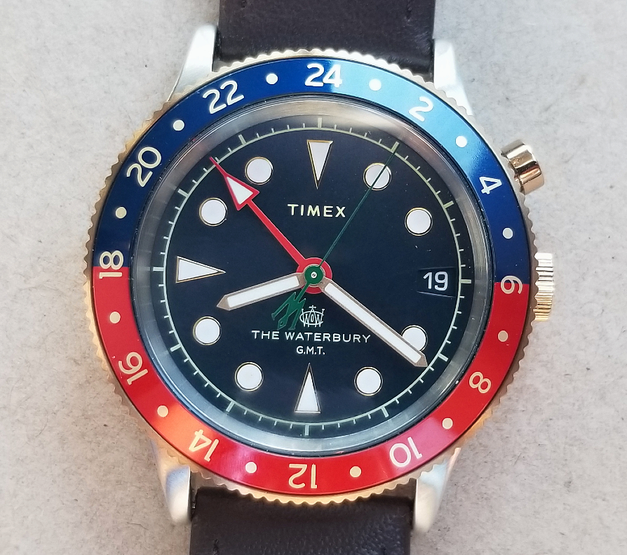
Timex Waterbury GMT 39 mm with leather strap, 2021

Hi, this is Alan. Thank you for reading, and for your interest in these pages and the site. My contact info is below.
Here is a truly wonderful Timex, a GMT, released as part of a Waterbury Collection, a nice collection of watches that revisit the history of Timex. Timex hasn't made many traditional analog GMT watches over it's history, so it's a pretty special release.
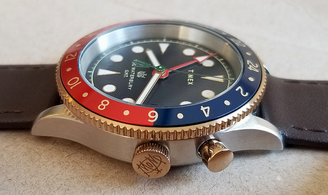
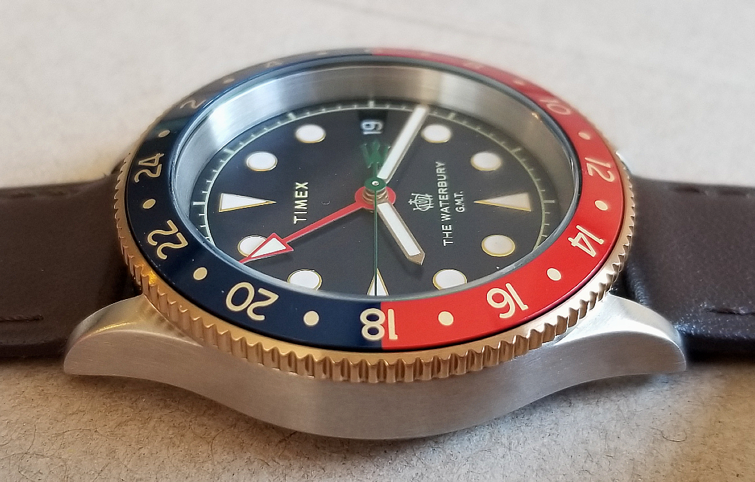
The 39 mm steel case is accented by goldtone bezel edge, crown, and pusher. Combined with a dark brown leather strap, the watch achieves a balance that has "warmth," and evokes classic, vintage aesthetics.
end/
In addition to the traditional hands, it features a fourth hand, a particularly beautiful arrow-tipped red and white GMT hand, for tracking a second time zone. If desired, even a third time zone can be tracked, using the rotating 24-hour bezel in 50/50 red and blue.

There are indeed time travelers among us. As we shall see later, the GMT concept was created to fulfill the needs of "pilots, navigators, ship's captains, and international travelers." (Graphic from Timex).
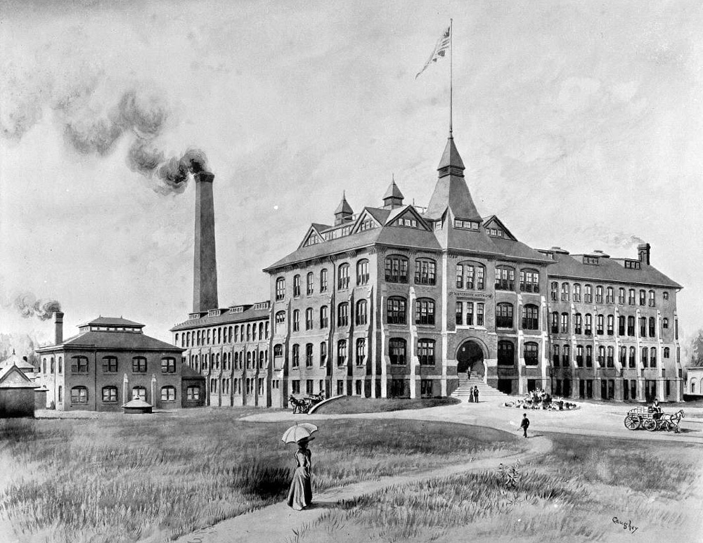
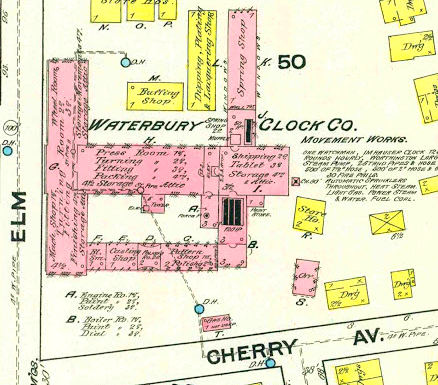
What is "Waterbury?" Well, Waterbury is a city in Connecticut, about 90 miles from Midtown Manhattan, and was the site of the Waterbury Clock Company (1954,) later the Waterbury Watch Company, the company that can be traced back as the origins of the global company that is now Timex. The above drawing shows part off the works, around the 1870s.
Timex has chosen to name a collection of heritage-inspired watches Waterbury, as nod to its history and long legacy of watchmaking.
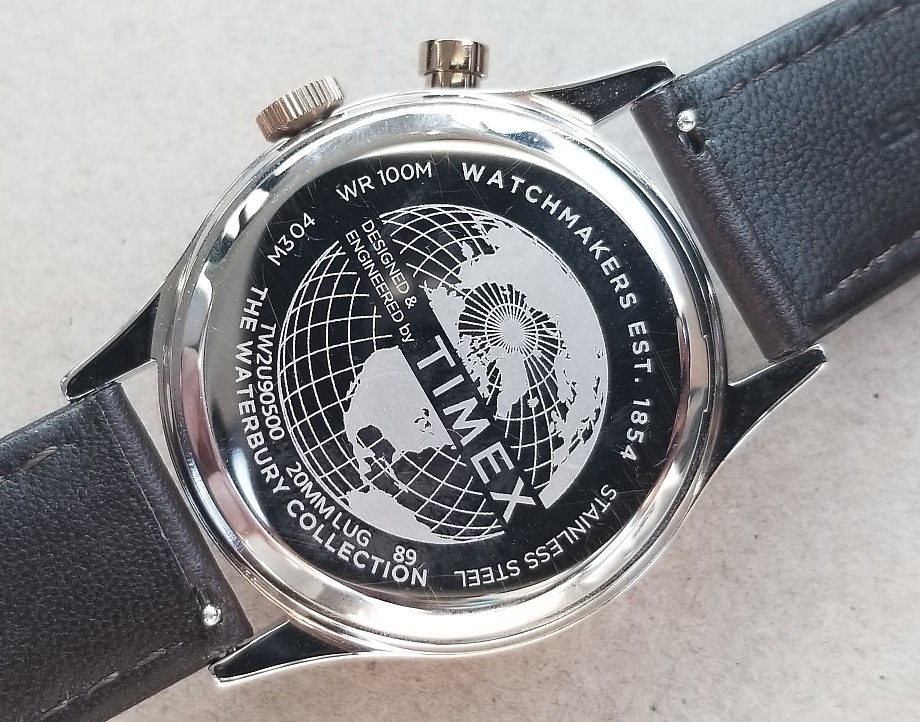
The polished steel caseback has engravings that I really like. . The globe is a nice feature, indicating the global nature of the brand. The 89 indicates manufacture May 2021. M304 I believe refers to the movement.
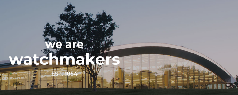
The current Timex world headquarters, above, is in Middlebury, Connecticut, not at all far rom its origins in Waterbury.
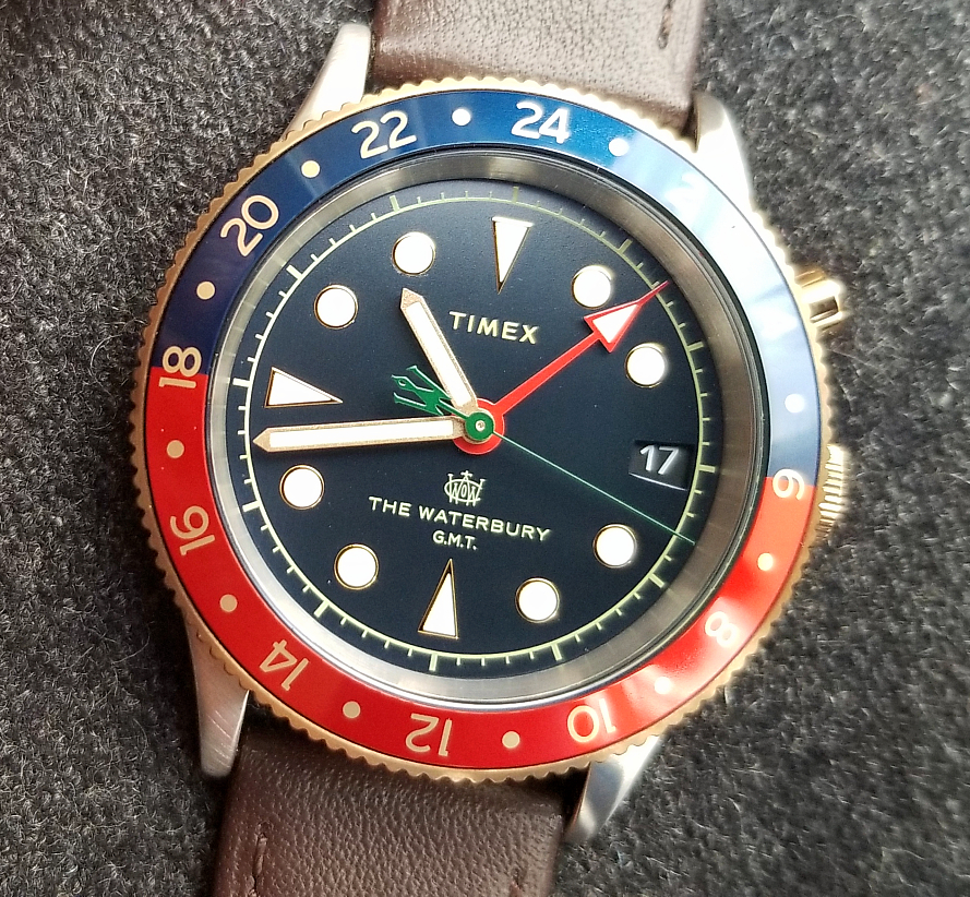
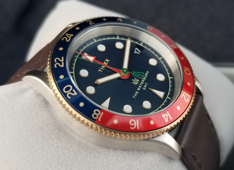
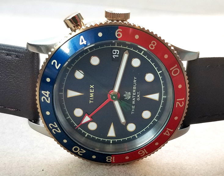
Let's take a good look at the watch. 39 mm case, 100 meter water-resistance, 20 mm lugs. Luminous hour, minute and GMT hands, and luminous dial markers. Date window. Dark blue dial background with gilt-tone circle and minute marks at the dial periphery. The dial triangles and circles marking the hours also have thin gold-tone frames, as are the minute and hour hands. The GMT hand is great. Bold, red, with a pleasing arrow tip, and a straight extension of the arrow at the tip. The minute hand is green, and has a stylized W at the short end, for Waterbury. There is also printed on the dial, above THE WATERBURY G.M.T. , a reproduction of the original logo of the Waterbury Watch Company. And the beze! Marking 24 hours, half red, half blue, the design pays homage to the traditional colors of the great GMTs in watch history,
I wanted to mention the gold tone. As mentioned above, on the dial, there is gold color for the text and logo printing, the hands, and the frames around the hour markers. The toothed edge of the bezel as well as the crown, and GMT pusher are also gold-tone. I think this strikes a nice balance. They could have made this watch an all-steel GMT, and avoided having to "balance" the gold and steel of a two-tone watch. But they added the gold elements, and I think the balance is just right. In fact, I don't really consider this a "two-tone" watch in the traditional sense, but more like a steel watch with gold accents. I don't think this watch would be nearly as beautiful if it were all steell.
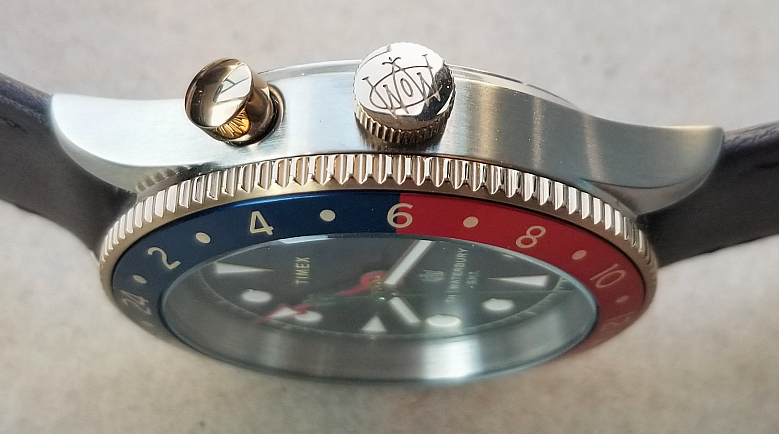
You can see the very slightly raised edge of the mineral glass crystal in this pic. Also, note the logo on the crown (also shown below in a Timex graphic.) Four letters make up the logo WWCO, for "Waterbury Watch Company."

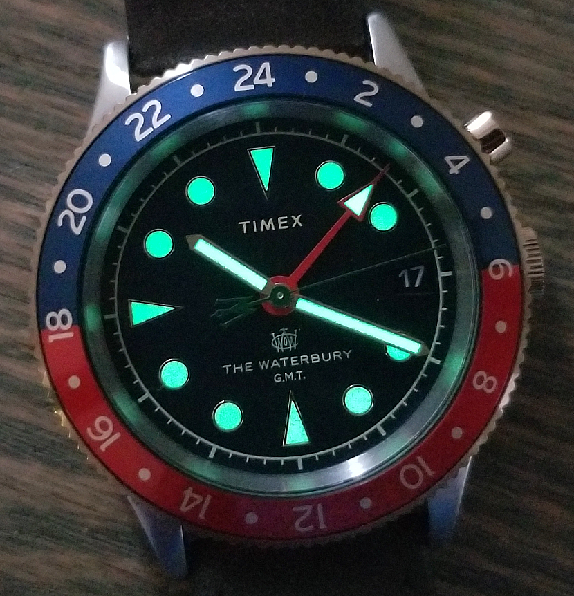
The luminous material is pretty strong.

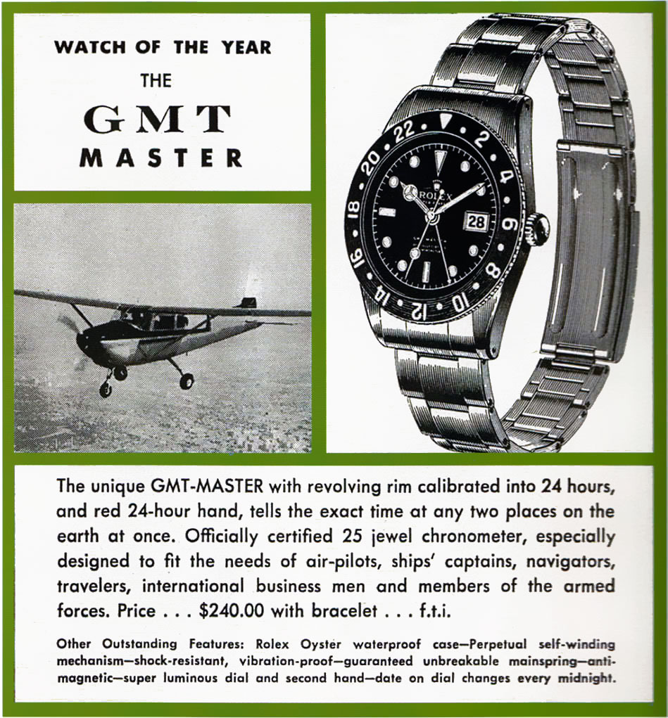
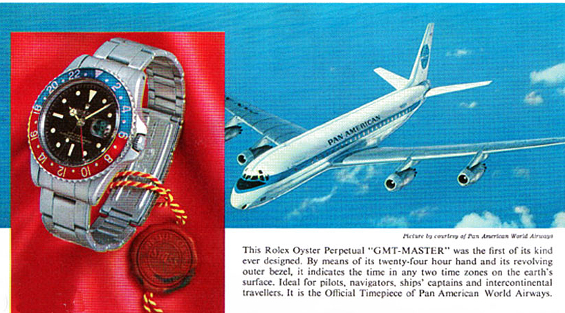
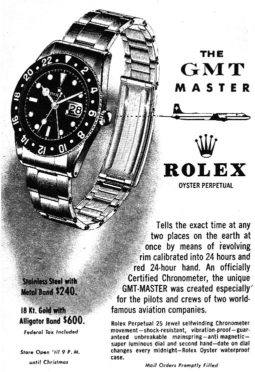
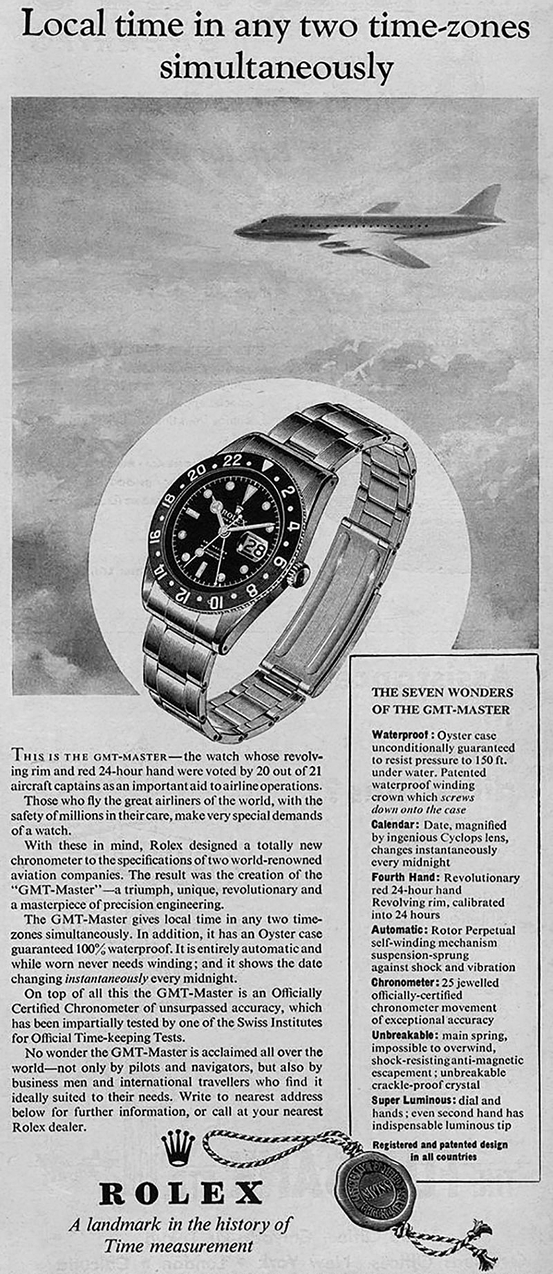
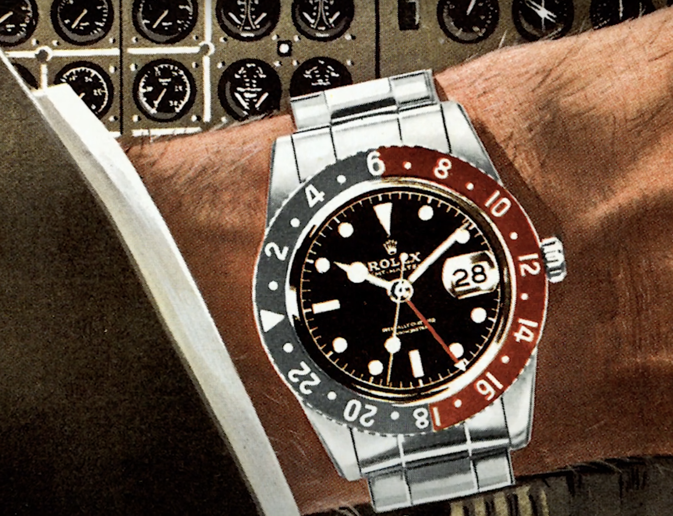
So, why does anyone need a GMT watch? In short, to facilitate the tracking of different time zones in the age of air travel. The above is the "Rolex GMT Master," without any doubt the most famous GMT watch ever. It was created. in 1954, reportedly specifically made for pilots Pan American Airways. In 1955, it was declared "watch of the year," and has since gone on to have a long and successful legacy that can be read about elsewhere.
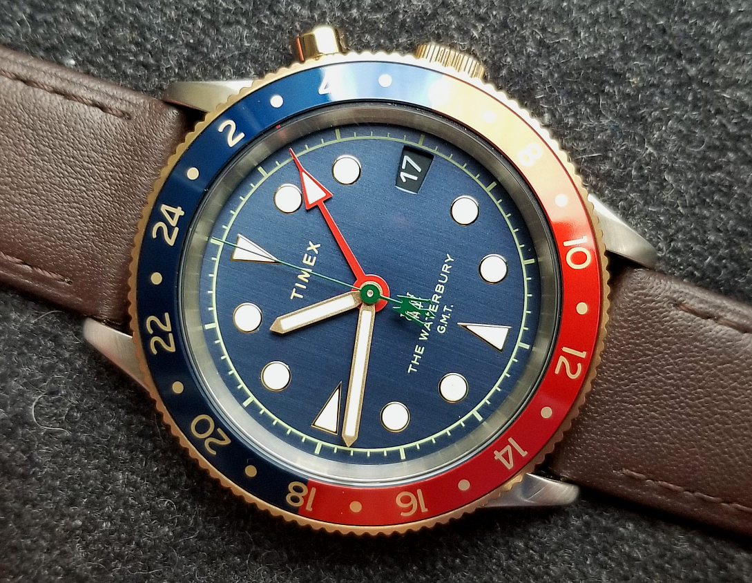
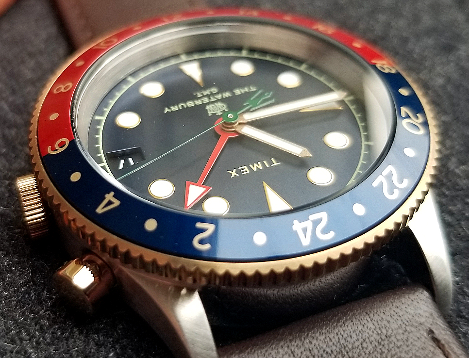
The bold colors and the contrasts makes this a visually very pleasing watch, Also notice in this pic, as well the one directly above it, the depth of dial beneath the glass.
(Above movie is by Timex.)
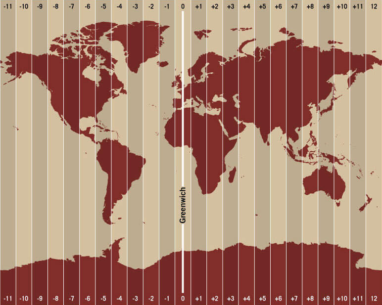
The Prime Meridian, zero degrees longitude, passes through the Royal Observatory in Greenwich, England, along with other places (see below pic.) "Greenwich Mean Time," or GMT is represented as hour zero, and all other time zones will be plus or minus in reference to GMT. For example, New York City would be -5 hours. It was selected as the Prime Meridian in 1884, though time has since been more accurately represented Coordinated Universal Time.
The designers at Timex did a great job. This is not a reissue of an existing watch, so there was no template upon which to re-create. It is a completely new design, based on the brand's heritage as well as classic GMT features in the history of watchmaking. Not always easy to create the right elements in a "new watch with a vintage feeling" production, but to me they did it here. I really love this watch.
Don't forget to scroll down and see a few vintage ads from the Rolex GMT Master.
Thank you for reading.
I hope you will like it.
Alan
Contact
Website: Alan's Vintage Watches