.
Timex x Nigel Cabourn Military Style Watch, March 2018
【SS18 UNISEX】 Nigel Cabourn x TIMEX - ナムウォッチ / NAM WATCH
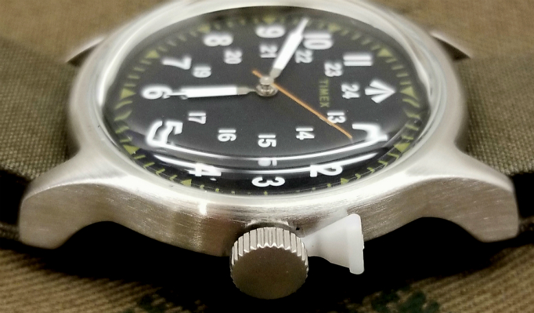
This is quite a stunning Timex. It was just released on 9 March, the result of a collaboration between Timex and British designer Nigel Cabourn (NC). The watch is part of a SS18 collection inspired to celebrate the designer's 50 years in fashion, and is a beautifully designed and well-crafted watch. I am Alan (contact: email). I will be reviewing the watch, along with straps and included accessories, and will also advance some of my opinions and low-level philosophy about this watch as an object, and about some of the relevant history. Nothing heavy-handed, and I am always open to discussion and interpretations.
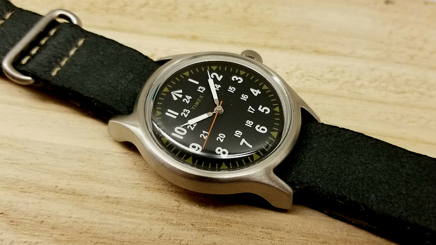
The watch is a further adaption of Timex's ongoing adaptions of a 1960s-era US government specification for contract-issued military watches. The "Original Camper" was brought back after 25 years, by TIMEX Japan, in 2015, and this is a variant. Also, the case, crown and crystal of the NC Timex are identical to those of the Timex Japan SST steel case Camper (more on this later.) The dial design, as we shall see below, is adapted from the same 1960s specification (MIL-W-46374). [BTW, like my other reviews, I tend to "move around" topics, watch parts, etc, sometimes bit of back and forth, but I cover everything, and I hope it does not seem disjointed.] Note: I have added more pics, after creating this page. Scroll to *way far bottom* to see all pics!
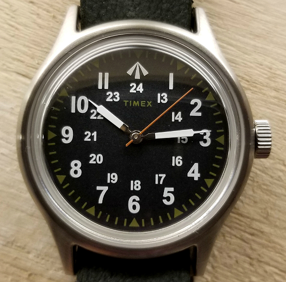
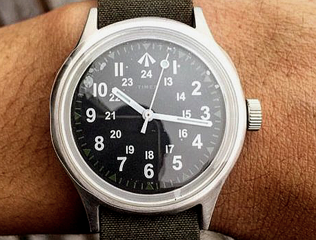
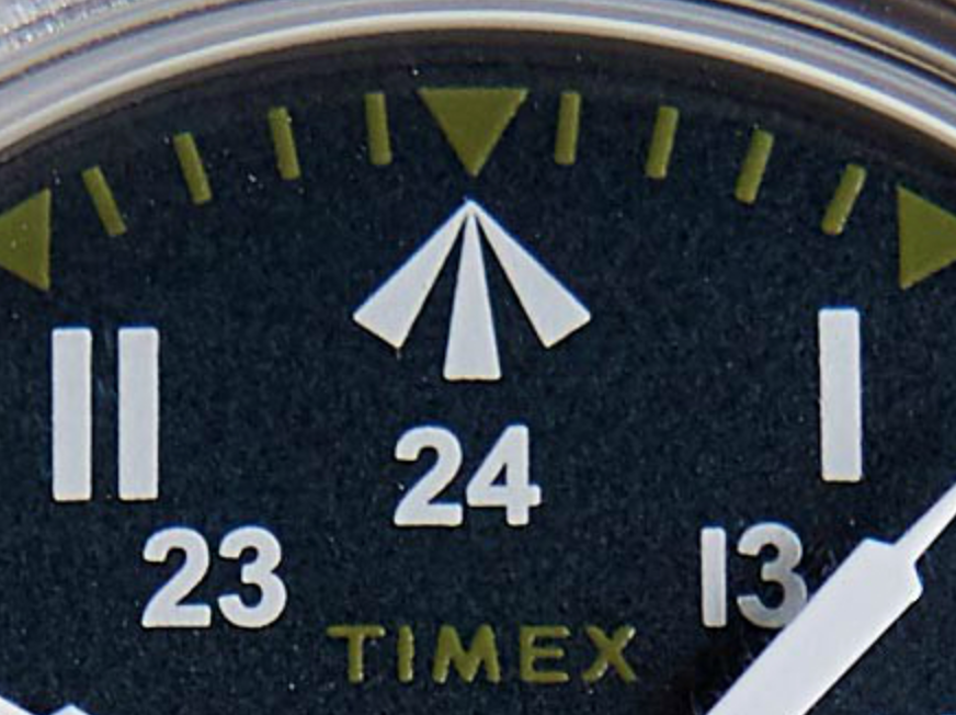
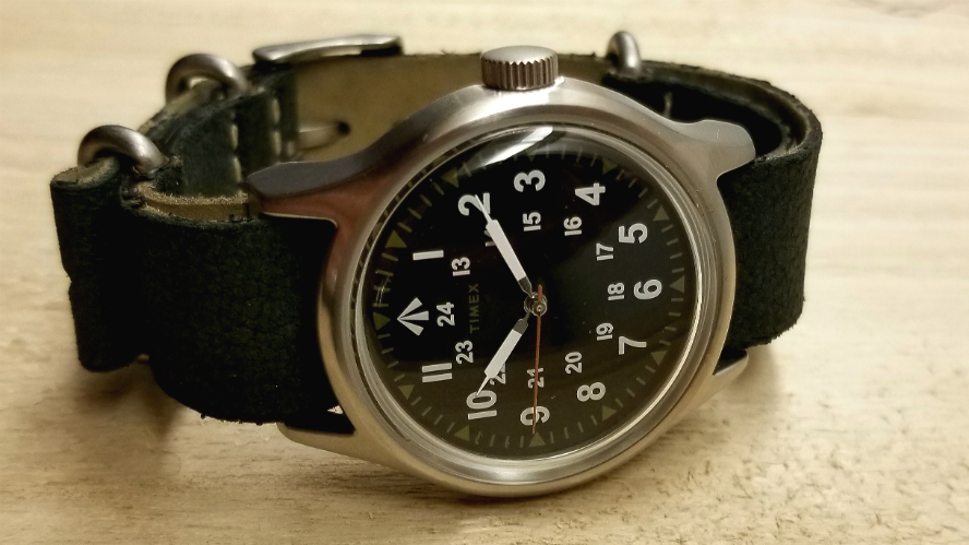
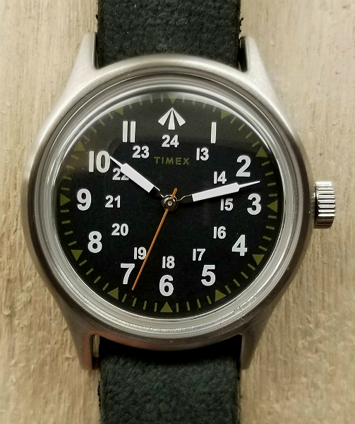
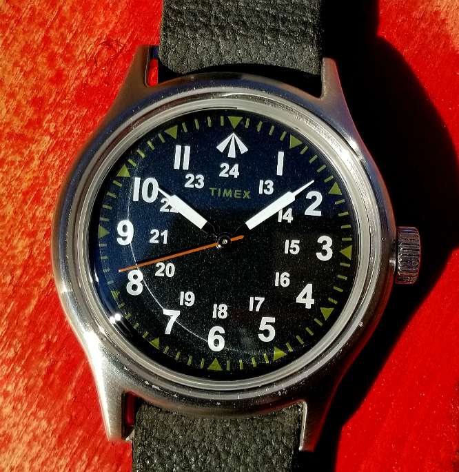
Let's take a good look at the dial. The background you can see is black, with a sort of matte surface. 1-12 hours with the Broad Arrow replacing the 12, with 13-24 hours more centrally. The outer minute marks with hashes and triangles, as well as the small TIMEX script,are in a lovely sort of olive green color which isn't a color choice I would have thought of using, but it really looks nice. It is the same green, or close to it anyway, as that of the plastic/resin case of the original 1960s Timex MIL-W-46374 watch, and if that was intentional, I think that's pretty cool.
I like that TIMEX is small, unobtrusive, and is in the same green as the outer markings. Not only does this achieve a kind of aesthetic balance, but if the TIMEX was in white, it would be more visible. As it it, when you're wearing the watch, there is virtually no way anyone will know unless they grab hold of your wrist and look closely, that this is a TIMEX. I love seeing TIMEX on my watches, but for some reason with this watch I like that it is small and subtle.
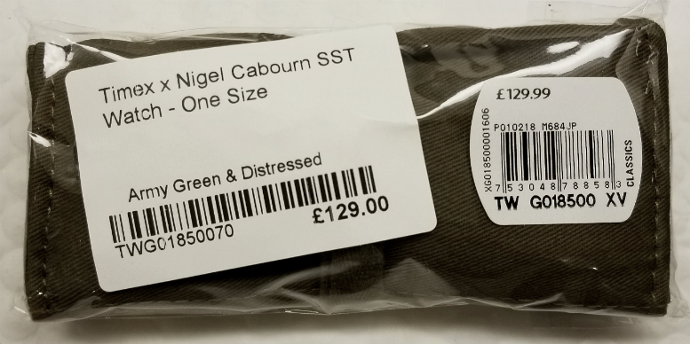
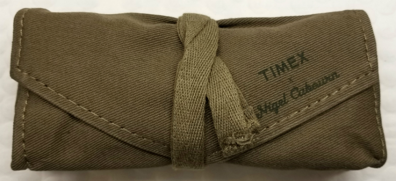
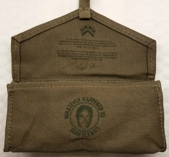
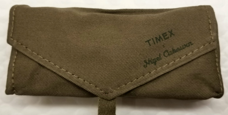
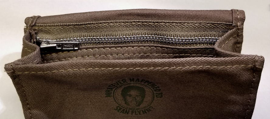
Watch supplied with a super-cute "mending kit" made from brown-green canvas. Here it is as obtained from NC, with outer cellophane wrapper and the factory stickers. "Army Green & Distressed," Timex stock no. TWG01850070. Retails for £129.00. Below is the kit open. Notice the picture of Sean Flynn, as well as a sort of artist's statement from Nigel that is kind of hard to read on this picture, but better pictures and more on this further below.
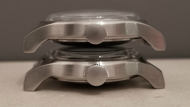
The case is super-fine. All steel. Solid lugs like the '60s plastic original, seems to be well-made. It is *exactly* the same case (as are the crown and mineral glass crystal) as another Camper, the SST Camper from Japan Timex. Below are the two watches stacked together, with the SST Camper on top, but you really can't tell them apart.
Just taking it out of it's wrapping for the first time. Crown was pulled out to save battery, with a small silicone stopper across the stem.
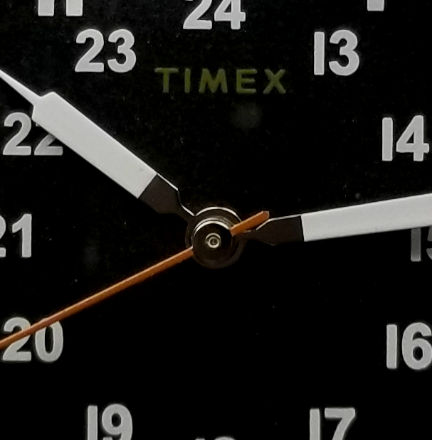
Hour and minute hands are nice. White non-luminous paint (nothing about the dial/hands is luminous) with the paint stopping before the post. You'll see this on some watches, and it gives the impression from afar of the hands floating. I'm not sure if it increases the conspicuity of reading time, or if it is aesthetics, but I am guessing that it originally had a functional purpose. Seconds hand is kind of halfway between red and orange. Another good look at the small, olive TIMEX
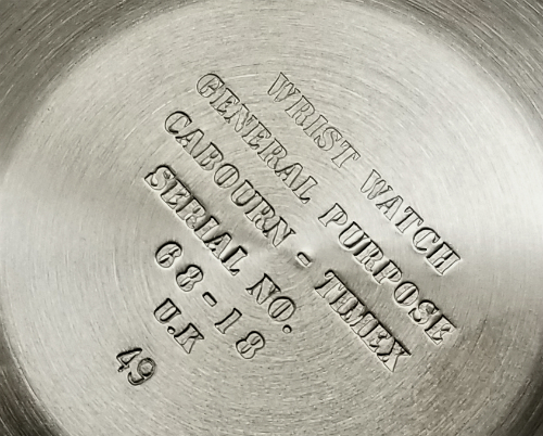
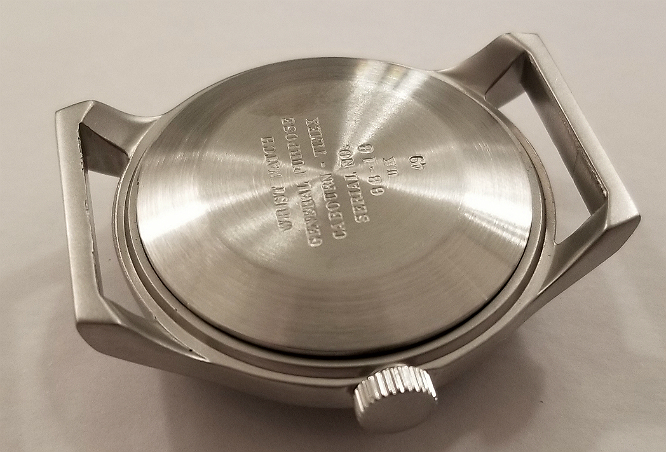
Stamped caseback markings. Does anyone know what 49 represents?
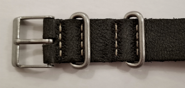
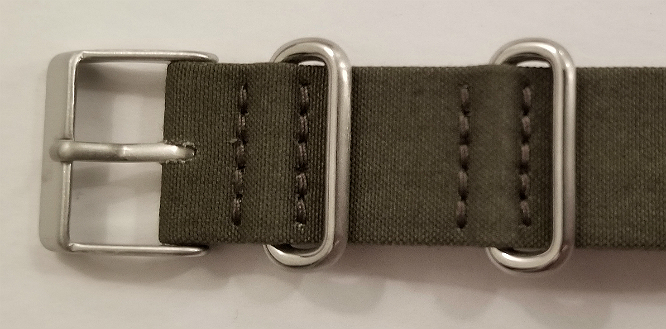
Watch is supplied with two single-piece straps. Above is grey distressed leather, and below is green Ventile surface and leather backing. Both have the same nice steel hardware. The grey leather one is slightly narrower than the green one, probably by less than a millimeter. I had never heard of Ventile before, but apparently it is a woven from threads made from long-staple cotton, which can be made into a "low twist" thread, allowing for super-tight weaving. Nice stitching on the straps.
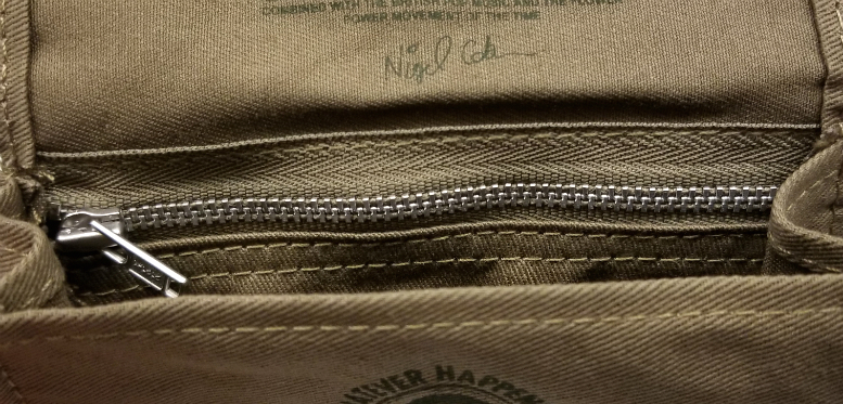
Inside of the mending kit (which I am really liking much more than I expected I would) there is a zippered compartment. No plastic zipper here; nice metal zipper made by YKK, a Japanese manufacturing company. See close up of zipper-pull.
Before I forget, take a look at the hands on this watch. It's from the Instagram page of Nigel Cabourn Japan (link here,) and you can see the hands differ from the release version of the watch. These hands are the same as the (luminous) ones on the TIMEX Japan Original Camper. This obviously was a prototype, and perhaps they were thinking of using these hands. I certainly like these hands, but the ones on the release version work very well with the dial, I think. Just thought this would be interesting to show.
Let's revisit the broad arrow placed on the dial in place of the 12. What is the broad arrow? "The broad arrow was used in England (and later Britain), apparently from the mid 16th century, to mark objects purchased from the monarch's money, or to indicate government property." (Wikipedia). So, this is a mark of government property, used for a wide variety of applications, including on wristwatches issued to the appropriate personnel by the Ministry of Defence. Many watches had the broad arrow on the dial, various companies, etc. Here's a Smiths army watch I once had (sold it to a chiropractor in LA.) More on broad arrow in a moment, but in this context I also want to consider what Nigel has stamped on the inside flap of the mending kit. Have a look, below:
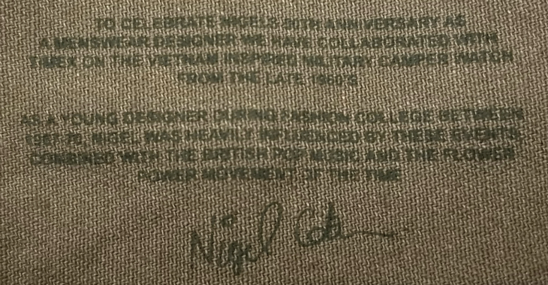
A sort of statement of purpose and intention, a consideration of history. It may be a bit hard to read, so I will transcribe it here:
"To celebrate Nigel's 50th anniversary as a menswear designer, we have collaborated with Timex on the Vietnam inspired military camper watch from the late 1960s.
As a young designer during fashion college between 1967-70, Nigel was heavily influenced by these events, combined with the British pop music and the Flower Power movement of the time."
Nigel Cabourn.
Before considering Nigel's above statement, I want to list one more piece of information, as part of this discussion, and that is the machine translation at the Nigel Cabourn Japan website for this item. Machine translation admittedly leaves much to be desired, but reading through the irregularities, you get a sense of their overall thoughts for this watch. In particular: "At the time Nigel began to engage in design, Vietnam far from the UK was in the middle of war. We propose movements and events represented by flower power etc, and those that happened at that time by subliming to the present age." (More on this after a couple more pictures, below.)
【SS18 UNISEX】 Nigel Cabourn x TIMEX - ナムウォッチ / NAM WATCH
<Nigel Cabourn × TIMEX> A remarkable new collaboration will finally appear.
Also in the category of military watch, TIMEX who developed a
watch-type military watch in the 1910s only when it was a pioneer and
actually received the request of the US military.
Together with the company that boasts over 160 years of history, Nigel
Cabourn is the 50th anniversary as a designer The 2018 Spring / Summer
collection theme is the Vietnam War. At the time Nigel began to engage
in design, Vietnam far from the UK was in the middle of war. We
propose movements and events represented by flower power etc, and
those that happened at that time by subliming to the present age.
In addition to its origins, in collaboration watches based on the
Camper which widely exist in the clock industry and the fashion
industry as "the apex of a practical clock" or "the ultimate basic"
also appears in modern times.
About TIMEX In 1854, founded as Waterbury Clock Company in Waterbury,
Connecticut, USA TIMEX is an American watch brand with a history of
more than 160 years.
Democracy called "one in three people in the world", versatility that
suits everyone, and the value born because of the long history, as the
standard of casual watches the world around love It has been.
About Camper. Founded in 1854, TIMEX who was involved in the
development of the US military's first military watch in 1917. In
World War II, we brought a bomb timer etc. to the US Army and received
recognition from the US Government due to its achievement. In the
later Vietnam War, "disposable watch" which does not need repair or
exchange in the battlefield was developed and was given to US military
by US government purchase. This watch was later sold as a consumer
product under the name of "Camper", and since then it has become a
best seller that continues to this day due to its high practicality.
Size: F
Color: Green x Black
Case material: Stainless steel
Windshield: Dome type
Strap: Bentail / Distressed leather (2 pieces)
Stamp: Limited stamp
Included Bundle: Guarantee / Special canvas bag
Part number: 80362969000
Collection: 2018 SS
SEX: UNISEX
ITEM: Goods
LINE: Collaboration
Country of origin: Philippines
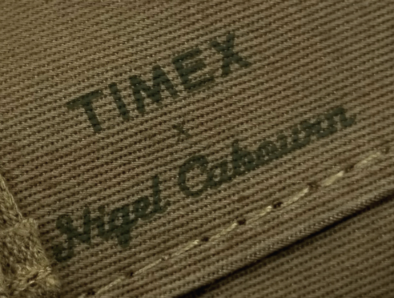
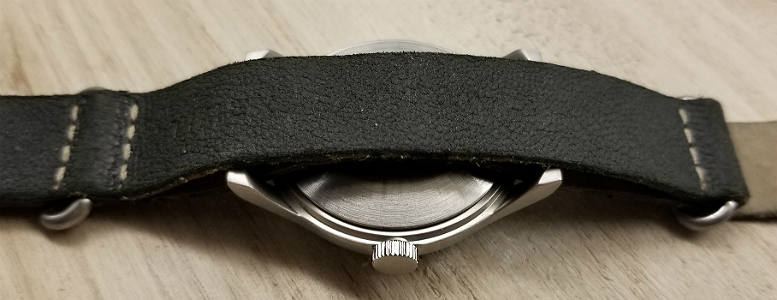
Nice printed signatures on outer flap of the mending kit. Below, the undersurface of the distressed grey leather strap. I like the grey strap better than the Ventile, and wearing the watch on it.
Putting all the visual and textual information together, what does this all mean. What is the meaning of this watch, does it relate to history, and is it a "coherent" object. I have some thoughts, and in general I affirm the design and symbols, and what I see as intentions and purpose.
I will say firstly that some will object to the placement of the broad arrow on a civilian watch, one that is not specifically related to a military contract. The argument being that if the watch is not a MoD issue watch, and therefore not British property, it should not have the broad arrow. I understand why people might say this. Others will say that even if you were going to put a broad arrow on a non-issue watch, then at least make it modeled after a watch worn by the British services, not a Vietnam-era American watch. I also understand why people might say this.
But I will also say that these interpretations will ultimately revolve around whether or not you believe there is a kind of "sanctity" to the broad arrow, and whether or not it can ever be "appropriated" as a symbol for anything other than Crown property. As far as I know, there is no legal reasons preventing the use of the symbol in design, fashion, etc, and therefore any objections ultimately become based on how you feel about its use, in that way. As I've said I understand those who object, and people have their reasons that are meaningful for them, reasons why they have those objections. But those objections carry no specific authority, in the the broader culture that everyone lives in. With these considerations, I find the broad arrow an acceptable design element on a wristwatch. (more on this below)
Above, watch on the grey leather strap. It's very comfortable, and the grey is a dark grey and complements the dial and overall look of the watch very nicely.
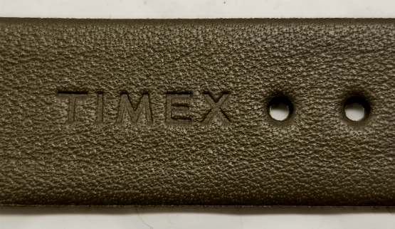
Below, the undersurface of the Ventile strap has smooth leather, somehow fused to the Ventile, and it is embossed TIMEX
I was thinking about the objection (one that I have heard) that the broad arrow does not belong on a watch with American provenance, a like this Cabourn wristwatch modeled after a US issue watch. Again, this objection supposes a kind of "sanctity" of the broad arrow as a symbol or an object, which I already have rejected, but also further goes against examples of history.
Recall the Mod subculture of late 1950s and early 1960s Britain, and how young people, beginning in London and later throughout much of the country, began wearing US Army "fishtail parka" (M-1951) along with patches and other designs of the roundel of the Royal Air Force. The parkas were US military garments developed for use during the Korean war. The Mods then attached to a parka this symbol, most evocative of the Battle of Britain, where the Royal Air Force, effectively, kept Britain from falling to Nazi Germany. They didn't attach the roundel to an RAF fighter jacket. They didn't attach it to a British Army anorak. They chose instead to attach it to a *US Army parka* from the Korean war. Because this combination created meaning for them. In addition to parkas, they also attached the RAF "target" roundel their scooters, which were not UK products, but were made in Italy. So, were these Mods "mixed up kids," confused and using mismatched symbolism, or were they creating a new identification of their own through the use of whatever symbols they found meaningful?
To conclude my thoughts on this, the Timex x Nigel Cabourn watch is, to me, an object of clarity and coherency. Nigel's use of the broad arrow, perhaps in the same way that the Mods found meaning in the RAF roundel, is clearly meaningful to him. It is also clear from his statement that the events that were happening in Vietnam, along with the resulting "flower power" movement among young people in the States, was meaningful to him. It does not seem surprising that using the template of a US military watch,for this collaboration, was significant.
Finally, once again, from the Cabourn Japan link to the watch, machine translation: "We propose movements and events represented by flower power etc, and those that happened at that time by subliming to the present age." I'm sure the translation is imperfect, but I sort of hear this saying something like, "We acknowledge the history of these events from long ago, and we have not forgotten their significance. In this watch, we wish to recall their importance in the present age."
I am happy to hear other people's thought on all of this
This leaves us with a very lovely collaboration between Nigel Cabourn and Timex. I hope you have enjoyed the photos and the review. All photos above were taken by myself, of my own watch. If you'd like to see some very high-quality photos of the watch from the Cabourn website, I've assembled them all on one page for easy viewing, along with a link to the watch. Have a look if interested. Also: my review of three early Camper mechanical TIMEX from 1989-1991.
Thanks again,
Alan (Contact information at bottom of page.) [I've added more pics, after originally making this page. Scroll down for more pics!]


END.
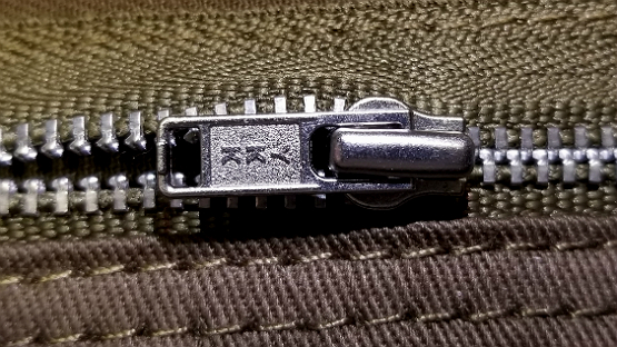
Couple more photos of the bag, and of the YKK zipper.
I just noticed the watch in the sunlight, today. Looks nice. The green markings really seem to stand out brighter.
On the shipping package, Nigel Cabourn ink stamp and sticker. (I don't know why, but I love these kinds of things...)
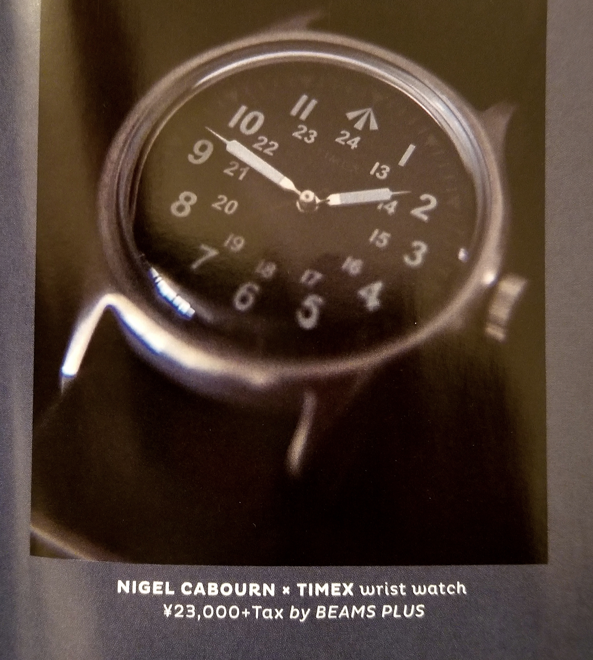
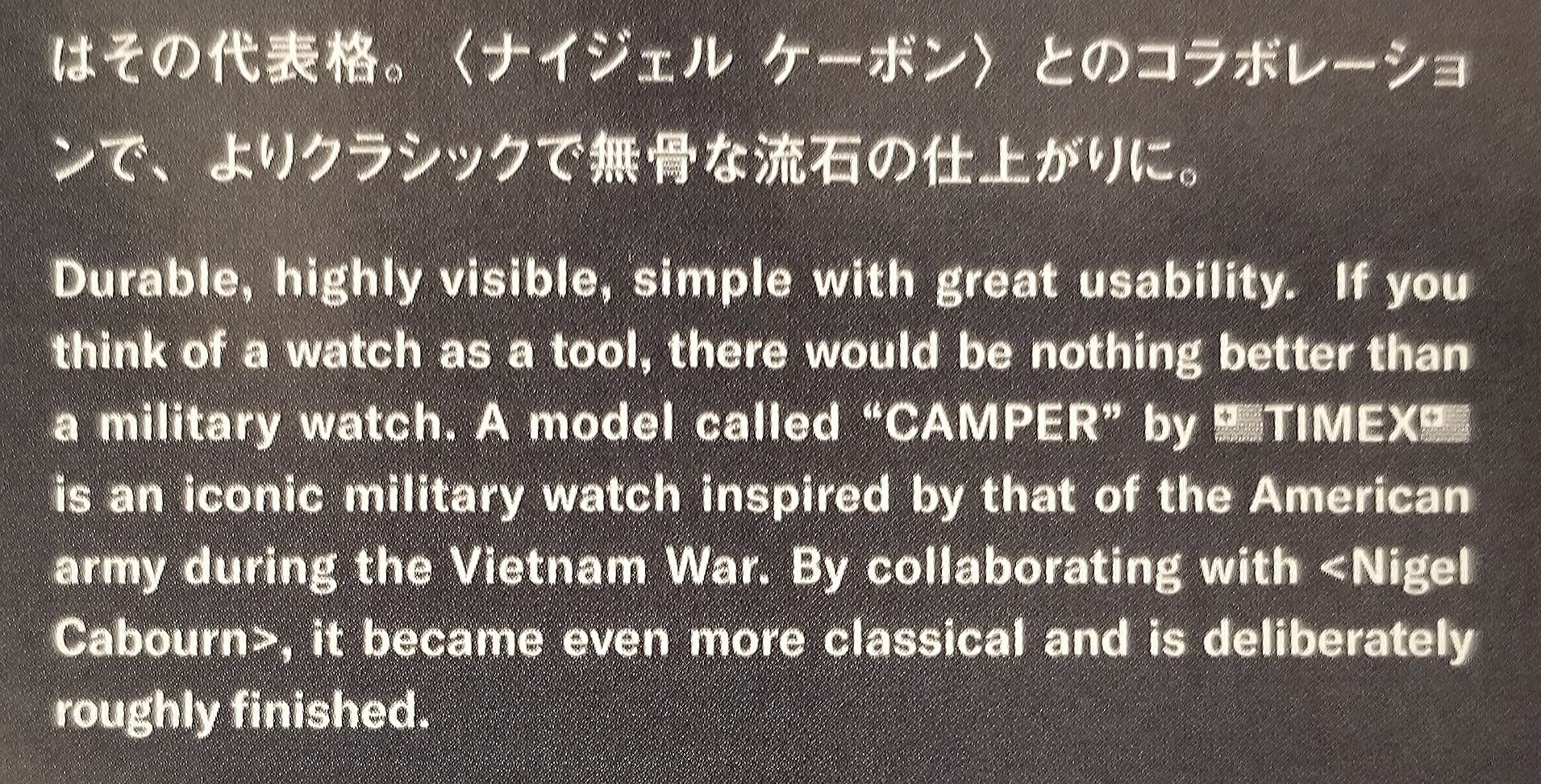
Above and below, from the Beams Spring & Summer catalog. Beams, a Japanese retailer, is an authorized stockist for the Timex x Nigel Cabourn watch.