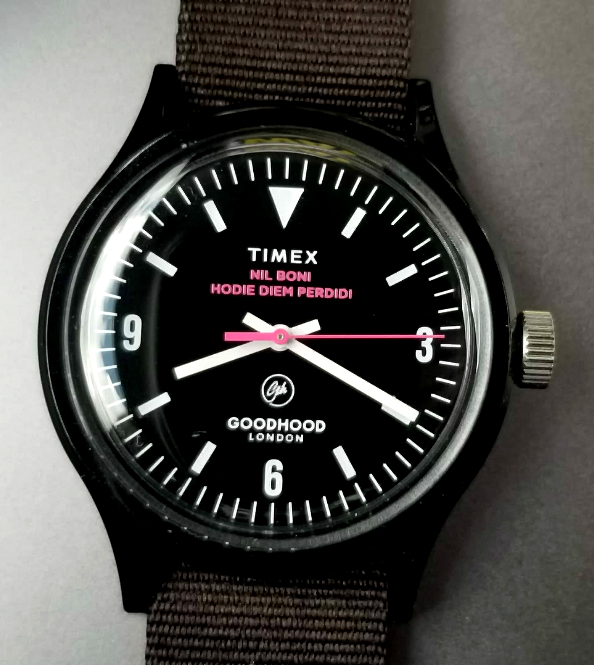
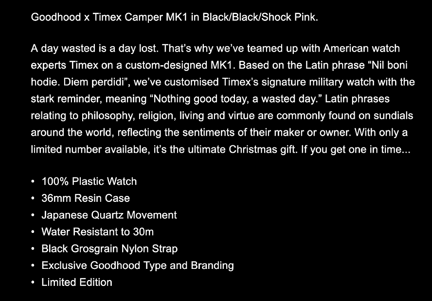
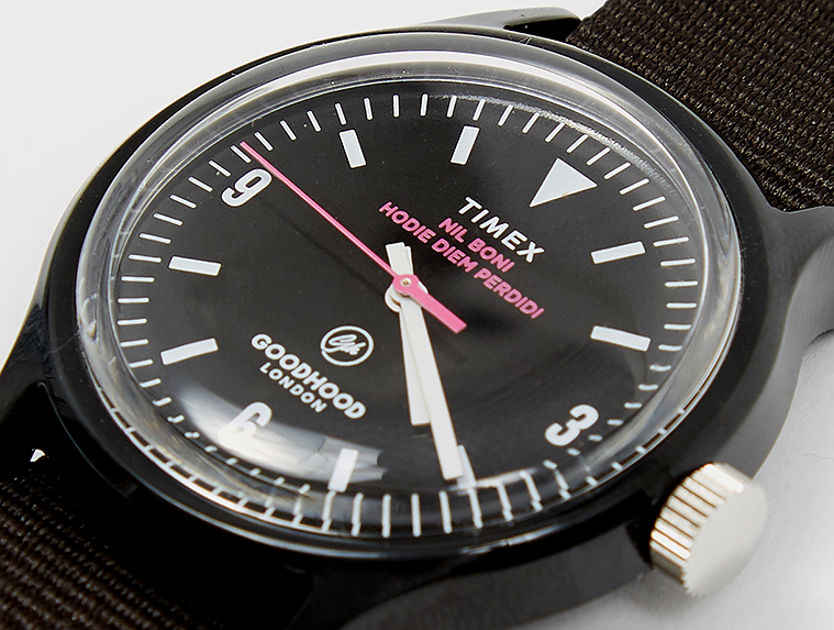
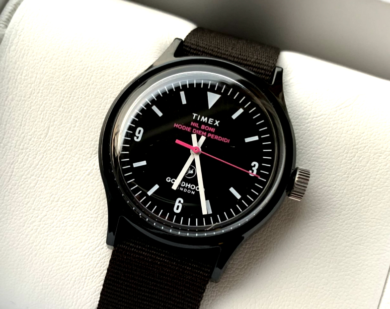
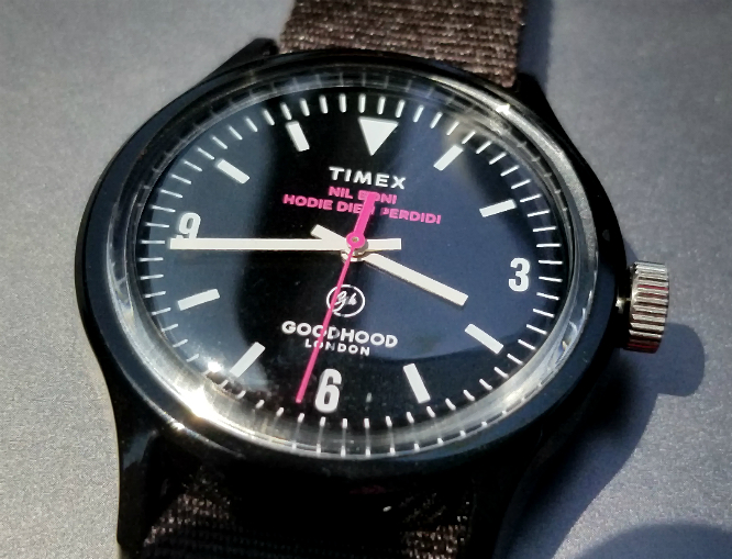
TIMEX x Goodhood Camper. Latin expression on the dial, in "SHOCK PINK." December 2018.
"A day wasted is a day lost."
Hi, this is Alan. Thanks again for your interest, and for reading these pages. My contact information is below, at the bottom. Well, here is a pretty nice collaboration between TIMEX and Goodhood London, a Camper / Mk1 watch in black case, black and white dial, with accents of SHOCK PINK, and with a somewhat foreboding expression in LATIN on the dial. What is SHOCK PINK? (The color originated from a 17-carat pink diamond from Cartier, see below)
Goodhood, is a physical store in East London, as well as an e-commerce multi-brand retailer, selling goods from over 200 brands. "Our aim is to cultivate our unique vision of effortless life style and redefine the idea of luxury living. Our curational buying ensures every product has a story and relevance to our ethos. We actively aim to create a culturally relevant experience influenced by the flow of culture rather than the trends of the fashion industry."[1]
"Latin phrases relating to philosophy, religion, living and virtue are commonly found on sundials around the world, reflecting the sentiments of their maker or owner." [2]
NIL BONI HODIE. DIEM PERDIDI
(What?)

And why am I showing the dial of a Rolex Explorer, ref 1016? More later.
So, what is this watch all about? What is NIL BONI HODIE. DIEM PERDIDI. This appears to be an "intentional" design/concept, encouraging (forcing? haha) the wearer to be almost "morbidly aware" of how ones spends time. The phrase, in Latin, translates to: NOTHING GOOD TODAY. A WASTED DAY. This somewhat foreboding statement is meant to remind the wearer of the importance and especially of the irreversibility of time. The default seems to be, "You haven't accomplished much today, you have wasted your day!" Presumably, this should serve as a kind of constant reminder for us to use our time in ways that we won't look back and consider "wasted." This isn't exactly "negative reinforcement," but probably time-productive kinds of behaviors are strengthened by the awareness of the negative outcomes of "time wasted." I'm sure B.F. Skinner would have at least something in passing to say about this watch.
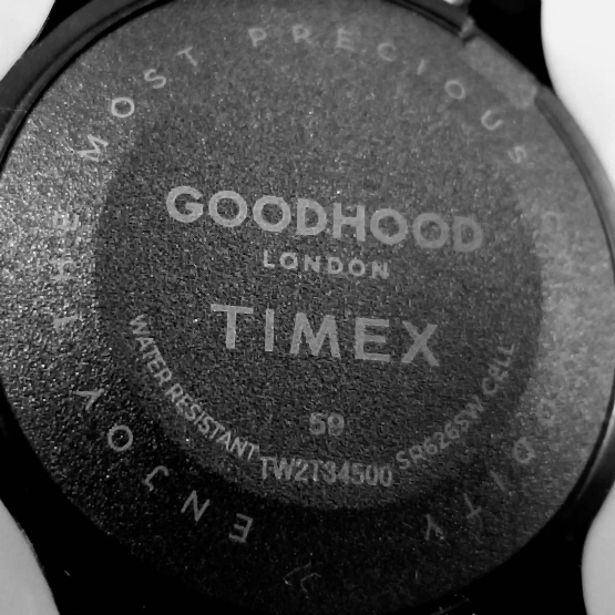
Even the caseback tells us to ENJOY THE MOST PRECIOUS COMMODITY. The unspoken part of this might be, "Enjoy it while you still can..."
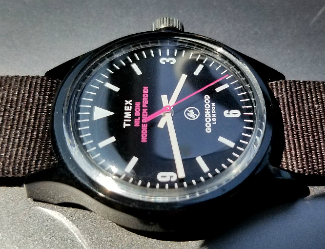
(Because of reflections I needed to take two photos to fully show the phrase. The 59 indicates that the watch was made in November 2018. It went on sale December 2018.)
A screen shot from the Goodhood page,
end/
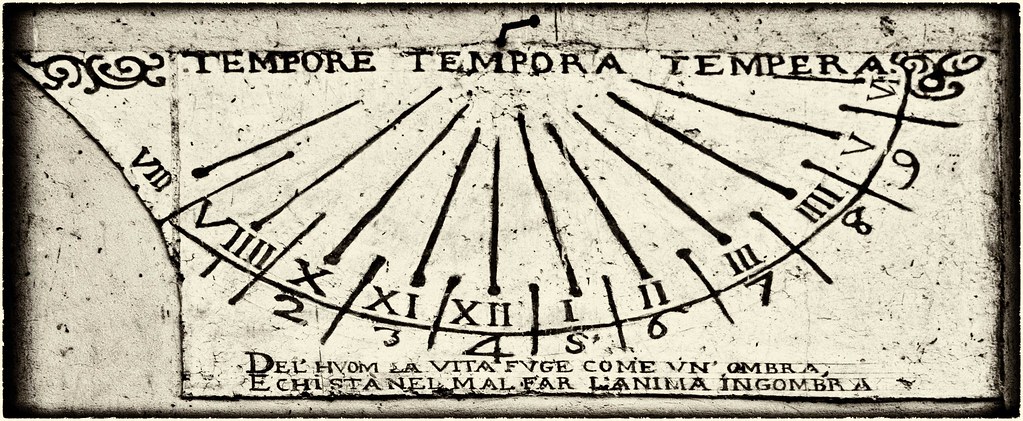
Above, sundial, with Latin phrase. Click here to get to the page where this came from.
DISCE BENE VIVERE & MORI - Learn to live well and to die well.
MORA TRAHIT PERICULUM - Delay engenders perils.
VIGILATE & ORATE, TEMPUS FUGIT - Be vigilant and pray, for the time hastes away.
QUALIS VITA, FINIS ITA - Each life has an end that suits it.
DISCE DIES NUMERARE TUOS - Learn to value your days.
UTERE NON REDITURA - Use the hour, it will not come again.
UNA EX HIS ERIT TIBI ULTIMA - One of these hours will be your last
*** ONE OF THESE HOURS WILL BE YOUR LAST! ***
*** this all creates a feeling of foreboding ***
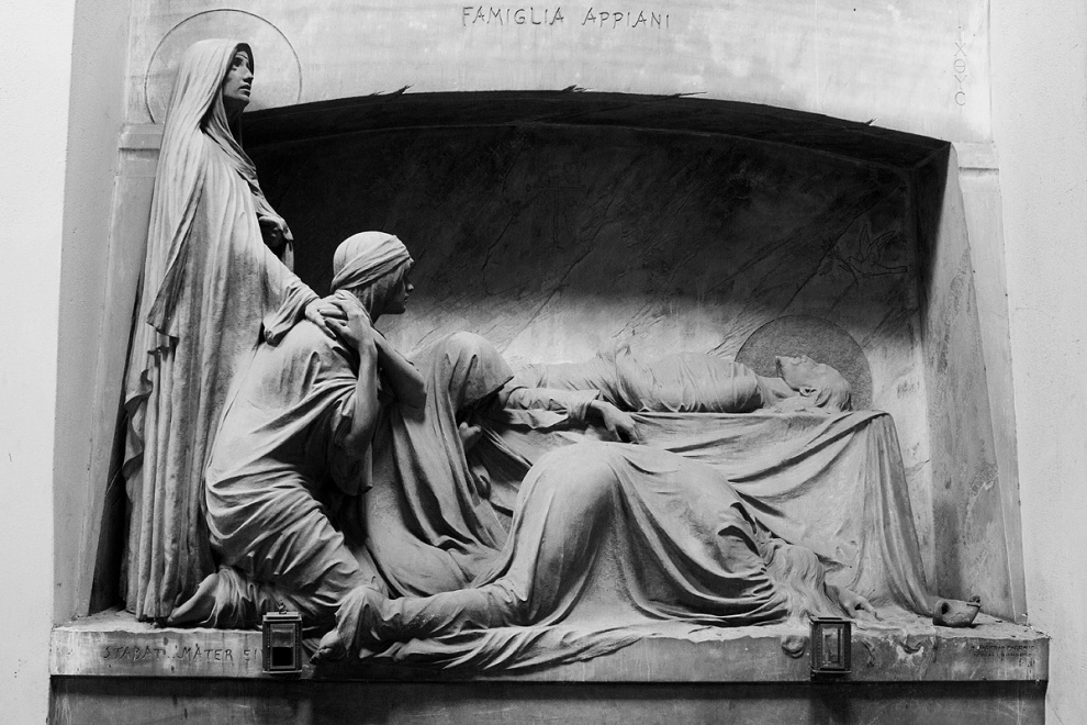
All of this just makes me think of the Appiani family tomb in Genoa, Italy (a photo of which appears on New Order's 1980 album, "Closer.")

And Hamlet: "What dreames may come, When we haue shufflel'd off this mortall coile, Must giue vs pawse."
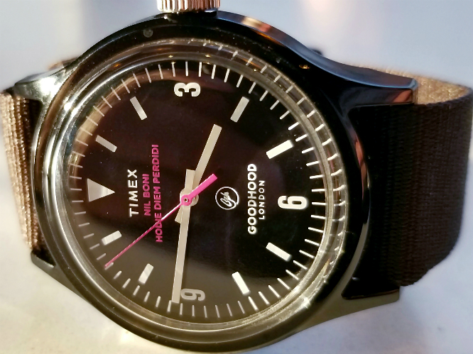
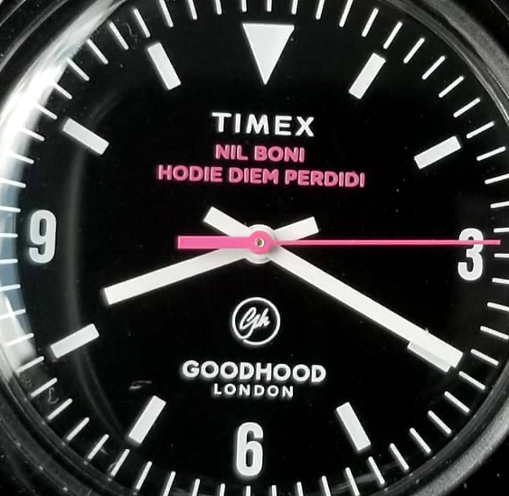
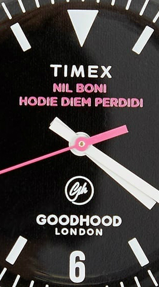
This pic is not of my watch, but was from the Goodhood website.
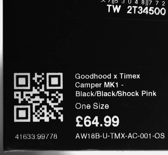
From the packaging. Not a bad price at all, for a bespoke, limited edition TIMEX Camper. Model is TW 2T34500.
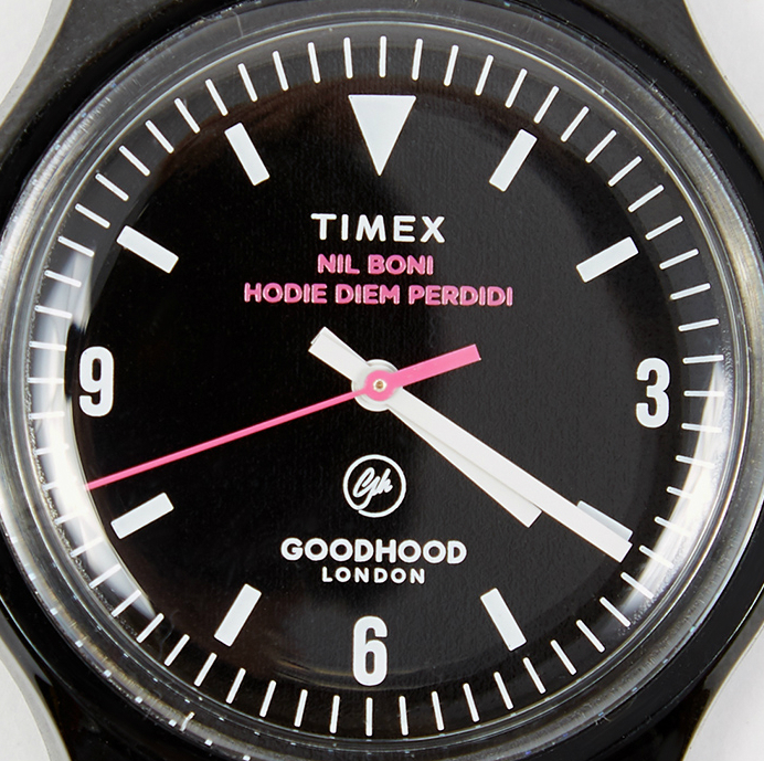
Above pic is also not my watch, but from the Goodhood page. But I'm using it here, as it's more clear and sharp than any high-res pic of the dial I was able to obtain. So, let's have a good look at the dial. A very high-contrast dial, black background, white hour markers and numerals, white hour and minute hands. TIMEX, GOODHOOD LONDON, and the Goodhood logo in white. But then SHOCK PINK for the seconds hand, and the Latin inscription NIL BONI HODIE DIEM PERDIDI.
Wow, what a design choice! It turns what would otherwise have been a very good watch into a great watch! The dial doesn't really share much with the "typical" Original Camper template; many of the Camper collaborations vary little from the Original, but this dial is designed from the ground up. While keeping the usual Camper case/crystal, same type of Japan quartz movement, same standard strap, there is a total revamping of the dial/hands to the bespoke design.
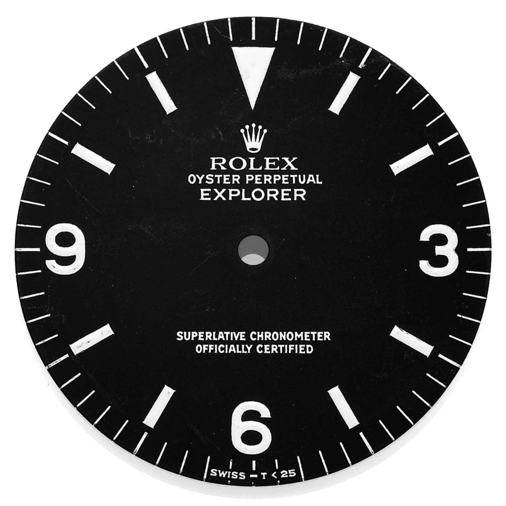
Back to that Rolex dial. 1960s Explorer, ref. 1016. Notice the similarities between the Explorer and the TIMEX dial. Totally acceptable; the 1016 dial is so iconic, and so great, that there is everything to celebrate the close similarity with this TIMEX.
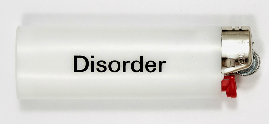
You can also buy this lighter, at Gooddhood. About eight dollars. "A collaboration between Goodhood and Factory Records art director Peter Saville, this lighter is a special release. Marking the 40th anniversary of Joy Division's classic album Unknown Pleasures, this white lighter features black text on the side."
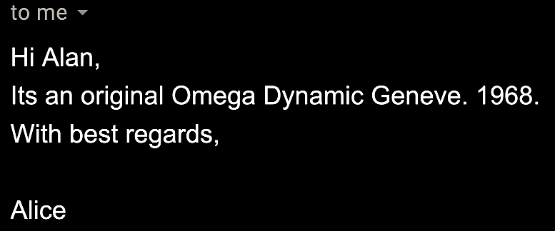
Peter Saville wears a pretty nice vintage watch, btw. Not surprised. Back in 2012 I saw a video where Peter was talking about design, and I noticed he was wearing a nice looking watch. I sent an email to the Peter Saville Studio website, asking about the watch, and received the above reply from Alice. Pretty cool.
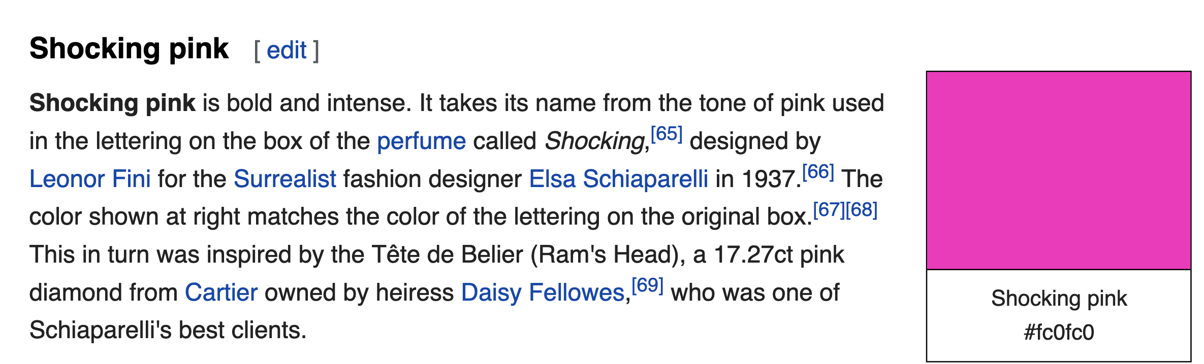
And what is shock pink, or "shocking pink?" Above, from Wikipedia, explains that shocking pink derives from the color of a perfume box, which in turn derived from the color of a 17ct pink Cartier diamond. THIS IS NOT THE USUAL TIMEX STUFF.
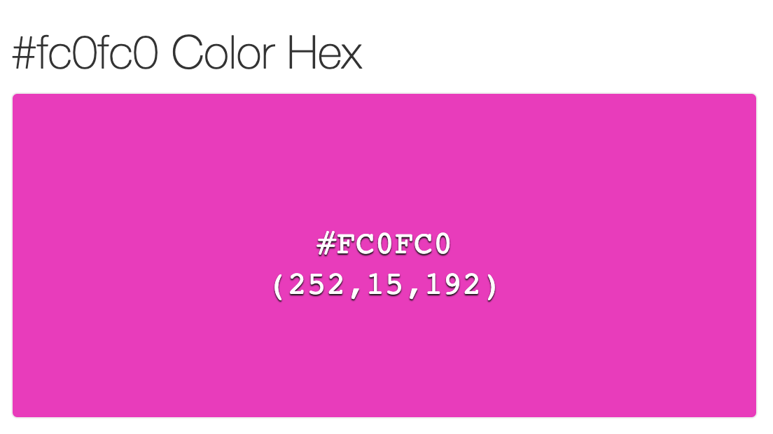
Using that #FC0FC0 code you can also create your own blocks of shock pink, here shown with its RGB numbers.
Thank you for reading.
I hope you will like it. SPERO TIBI PLACET VOBIS.
Alan
Contact
Website: Alan's Vintage Watches
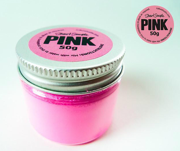
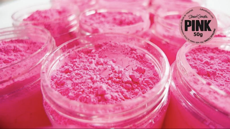
The above and below two pics are from Stuart SempIe and CuIture HustIe website. It is said to be the "pinkest pink" available. I actually own two pots of this paint, purchased in December 2016. The powder is meant to be mixed with water, to create paint. I still haven't found the perfect thing to paint the "pinkest pink."


love will tear us apart. pink will bring us together.