Timex Giorgio Galli S1 Automatic Watch, November 2019
“The S1 is a bridge between classic watchmaking and industrial design.”
Hi, this is Alan. Contact information is at the bottom. Once again, thanks for reading, and for your interest in these pages.
Here we have a very special Timex that was many years in the making. It is the Giorgio Galli S1 Automatic, released in November 2019. I bought this watch as soon as it became available, but it has taken me far longer than usual to write this review. There is so much to this watch, and so much to cover, I wasn't sure where to start or how to begin!

end/
Some background: Giorgio Galli is the Design Director for Timex Group. His Milan-based Giorgio Galli Design Lab which began in the 1990s, was acquired by Timex in July 2007, though the lab was designing watches for Timex and others for quite some time before that. The S1 is the first watch that was designed completely by Galli, and the first to bear his name.
While all distinct watch creations are by definition "unique," the S1 has many features that are remarkable, often surprising and delightful, sometimes evocative, and in some cases truly unique. And I don't think I have yet discovered everything about this watch. While I probably won't formally compartmentalize this review into distinct sections, each component of the watch has in fact numerous features worth noting, incluidng the
1. Dial and hands
2. Case
3. Crown
4. Movement and caseback
5. Strap
Some basics fo the S1:
Case: 41 mm diameter, made from injection-molded marine-grade steel, with display back
Crystal: K1 Hardened IGN/A3 glass
Movement: Miyota 9039 automatic, with custom rotor. Movement is high-beat, 28.800 beats per hour
Strap: black synthetic rubber, with unique closure system
Water resistant: 50 meters
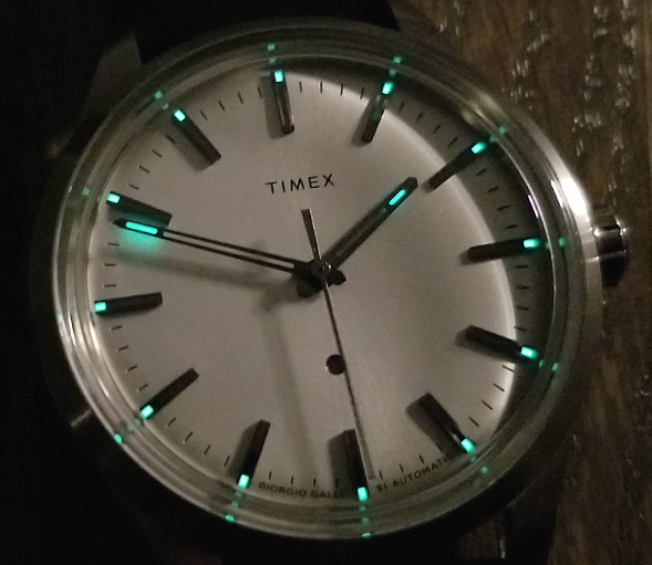
Luminous dial and hands: yes
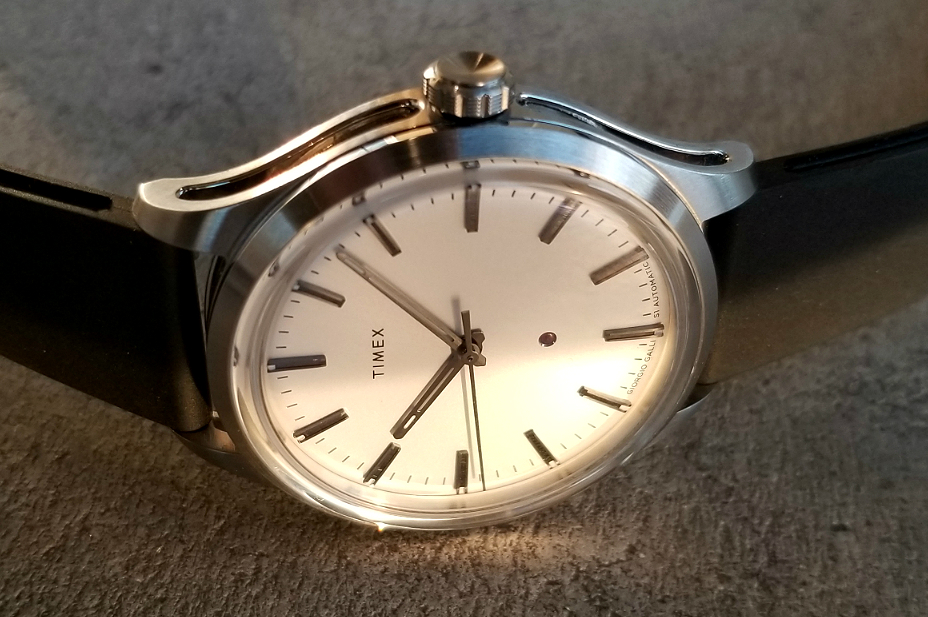
The watch is enigmatic in that has some "classic" and "traditional" features, while also being overwhelmingly modern and futuristic, even avant garde. While any great design will incorporate cues and elements from the past, the S1 is decidedly a modern watch with its feet firmly planted the present and beyond. Galli has a love for architecture and photography, and works with how light affects the appearance of the designs.
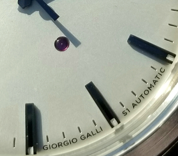
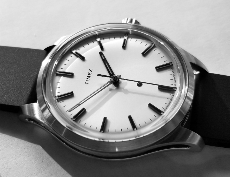
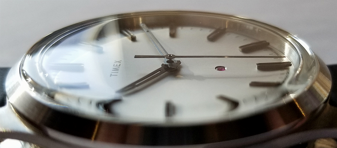
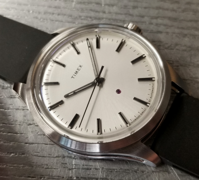
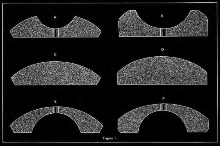
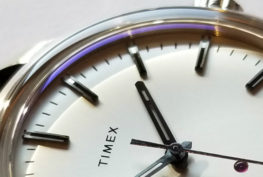
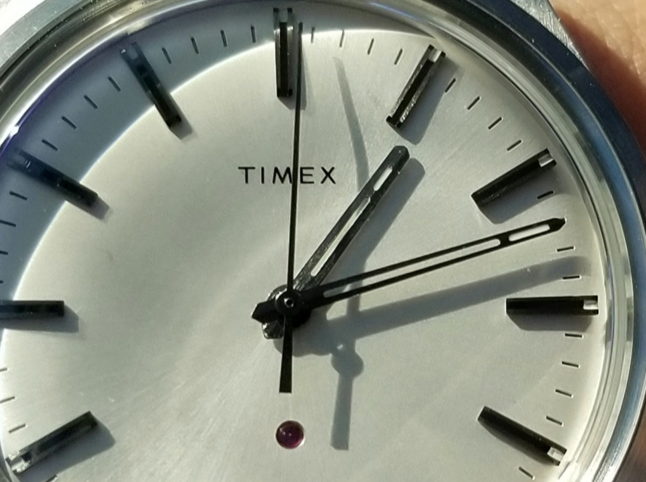
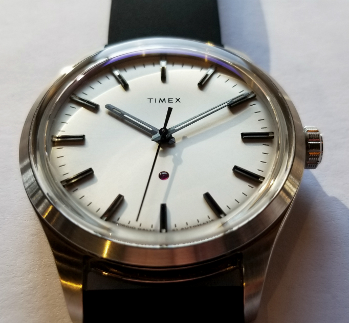
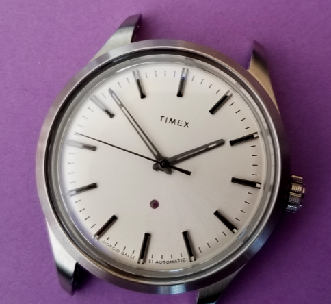
Notice the signage at the bottom of the dial GIORGIO GALLI S1 AUTOMATIC in modern, sans serifs lettering. And also: I have not yet mentioned an obvious and wonderful feature of this watch, the red synthetic ruby, a movement "jewel" (hereafter just referred to as the "ruby") embedded in a round depression in the dial above six. This is non-functional, wholly representational jewel, and has, to me at least, great significance and meaning, which I'll discuss later. The outer surface is convex, and notice the tiny pivot hole in the center. In the diagram below, from a Swiss jewel maker vintage ad, it's type E or F, I'm not sure which.
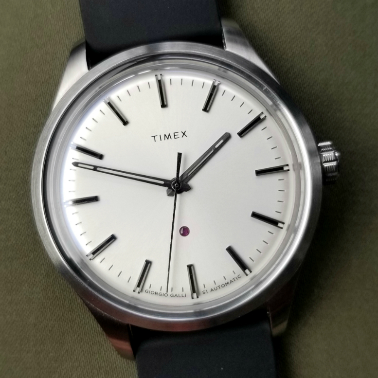
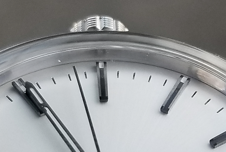
Let's start going over features of the dial and hands. On closer inspection, other details will be evident, but at first look en face like this, the watch has features similar to other "dressy" or "classic" watches, to me having the clean and modern look that began in the early 1960s, when it became popular to start replacing hour numerals with straight markers. Aside from TIMEX, there is only the small GALLI signage at the bottom. Straight, tapered seconds hand, skeletonized hour and minute hands, each with a small bit of luminous material at the tip. The straight markers are metal and some kind of black inlay, with also a small bit of lume at the periphery. Dial itself is sort of silvery, neither matte nor highly reflective, not really having any kind of "sunburst" lines.
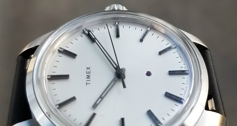
Look closer, and you'll notice the raised hour markers with small rectangle of lume at the peripheral end. The have an "industrial" look, to me, and although they are static elements, remind of of machinery. Notice the minute hand with lume at the end, and the seconds hand. All hands, and the hour markers appear to be brushed steel. This makes them less "shiny," almost black against the silvery dial, creating high contrast and visibility. Giorgio Galli is working with the light.
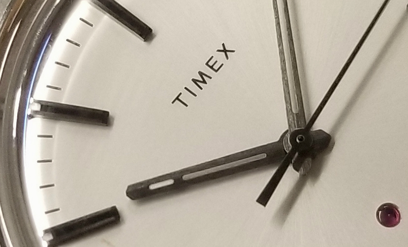
The brushing can be seen especially well on the minute hand above and in all the hands below. And I love the ruby...
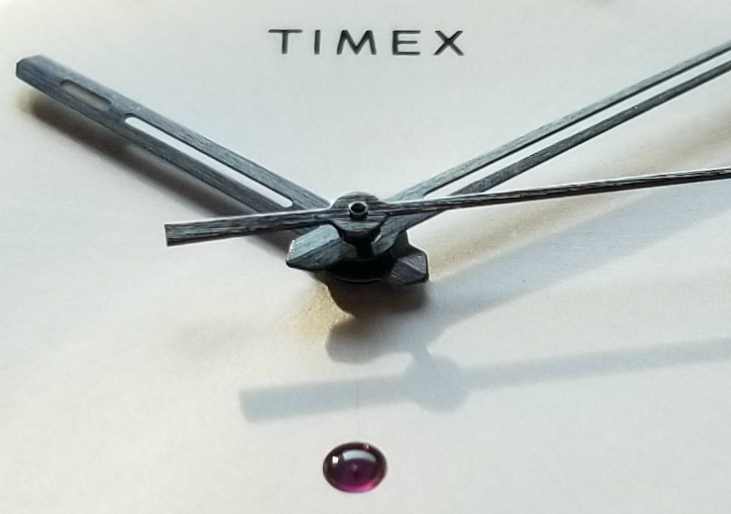
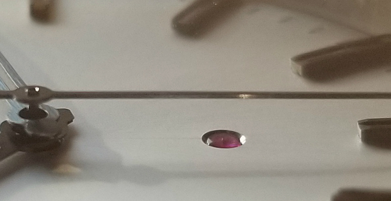
A good look at the ruby, sitting in its slightly beveled hole, with its surface appearing flush with the dial surface.
What about this ruby? Why drill a hole in a perfect dial, and pop in a synthetic ruby. The rubies are meant to be a part of the movement, to reduce friction and provide more accurate functions, and to also prolong the life of the bearings. But what is this ruby doing on the dial?
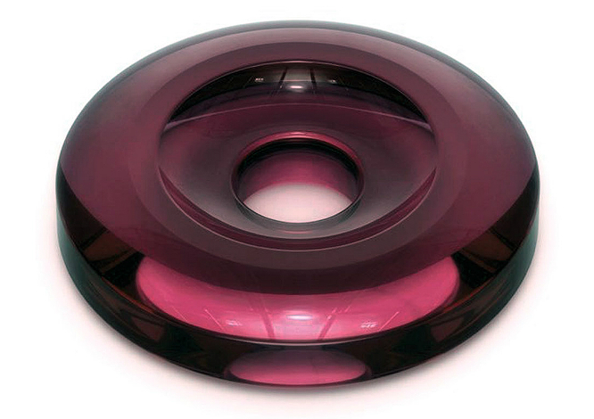
Jewels (rubies) are used as bearings to reduce friction at critical pivot points, to improve the accuracy and durability of watches. The above photo of a jewel is from this site, which is a good short primer on jewels in watch movements. (The jewel shape on the S1 differs from the above, which is looks bi-concave. The jewel on the S1 has a convex anterior surface.)
“The jewel on the dial represents the automatic movement inside the watch,” says Giorgio Galli.
This is quite a remarkable thing to do.
But before more about this jewel, I want to talk briefly about display backs. Clear display backs on wristwatches have for many years been relatively common, allowing the owner to see not just the beauty of the movement, but to appreciate and understand the wonders of engineering and design that are at the heart of a mechanical watch. It is interesting that the earliest known display backs were not intended for the consumer, but were in pocket watches made for salesmen, so they could show the nice movement to potential retailers and customers. Here is one from as far back as 1916!
Gradually, it seems, display backs were marketed to the consumer for the reasons which are obvious, and are beyond the scope of this article. While not everyone enjoys display backs, they are a well-established thing in watchmaking.
A display back, as nice a thing as it is, requires you to remove the watch from your wrist to in order to see the movement.
By placing the jewel on the dial, Galli is encouraging us to remember and appreciate the mechanical movement inside. To be reminded, at every glance, of the marvelous machinery inside that is making our watch work so wonderfully.
Moreover, I see it as a tribute to the long history of watchmaking and innovation. While I can't speak on behalf of Galli, or read his mind exactly, I personally see this jewel as deeply emblematic of the complex technological underpinnings of the mechanical watch, along with the history of innovation, and the story of how we got here.
Professor of engineering Debbie Chacra researches and writes about "Gratitude for Invisible Systems." Not about watches of course, but about the "largely invisible systems that exist primarily to contribute to the common good" in our societies. Her work is remarkable and extremely important; if I can borrow from this, however tangentially, I will say that this lone jewel, looking at us from the dial surface, encourages a gratitude for the highly complex and invisible systems at work beneath the dial, and encourages an appreciation of the history of watchmaking. But not in a kind of "dusty textbook" way, but thoroughly modern the way the jewel is incorporated into the dial of the watch. Maybe that's a stretch, but I feel personally that way, about this jewel.
Placing a ruby on the front of a watch dial is, I feel, an astonishing thing to do. It is as radical an idea as, say, taking a spark plug from the engine of your favorite gas-powered automobile, and using it as a decorative ornament on the hood of the car. It would be equally emblematic.
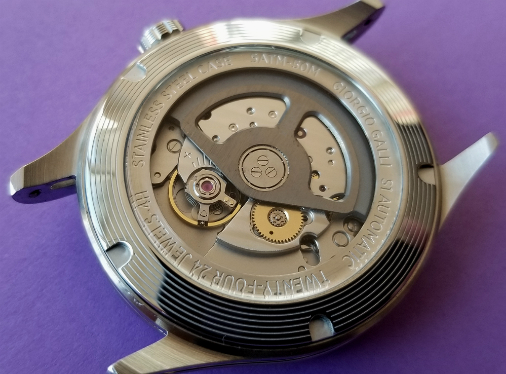
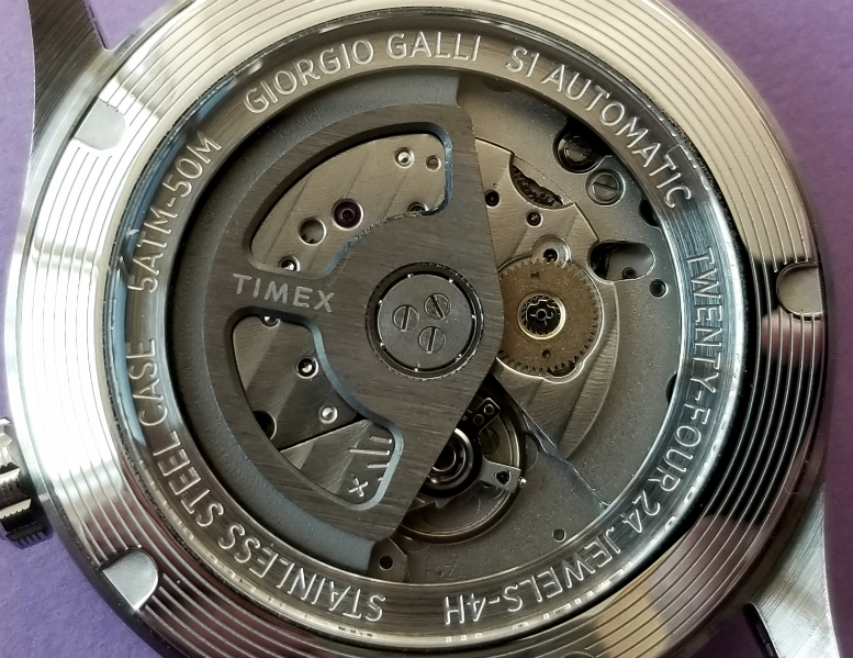
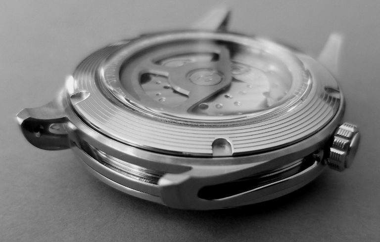
Let's turn over the watch and have a look a the movement, through the display back. There will be features of the case visible in some of these pics, and I'll comment on them.
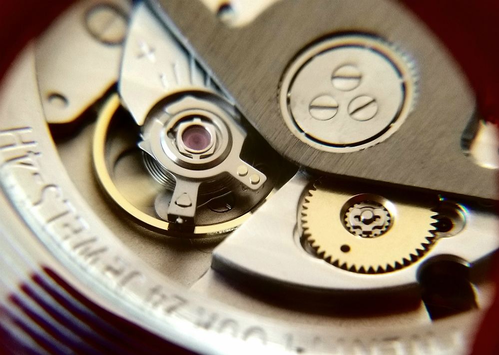
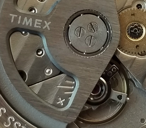
As mentioned, the movement is a Miyota 9039 automatic with high-frequency escapement, beating 28,800 times per hour. The movement features a custom rotor. In the above pic, notice the concentric ridges of the caseback, and the five U-shaped slots for the caseback wrench.
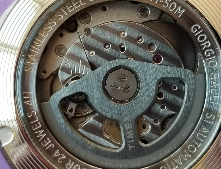
Like the rest of this watch, the appearance of the movement will vary depending on the incident light. Here, the decorative damaskeening work is well seen on the movement plate underneath the rotor, and the brushed appearance of the rotor is well seen.
The custom rotor is signed TIMEX, and also has two cut-outs, so as to obscure less of the movement from view.
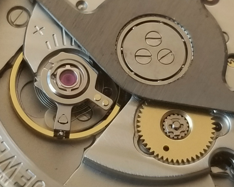
Here is a good look at the balance. Notice the attractive shock-protection device with the cap jewel. Also a nice look at the six tiny bearings that help the rotor move smoothly. This is shown below as well.
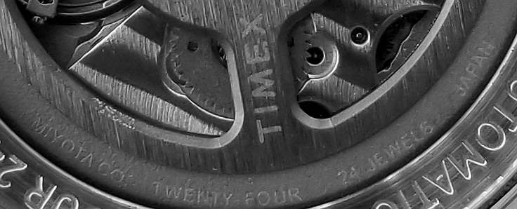
TIMEX
MIYOTA CO
TWENTY FOUR 24 JEWELS
Nice look at the metal machining work.
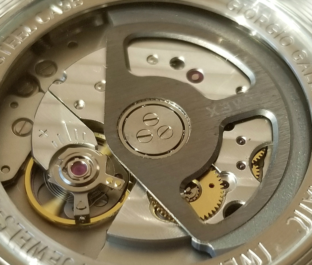
Balance in motion. Notice blurring of on of the "arms" of the balance. Also, a good look at the weighed arc of the auto rotor. It's not a single piece of metal, but looks like metals of two different colors, therefore to me it seems like the arc/weight has been fused to the rest of the rotor.
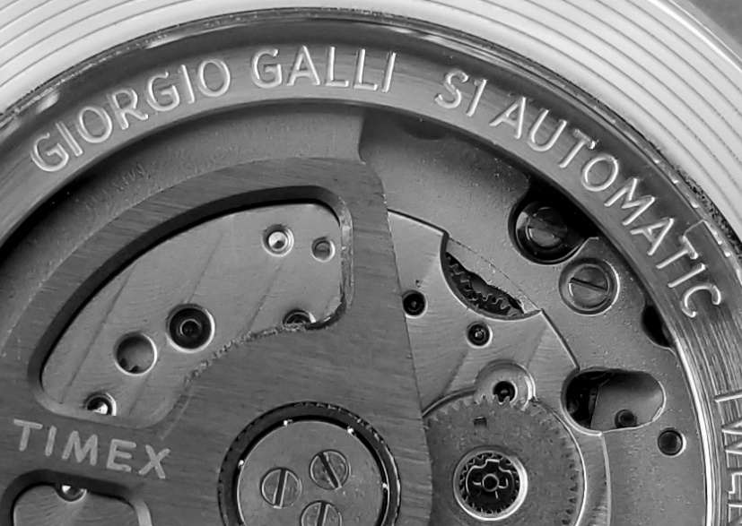
GIORGIO GALLI S1 AUTOMATIC, at the edge of the movement.
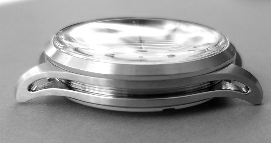
The case for the Giorgio Galli S1 Automatic is truly something to talk about. It is a reflection of Galli's experience as a designer, and also of his love of forms, shape and architecture, and the play of light and shadow on the various design elements.
But before I talk about the case, I wish to just mention the crystal. It is made from mineral glass, but not the ordinary kind that you might see in say the Timex SST Camper, for example. The K1 designation for this glass means that it has been hardened to resist scratching and shattering. That does not mean that it is immune to these events, but that they are less likely. People talk about sapphire glass, and people are always saying (not necessarily about this watch, but in general) "But I wish it had sapphire glass." Well, sapphire glass is much more expensive, and to me, I find the mineral glass a little more "warm" and more visually pleasing to look at.
The case has so much detail that it's easy to assume that it has been hand-machined. But in fact, it has been made using a manufacturing process called "injection molding," commonly used with plastics where metal is injected into molds, and then allowed to set. The resulting piece needs only some finishing, but not the labor-intensive and expensive hand-machining often required to achieve a case like this. Techniques like this keep costs in check, but still allow for a highly-detailed and beautiful result. This manufacturing method alone is a remarkable feature of this watch. Case made from SAE 316L "marine grade" stainless steel, resists oxidation and corrosion.
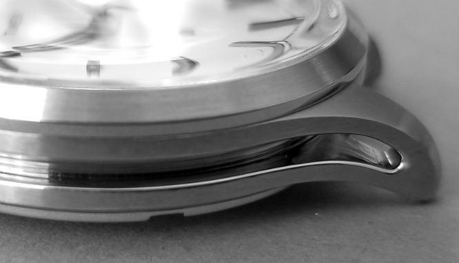
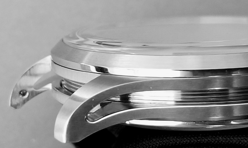
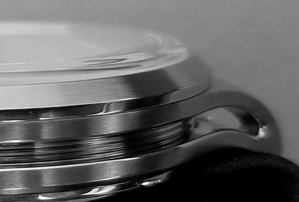
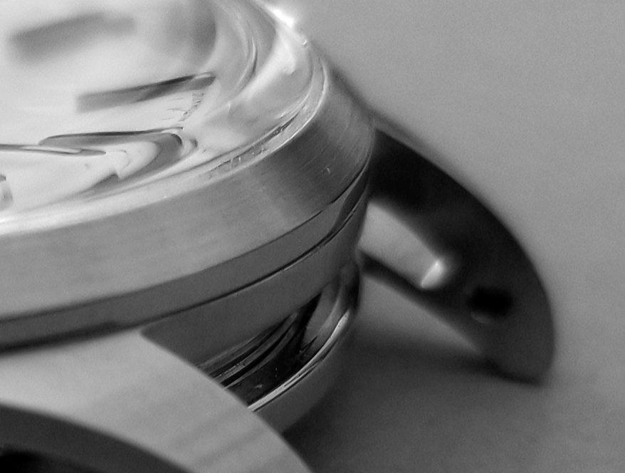
The above three photos, especially the first one, show the "skeletonized" form of the case. Long, curvilinear "cut out" from the sides of the case running from lug to lug. To me, this creates the appearance of machinery, and adds to the "industrial" vibe I get from this case.
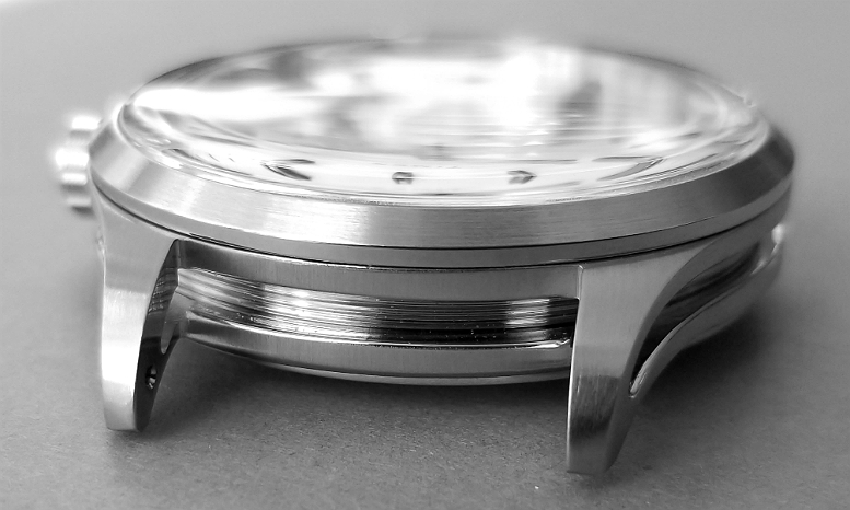
Running around the inside circumference of the watch are these prominent grooves or "threads" to the metal surface. All of the above photos show this. Again, this reminds me of machinery, of industry and gives this a bit of a timeless but still modern feeling.
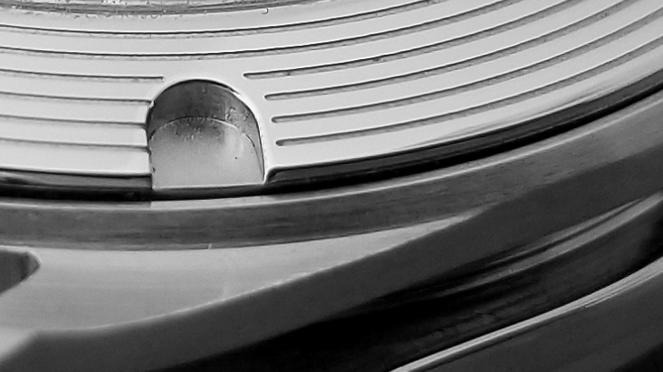
The metal rim of the caseback, showing one of the U-shaped slots for the caseback wrench, and a good look at the six circular grooves around this rim.
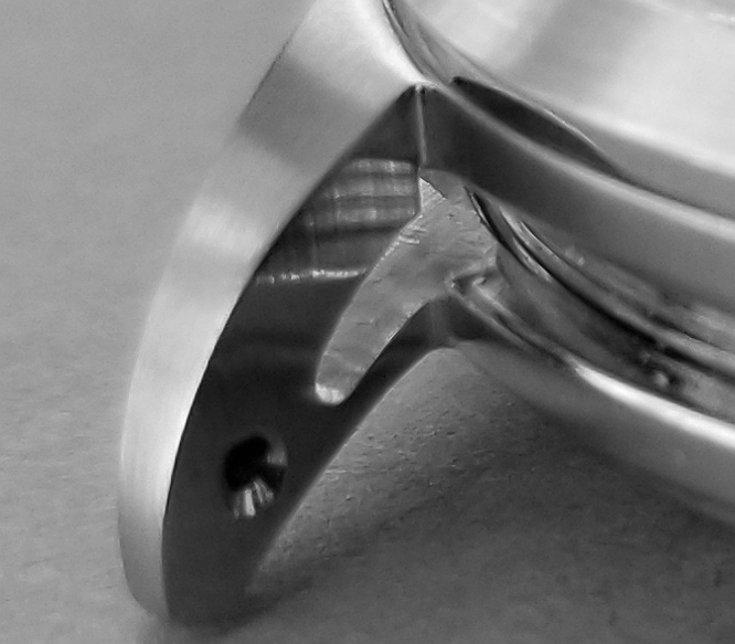
Macro on one of the lugs. Even the springbar holes have detail and attention. Notice the edges of the springbar hole are not straight up-and-down like a cylinder, but are tapered, allowing the tip of the springbar to find and slot into the hole easier.
I will also mention with this pic, that parts of the case metal are brushed to a slightly matte appearance and reflection, and other parts are more polished and shiny. This duality creates more interesting plays on light and reflection, and is a feature that adds to the appeal of the case, and to the watch overall.
Notice that the metal ring that holds the crystal is separate from the main body of the case. In these pics and others you can clearly see the "seam" demarcating the two components. This type of watch construction was common in the pocket watch days, but I'm not sure how common it is in higher priced current wristwatches. It certainly is not a feature of the typical Timex watch.
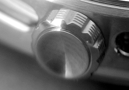
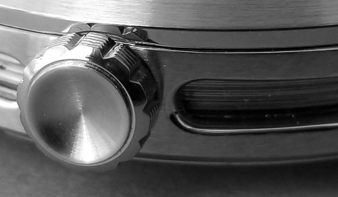
The crown is very nice, with V-shaped troughs and four channels cut circumferentially. The outer surface of the crown has a central depression. No aspect of this watch has escaped the designer's attention.
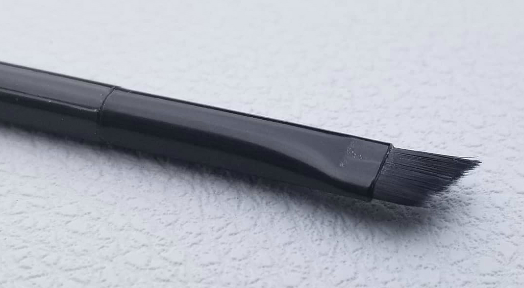
What is this?! It's a little black brush, with angled bristles, provided with the watch! Presumably, it is for using to clear out any dust that may accumulate in the various nooks and crannies of the watch. Now I know I have never seen this before in any watch I've had!
THE STRAP SYSTEM
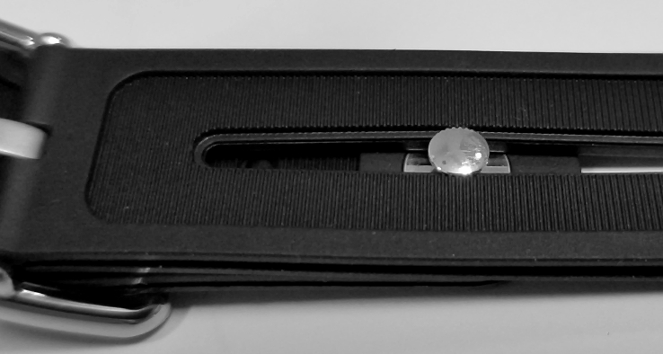
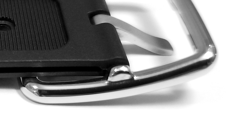
The strap and closure system is, I would say, quite unique. It is clear that a lot of thought went into its design. Made from black synthetic rubber and steel, it features a special "button and slot" closure system where the free end slots into the other half of the strap, eliminating the need for the stay loop. Above pic shows the view from the outer surface of the strap.
The metal button in the above pic is connected to a kind of mushroom extension on its opposite side (seen in the below pic which is flipped from to above pic to see the skin side of the watch.) This mushroom extension presses through the channel in the buckle end of the strap, snaps into place, and holds the free end in place.
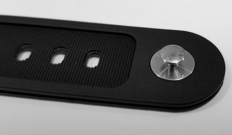
Here's a view of the undersurface of the free end, where you can easily see this mushroom-like feature, along the wrist side of the button.
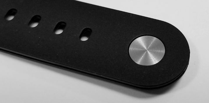
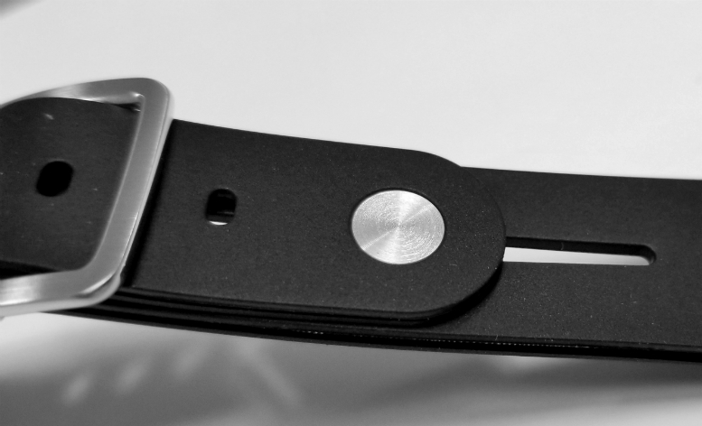
And this is just flipping it from the pic above, showing the button on the external aspect of the strap. This is the part that is visible when you're wearing it. The surface of this disc/button is totally flush with the surface of the rubber.
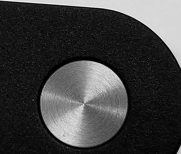
Even the button gets the designer treatment, notice all the concentric grooves in its surface!
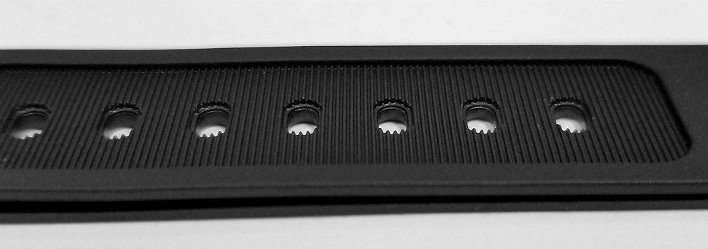
The skin side of both parts of the strap are designed with a lengthy "recessed" zone, with transverse ridges. I believe this is so that less of the surface area of the strap is actually contacting your skin—only the lateral aspects are in contact, leaving the central areas free—so that the watch strap won't become sweaty and just overall less comfortable. I will say, also, that this strap is soft and pliable right out of the box and is very comfortable at the start. No "breaking in" process at all.
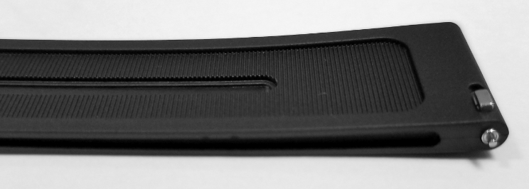
The edges of the strap have long "channels" which I believe to represent a continuation of the "skeleton" aesthetic along the sides of the case and lugs.
(In this pic, you can see how the channel in the strap approximates the case cut-out along the side.)
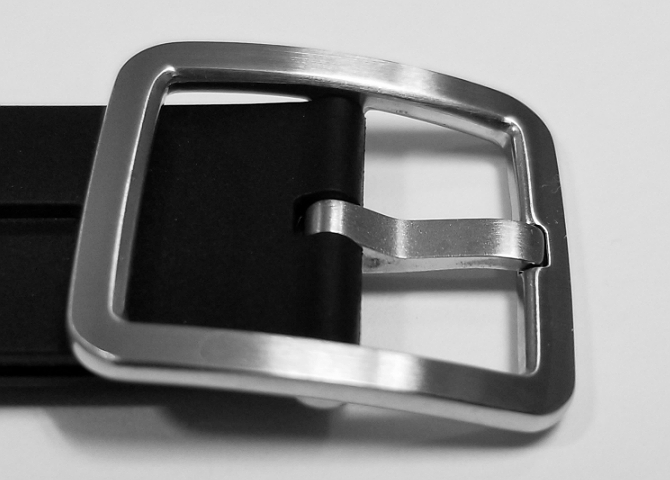
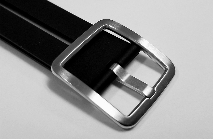
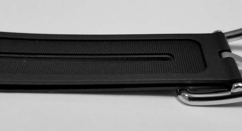
Steel buckle is almost square, but is rectangular, with brushed silky/matte appearance to the external surface. Notice the indentation or groove, to allow the prong to rest.
The undersurface of the buckle isn't brushed, but has a shiny steel appearance.
The Giorgio Galli S1 Automatic is a truly remarkable watch, and it will be exciting to see what comes next.
This page has "maxed out," haha, but I've made a (much shorter) ancillary page with a few additional pis and info that didn't fit on this page, if you're interested, CLICK HERE.
Thanks for reading. I hope you will like it.
Alan