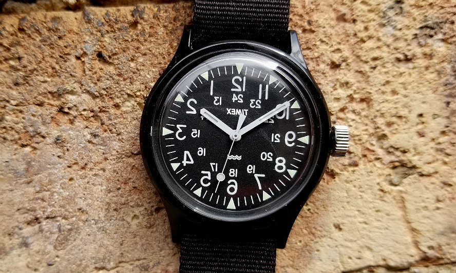
TIMEX Japan Camper variant (or deviant?)
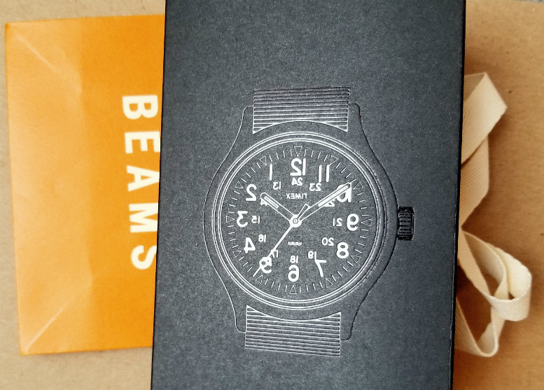
Engineered Garments x TIMEX x BEAMS BOY
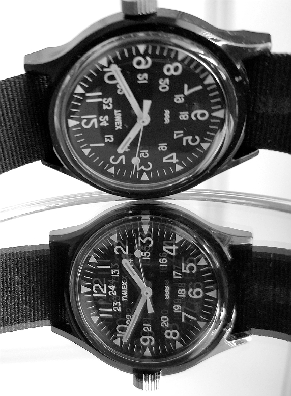
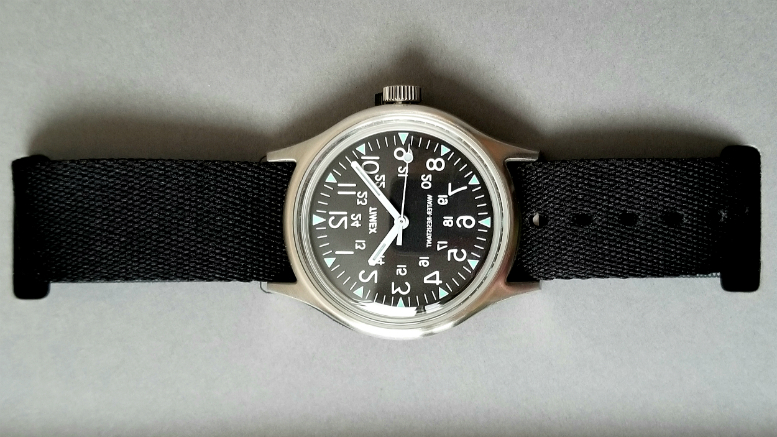
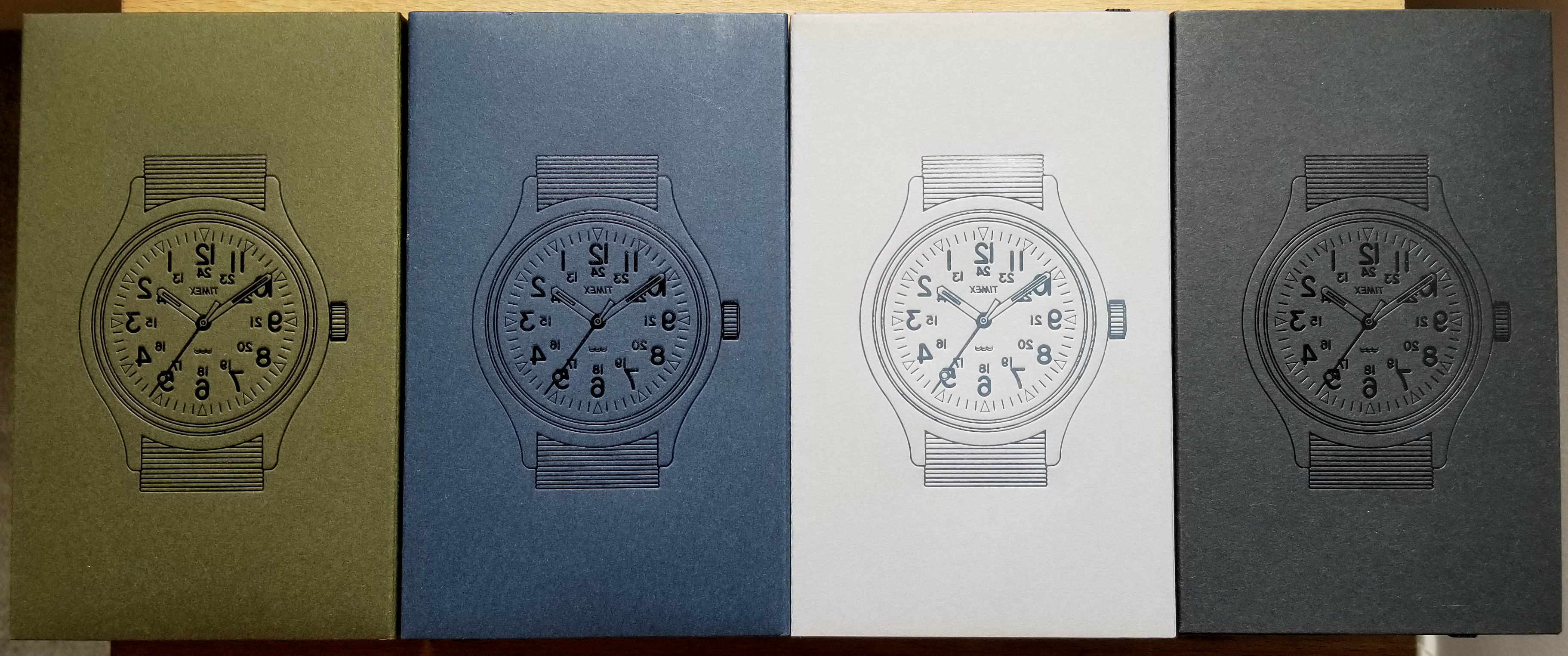
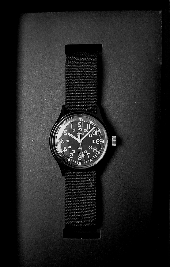
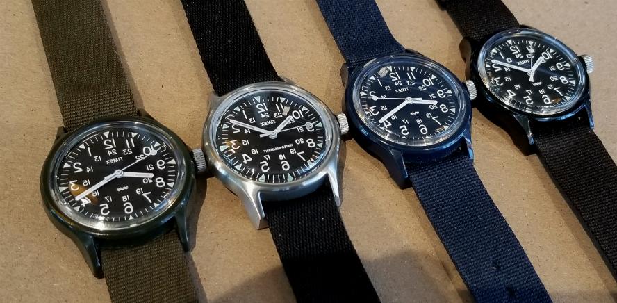
Here are all four of the collaboration watches, March 2016 - March 2018. Variations on the 2015 Original Camper.
Hi, this is Alan. (email). Thanks for your interest in these esoteric subjects. This page will be a sort of general review of all four (thus far?!) of the seemingly unlikely collaboration between TIMEX, the clothing maker Engineered Garments, and the legendary Japanese clothing retailer BEAMS. I have previously written separate page reviews on the above pictured steel case Camper (link here) released in January 2018, and the black resin case Camper (link here) released in March 2018.
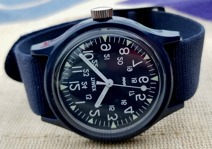
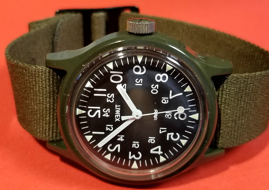
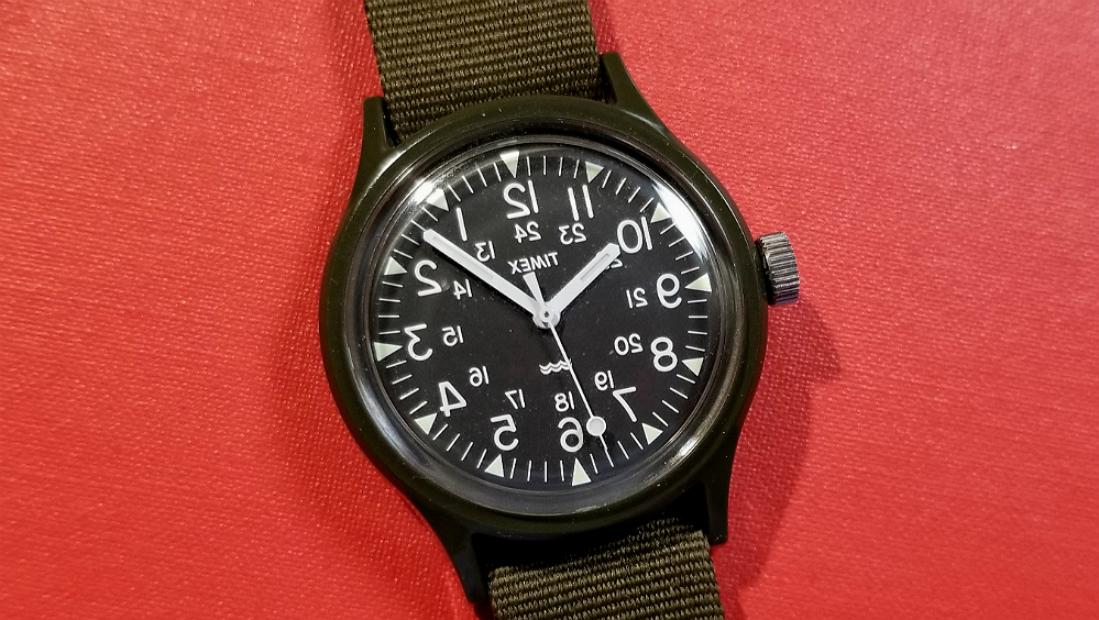
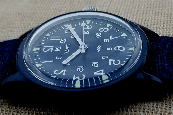
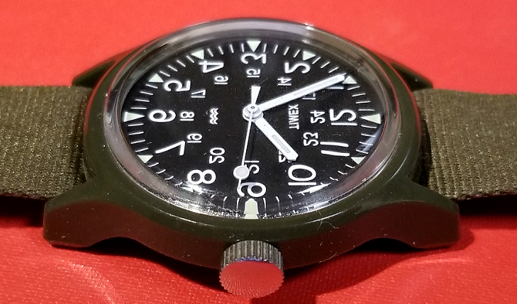
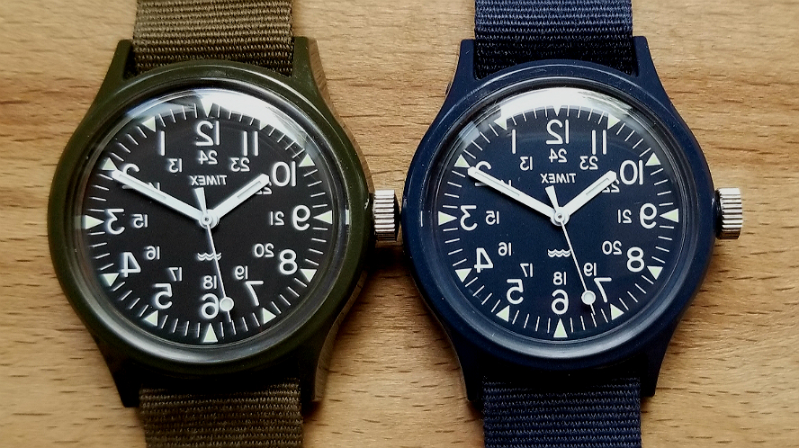
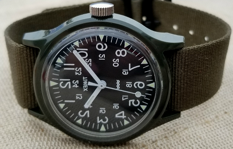
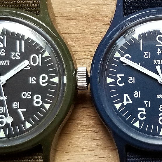
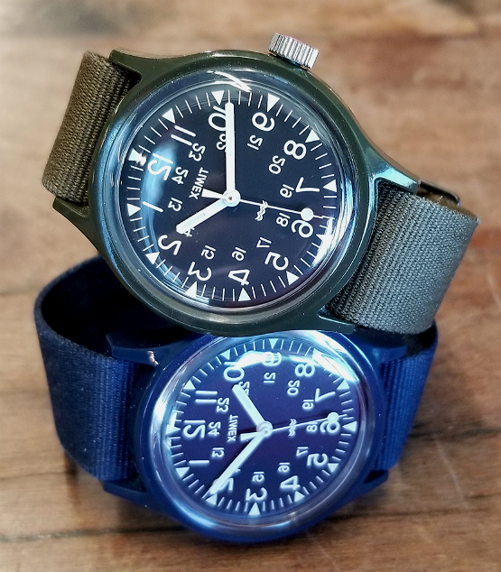
I have more recently (in May 2018) acquired the earlier green and navy blue resin cases versions of the "Reverse-Dial Camper," as you may want to call it, released in Spring of 2016 (March 25, & April 28, 2016 for green, & blue respectively). This review will include photos and details on all four of the watches in the series, but will probably highlight a bit more the earlier green and navy ones, as they don't have their own pages. Navy has a blue dial; all others have a black dial. All watch photos here, unless indicated otherwise, are of my own watches.

/end
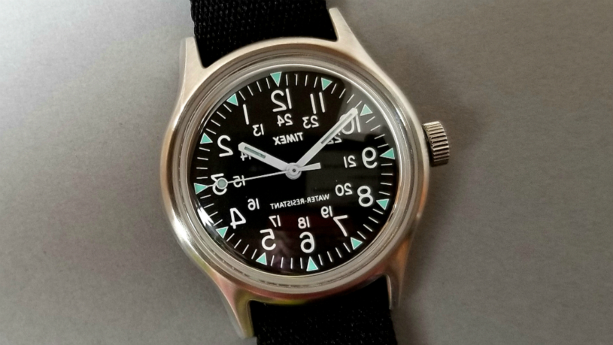
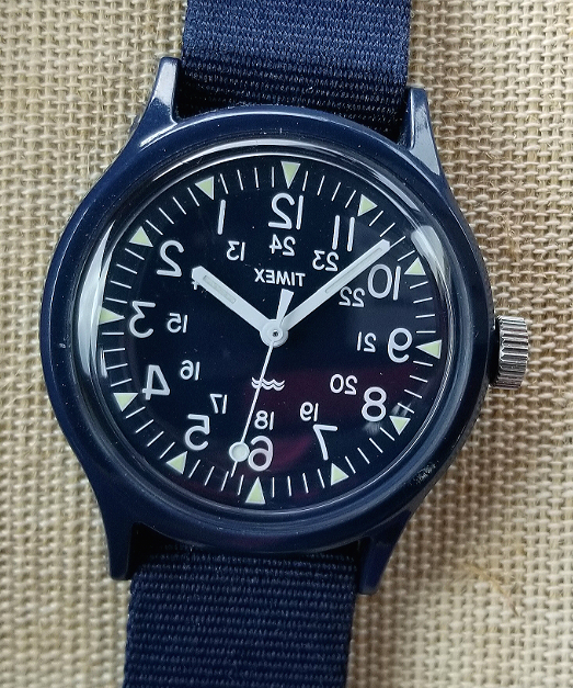
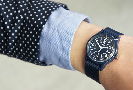
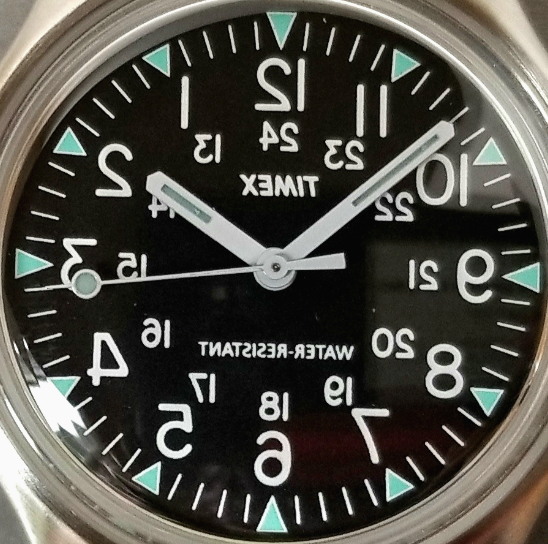
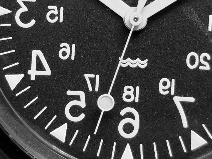
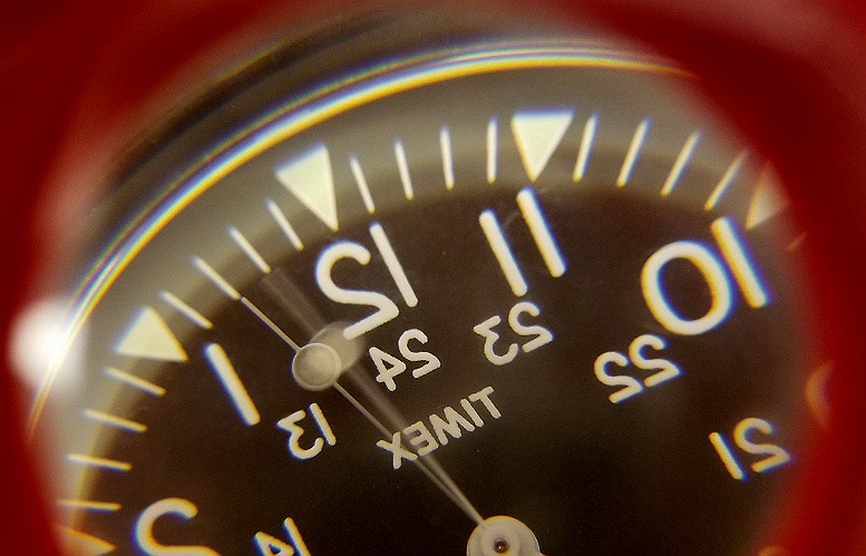
Central to all of the watches is the complete mirror-image reversal of the dial of the Original Camper base model watch from TIMEX, released November 2015. This includes reversal of the name TIMEX, and in the case of the steel watch, reversal of WATER RESISTANCE. (For reference, here is a page on the first Camper, a mechanical watch from the early 1980s to mid 1990s.) People have called these "mirror image dial," "reverse dial," "reverso" and maybe other names. As far as I know, nothing in the official name or catalog entry heading to the watch makes any reference to this reversal. Which I think is intentional, and pretty cool.
It is admittedly a weird watch; some have called it absurd. One of the creators says it harbors a bit of the "punk esthetic." How on Earth did something like this come about? Well, in 2011, as part of the routine day-to-day operations of a global corporation like TIMEX, representatives of TIMEX Japan visiting the United States had access to the archives of the company. One item in the archives was a wall clock from around 1910, made by the Waterbury Clock Company (a direct predecessor to the current TIMEX).
This clock had a reverse dial, and a movement which ran in the direction opposite to normal. When viewed in a mirror, this clocked looked correct. It was a "barbers' clock," made so that a barber could hang the clock behind him, and when viewing the clock in the huge mirror as he cuts the patron's hair, he is able to see the time correctly. Here is a picture of such a clock, that looks totally ordinary, except for the reversal.
Mirror, mirror, on the wall.
With this visit to the US, after seeing this dusty old clock, the idea was hatched by TIMEX Japan to make a wristwatch with a reversed dial, possibly even with a reverse-running movement! Then, in the spirit of "brand collaborations" that have been so prevalent in recent years, and for many brands part of their successes, TIMEX collaborated with Engineered Garments and BEAMS to create these watches. Key to the development was the founder of Engineered Garments, Daiki Suzuki.
There is a lot online to read about Daiki, but here is an interview with him, about the concepts for this watch. It's in Japanese, but your browser should do a decent job of translation. In the interview, Daiki says, "I have never been a punk, but but as one of the big keys for me to make clothes, there are concepts of this dissident, rebellion, and inverse."
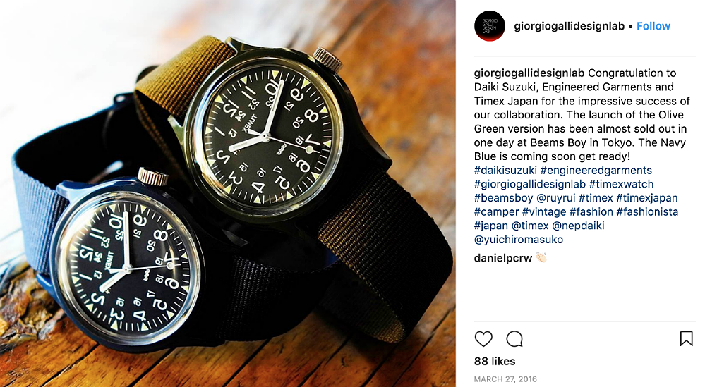
From the Instagram of Giorgio Galli Design Labs on the release of these first two watches in March/April 2016. The green version dropped first, and sold out in a day at the Harajuku BEAMS store, followed soon by the navy one.
What is remarkable, and what has probably contributed to the runaway success of this line, is less that a watch had its dial reversed, but more about which watch was chosen. In this regard, Daiki's choice of a watch, for his expressions of "dissent and rebellion" could not have been more perfect. In choosing to subvert a military watch (even if it is the Camper, a civilian legacy of that watch,) the specifications of which are unlike any ordinary commercial watch, may be the ultimate act of horological subversion and rebellion. Just ask some serious military watch collectors, many of whom have "gone crazy" over these watches. And I don't mean "gone crazy" in a good way.
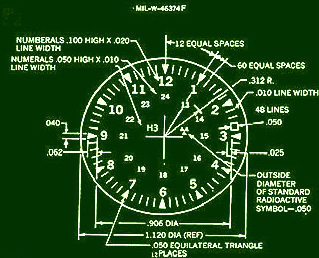
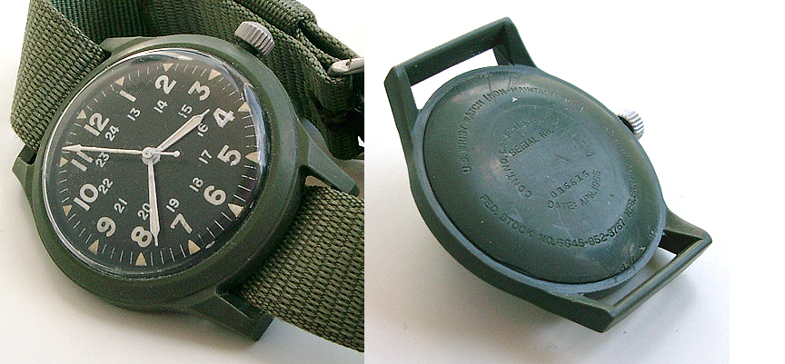
Above the F-specification of the dial/hands requirements for a specific US military watch. The '80s-'90s Camper, a mechanical watch, and the current quartz versions all derive from this specification. (Below, pictured watch is from 1965; this may be the Mother of all Campers. Photo from this page.)
You could argue (and this is just my own personal expressions, nothing to do with TIMEX / EG/ BEAMS) that to take a rigidly-specified military contract watch, a most solemn, unsmiling and truly humorless undertaking, and then literally turn it on its face could be the ultimate "anti-war" act, when it comes to "military horology." I, personally, have come to feel this way about these watches. This may in no way reflect its any origin thoughts of the the creators. But I'll bet they'd be fine with any interpretation.
Furthermore, and again I stress this is completely my own "musings" about this, I often think about Article 9 of the Japanese Constitution, written less than two years after the end of WWII, where the "Japanese people forever renounce war as a sovereign right of the nation, and the threat or use of force as means of settling international disputes." I wonder if taking an austere, self-important military watch and literally turning it on its face may in some ways reflect, however obliquely, and possibly even subconsciously, a symbol of what Article 9 represents, a rejection of belligerency, and a promotion of international peace based on justice and order. I am fully aware this may not at all be relevant. What do you think? Let me know in the comments....
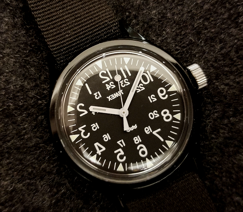
The black case watch, released March 23, 2018.
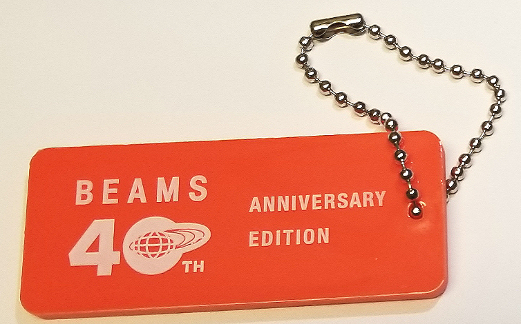
So, how did BEAMS & BEAMS BOY become involved in the collaborations? BEAMS, both a clothing brand and a major department store retailer since 1976, was having its 40th anniversary in 2016, and this must have seemed like a good way to celebrate that anniversary with a TIMEX collaboration. The nice orange keychain pictured above came with the 2016 green/navy releases.
Next, the collaboration for the 2018 (steel & black resin case) watches was with BEAMS BOY, to coincide with the 20th anniversary of BEAMS BOY (1998,) in 2018. I think it's pretty cool that BB was selected for the second two. BEAMS BOY is a BEAMS sub-brand "for women who love the strength and function found in men's fashion." This reverse dial TIMEX seems to fit, and if Instagram is any indication, the watches are a hit with Japanese women. Although all four watches had their pre-release drops only at the BEAMS and BB Harajuku stores, they were eventually sold through the general BEAMS umbrella. (Lots more after the jump showing the four watches below.)

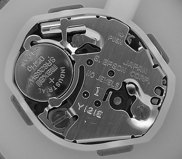
I'm pretty sure all of the watches will have identical or near-identical movements; the above is from the navy blue resin Camper, (April 2016). When I received it in 2018 from a seller in Japan, it was just over two years old, and the battery was down. So, in replacing it I got to see the movement. Made in Japan, "S. Epson" is Seiko Epson, a large multi-speciality company making quite a number of things, with watch movements a small minority of their output. S. Epson does not appear to be the same as Seiko Watch Company, but probably under some large corporate umbrella. S. Epson may have acquired Orient Watch Company.
In any case, the watch is powered by this movement made in Japan. Notice the battery, which says INDUSTRIAL, and JAPAN states 0%Hg, meaning no mercury. I am assuming this must be a requirement for batteries there. Notice how small the movement is compared to the size of the watch. The white spacer is needed to maintain movement in place. I'm not sure, but I wonder if a small movement is somehow more efficient, as far as battery life.
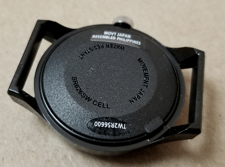
Back of the black one, March 2018. Molded into the back is MOVEMENT JAPAN, with a sticker that has MOVT JAPAN ASSEMBLED PHILIPPINES. But look at the watch on the left, below. It is the April 2016 navy blue one (alongside it to the right is a December 2017 Camper variant with ivory dial, identical markings to the black reverse dial one.) Notice it has ORIGIN CHINA, with no mention of a Japanese movement (even though it has one, that's the one pictured above). At some point after the release of the green and navy mirror-dial Campers, in Spring 2016, the casebacks changed to highlight the Japanese movement.
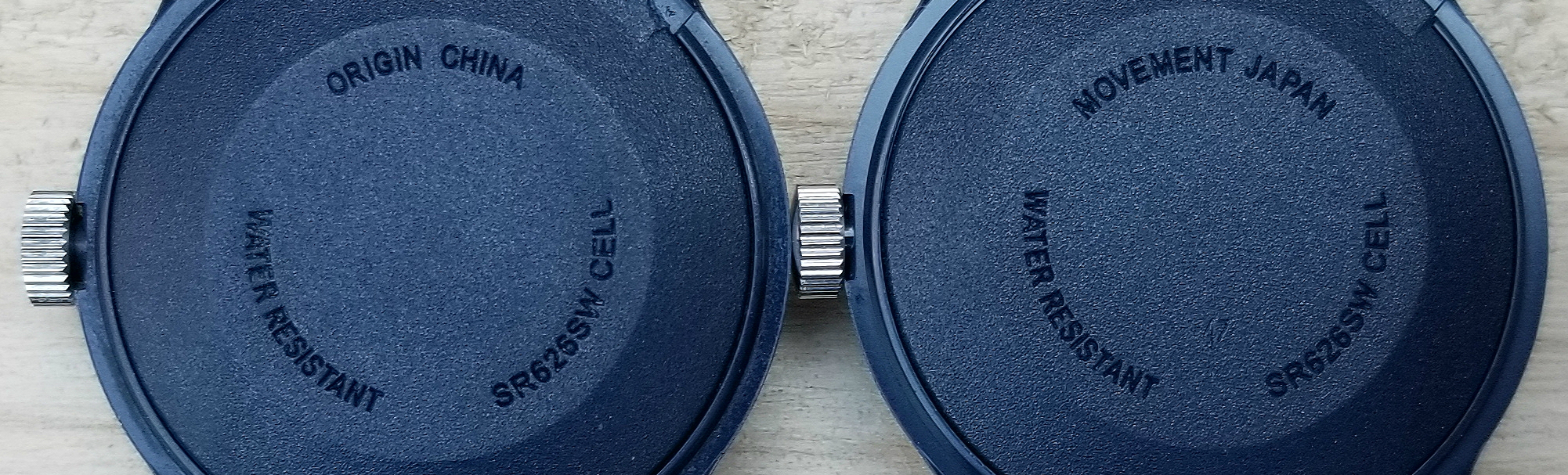
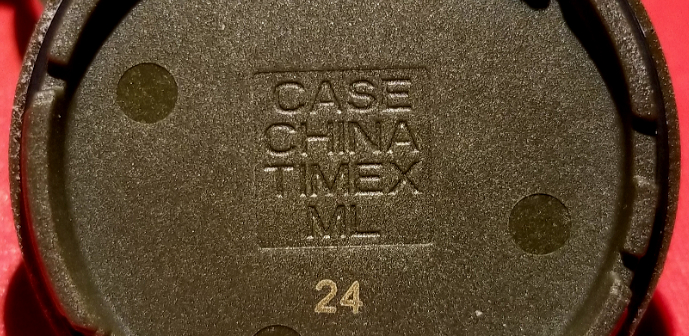
The battery on the green one died a week after I got it, so I saw the insides of that one as well. Each had on the INSIDE caseback CASE CHINA TIMEX ML 24.
The white movement holder / spacer comes out easily. Here you can really see the size of the movement in relation to the watch overall. Also, the shiny metal disc is the back of the metal watch dial.

Promo pic for the March 25, 2016 release of the green one. Another promo pic for both watches, below. The pictured boxes have had their outer "sleeve" part removed.
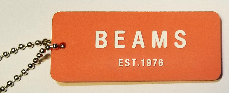
Side two, of the cute BEAMS keychain freebie.
Not me or my watch. Model wearing the blue one. Sorry, can't remember source for this pic.
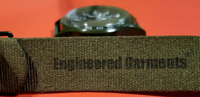
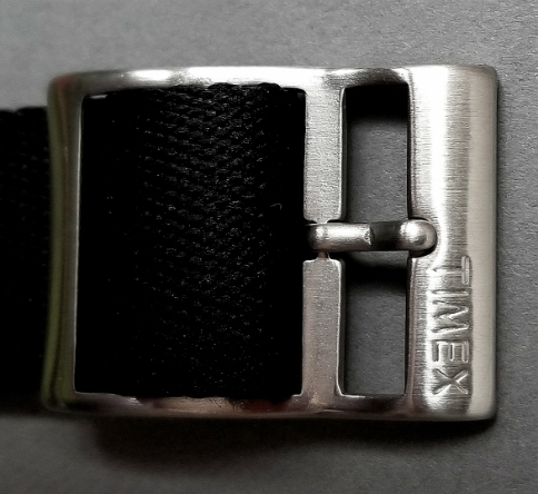
All of these come with single-piece nylon straps pulled through the solid lugs. All have Engineered Garments inked on the strap's undersurface. From the above linked interview, it is evident that Daiki didn't want the EG logo anywhere on the product (and truthfully, a dial reversal from the Original Camper base model feels more "pure" without any extraneous logos, so I'm grateful there's no EG on the dial!) but Mr Masuko wanted the logo someplace on the product, so there is the subtle EG under the strap, not seen when wearing.
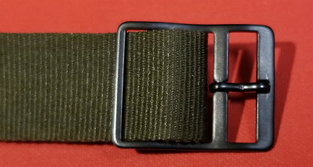
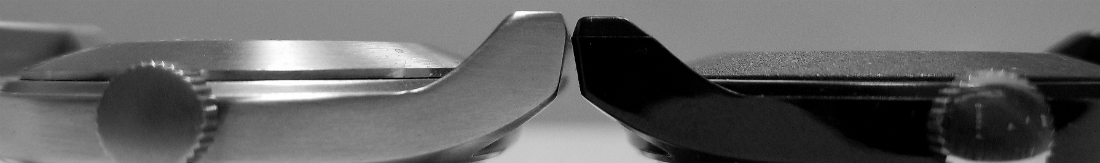
Strap on the blue and green ones are identical to the Original Camper, as is the black buckle. The black one, though, has a loop / stay for keeping the free end. The strap for the steel one is made of a different weave, is thicker, has a loop / stay and has a sort of premium steel buckle signed TIMEX.
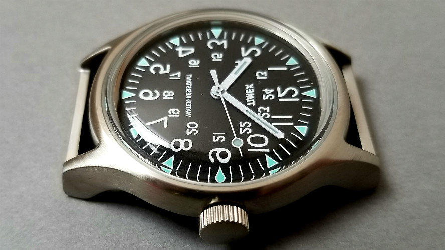
The steel version is sort of the "premium" version of the four. Besides the more substantial strap, it is of course housed in fine stainless steel. The dial has added color over the triangle marks in a really lovely kind of "robin's egg blue." Instead of the wave symbol, there is WATER RESISTANT, wonderfully reversed, of course. The retail price was about twice that of the resin case versions.
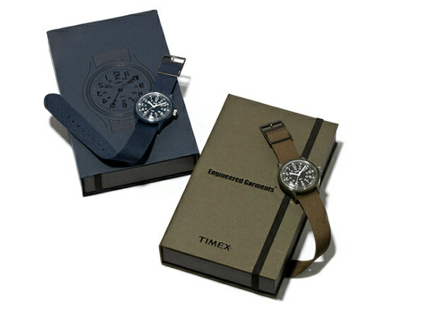
if you have read my earlier reviews of the reverse-dial steel or black case Campers (here: steel, black), you will know how much I enjoy the boxes these watches come in. I've never been much excited by watch boxes, even (especially?) the heavy and elaborate boxes that fine expensive watches sometimes come in, with velvet or satin lining, little frilly watch pillows, walnut or other wooden coverings, and other such embellishments. But I very much enjoy these boxes. More pics of the boxes at those links, but I'll include a few here.
The color of each box matches that of the watch case. There is an inner and outer box. The outer is like a "rectangular sleeve," open at both ends, and slides off to reveal the inner box, which is more sturdy, and opens like a book cover. Above is the appearance with the book cover open and watch removed. The watch was held in place on a slightly elevated cardboard stage. The ends of the strap were fed through slots on the stage, held in by elasticated loops underneath. All paperwork was hidden under the stage. It is a quite minimalist, almost Modernist presentation. Dramatic in its subtlety, and very pleasing. But if you think boxes are dumb, I understand, don't worry scroll past the dumb boxes, there is much more below about the watches!
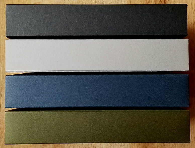
Stacked together, the boxes resemble books on a shelf. Color of box matches watch case color

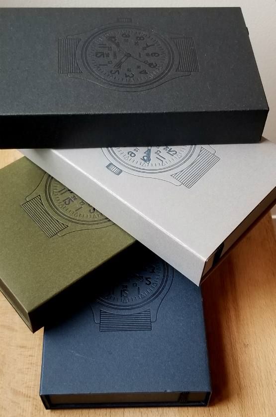
Can you tell I love the boxes.
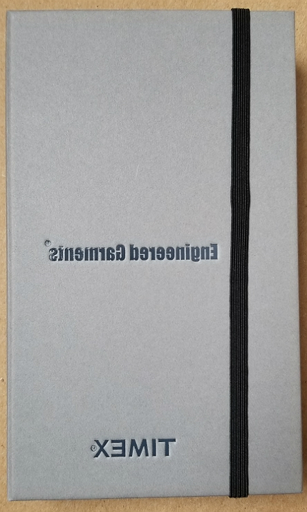
Front "cover" of the inside box. Black elastic holds the cover closed. With the elastic slid away, the front open up like a book. In keeping with the mirror-image watch design, everything on the box is written in mirror-image. (This same box architecture shows up with other TIMEX Japan watches, Like with the Re-Issue Series, a series of three watches initially released together March 2016, by Todd Snyder x TIMEX Japan. To see one of those boxes, click here.)
The box for a TIMEX Camper collaboration with Korean streetwear brand thisisneverthat seems to be the same. I really love this box.
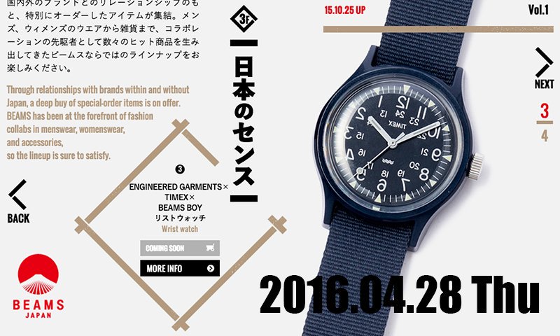
BEAMS promo announcing the release of the blue version, April 28, 2016.
Steel and black resin cases. (January 2018, and March 2018)
BEAMS was founded in 1976, initially as a shop for selling items imported from America, but has changed considerably since its founding. I've never been to BEAMS. But one American I know who has been to Japan says, "Beams is sort of like a cross between Barneys and Banana Republic, for young people. We have nothing at all like it."
BEAMS BOY label is sold through BEAMS, but there is one BEAMS BOY stand-alone shop, in Harajuku, where BEAMS got its start in 1976
The island of misfit wristwatches. A mixed up family. Four siblings who only look "normal" when they are seen in the mirror. And even in the mirror, the crown then is on the wrong side. Every family has what people sometimes see as "issues." In many cases these issues are what make them brilliant. These watches are brilliant.
Thank you very much for your interest, and for reading this review.
I never thought I would come to own all four of these. The steel one (number three in the series) is the first one I obtained. I find them compelling, although I cannot say exactly why. It is a great pleasure, to wear them, and I feel very grateful to have them. I wonder if there will be any more?
Alan
Contact:
Nice article in GQ (11/17) on Engineered Garments, and the Nepenthes New York store. Nepenthes, New York’s Last Great Independent Boutique, Is a Hidden Gem of the Garment District.
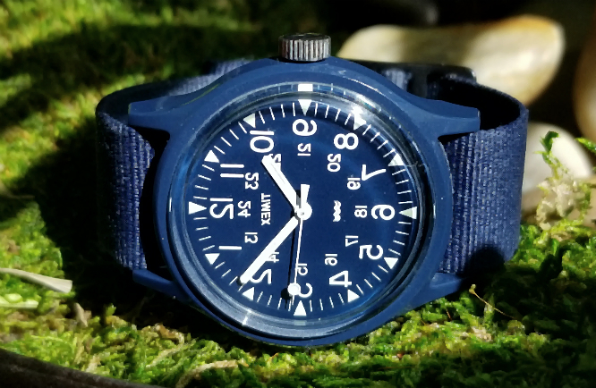
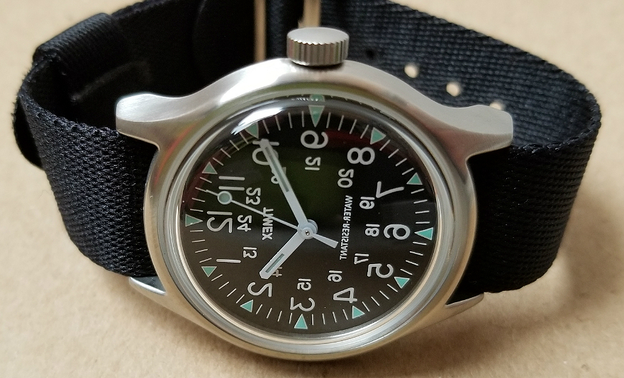
In bright light, in this case direct sunlight, you can really appreciate how blue the dial is on the navy one. The other three have a black dial. I assume this is blue paint applied directly over the metal dial.