Timex x Todd Snyder Blackjack Watch, in a steel case swapped from the Mod Watch.
Modification of a superb modern recreation of a rare and obscure vintage 1971 Timex "Sprite."
By Alan (email).
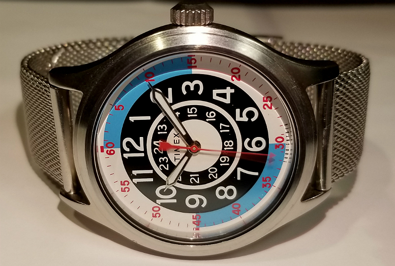
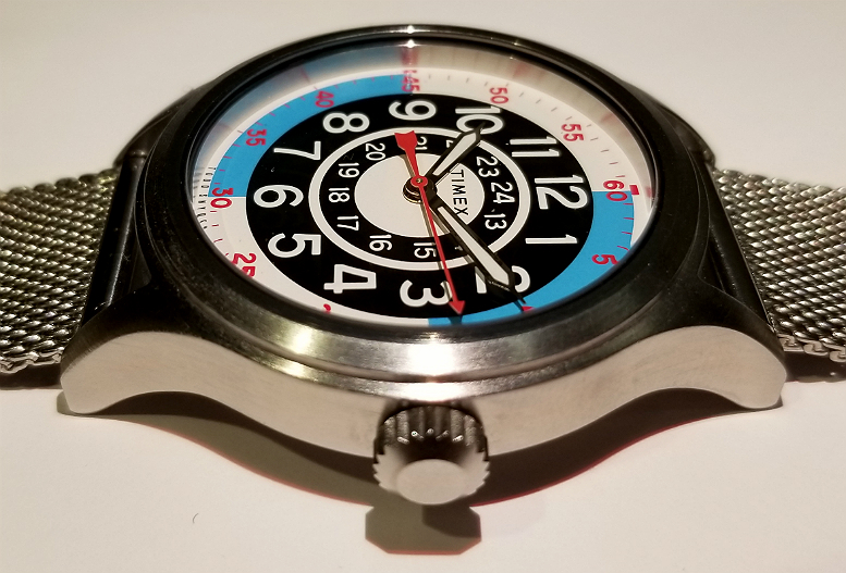
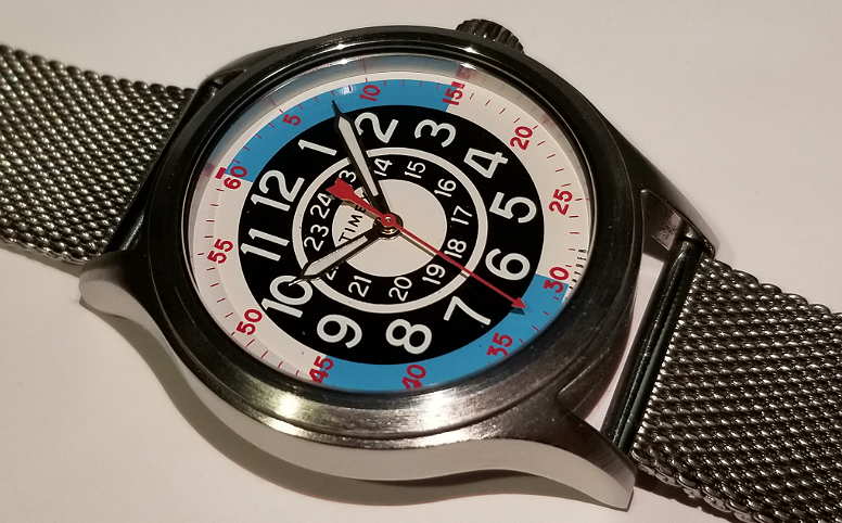
This was really a super-fun project. I have taken the steel case from a Todd Snyder "Mod Watch," and have transplanted the movement/dial assembly from the Blackjack watch into that steel case. I then used the movement/dial assembly from the Mod, and put it into the PVD-coated black case donated by the Blackjack. Essentially, both watches have a case/movement swap.
Why even do this. Why not leave these lovely watches as is. These are good questions, for which there isn't a great answer except that I wanted to try it out.
But first a little background on these watches. Timex in collaboration with NYC designer Todd Snyder came out with a line of superbly crafted Timex "recreations" in 2016, based on "iconic" and/or coveted Timex designs, including military-style watches, and the Mod Watch, linked above. These watches showed impeccable attention to the details of the original, with flawless replication of even the finest dial details. The waches were around 25% larger than the originals, and were housed, instead of in cheaper plated cases, in robust, beautifully made steel cases.
The Mod Watch, which was an homage to the 1971-1973 vintage "Sprite" model came out in 2016, and the Blackjack a year or so later. The Mod sold out in 23 hours, but then there was another round of production and I got one a few months later. Very pleased with it. I've since bought two other Mod watches for gifts, after people admired the watch so much on the wrist. When the Blackjack came out, I was super excited, because it's an homage to an obscure and seemingly exceedingly rare 1971 Timex that I happen to own (that is probably a "Sprite," but that I've never found in any catalogs or repair manuals). So, I knew I wanted to get the Snyder/Timex recreation.
The below picture I'm including here, if anyone's interested, to show what the Mod watch looks like in the Blackjack's case. I have more pictures that I'll put on a page when I get a chance. I was surprised at how much I liked this combo. The black of the inner 1-12 chapter kind of balances out the blackness of the PVD case. More than anything, I'm really glad this swap was so seamless and easy! (More below).
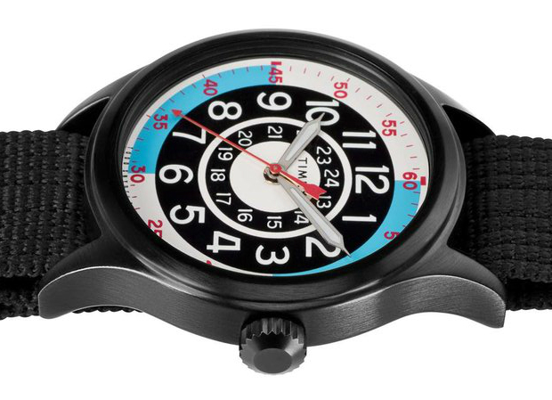
Above is a picture of the watch from the Todd Snyder website. It comes as you can see housed in a robust case, which has been PVD-coated (physical vapor deposition). So, I went ahead and bought the watch and another Mod Watch, because I wanted to see what the Blackjack would look like in the steel color case, and I wanted to see what the Mod looked like in a black case!
I took my chances, slightly. I thought it was very likely that both watches had identical case dimensions, and that a swap would be possible, but I knew I would not be entirely sure of this until I actually tried the operation. So, I bought both watches, and when they arrived, I set out to give it a try. Once the caseback has been removed, and the battery slipped out, this is the appearance of the movement. I needed to remove the crown, so that the movement would slip out, as they usually will do once no longer anchored in by the stem of the crown. I posted the picture on a watch forum, asking if anyone knew which lever or button released the stem, but no one knew. So I just gently probed around with a safety pin until it was clear which lever was spring-activated and was a likely candidate. I then depressed this lever fully, and the crown easily slid out. Then, very gently I tipped the movement into my hand, and then set it onto my work surface, taking extreme care to not let anything touch the hands and dial. Then, I performed the same procedure with the other watch.
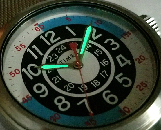
The Mod and Blackjack dial/movements, removed from their cases. On their own, where that's the only focus, you can really appreciate how exquisitely the dial and hands have been designed and manufactured. The high-contrast appearance is quite striking, really. Oh, and have a look at the crown, below. What a nice looking crown and stem. Check out the cute black rubber gasket, for water tightness.
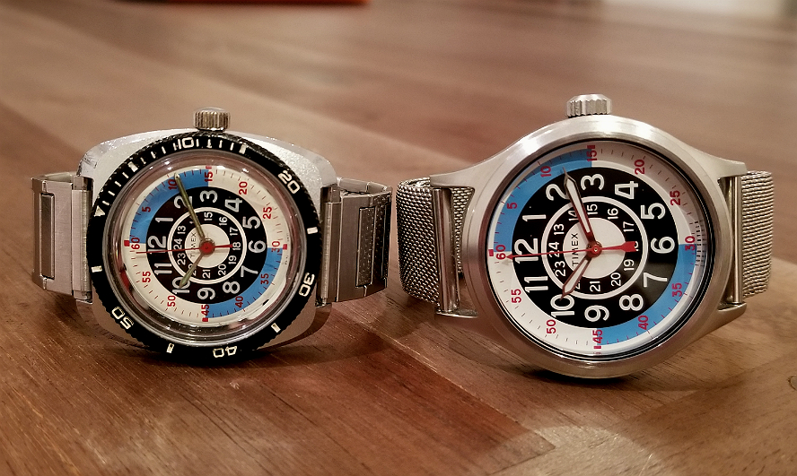
So, what do I think? I really like the result. I don't think either case is "better" than the other, but just creates a different look. The black case is certainly well-suited to the dial, but I also think it looks great in steel. Feel free to let me know what you think in the comments. Haha, there are no comments, but you can email me or get in touch on Twitter. You can see also that I have replaced the nice grey nylon NATO/G10 strap with this steel mesh strap. Just a different look, but both are good. This has a kind of "all metal" look to it.
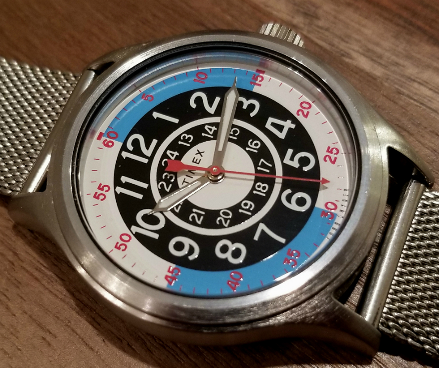
I haven't talked much about the dial. What a wonderfully insane-looking dial. So much going on. As I've mentioned here, and elsewhere, part of the appeal, is the high contrast of this dial. Sharp, crisp boundaries, going from white/black extremes, concentric circles "drawing the eyes to the center," the explosion of numbers, all make this watch dial great. But I think everyone will agree that what finishes off the appeal is the blue arcs from 12-3, and 6-9, and i think everyone will agree that if instead of the two arcs it was a solid blue circle, it wouldn't be nearly as great. I wish I could meet the person or team of people who designed the original dial back in the late Sixties or early Seventies.
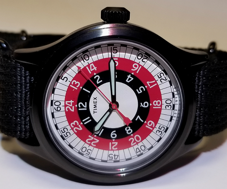
Let's have a look at the original dial, next to the 2017 Blackjack, below. The smaller dial watch on the left is of course the 1971 dial. You can see how much larger the new edition is, but you can also appreciate how flawlessly recreated is the new dial. Note: the case that the 1971 watch is housed in is not the original. To see the original simple round case, go again to this site. I just thought it would look good in a larger "cushion" shaped case, and and fortunately Timex used the same movement in a great many watches back in the day, and this one slipped perfectly into the larger case. The plastic rotating bezel I think looks cool, as it balances the black inner rings, and is then in turn sharply contrasted by the steel case.
Back to this dial. I also really like the red 0-60 minutes/seconds chapter at the periphery of the dial, with the numbers and hashes at every second. Take that away, and it's not as great as dial. In fact, change any aspect of the dial, add any more or take any way, and in my opinion it won't be as great. This appears a perfect balance.
What is this dial, actually? I think it is whatever it evokes in you, and people have thought racing, gauges and gears, machinery and other tools, military, scientific instrument, "nerdy," etc. What it certainly is not is a "classic dressy" watch, like the Timex Marlin watch, which in a very different way has its own greatness.
/end
Few more pics, and contact info, below.
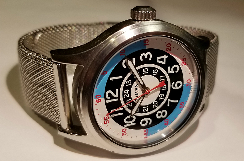
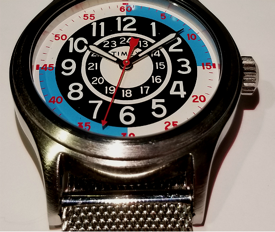
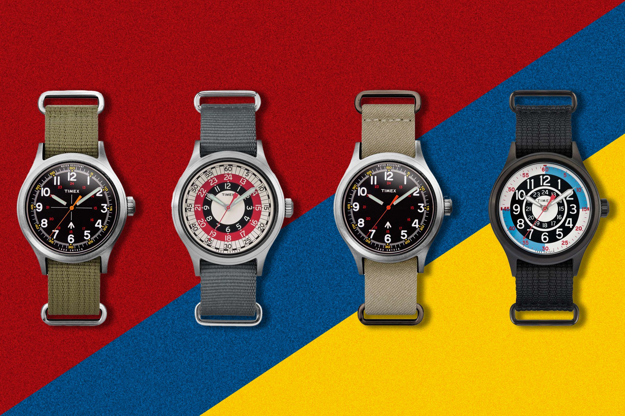
Image source: unknown