"Military style" TIMEX Viscount model, 1978.
This is Alan (contact: email). Here is a review of a 1970s TIMEX automatic watch in the series of Viscount. It could be called a "military style" watch, owing to a lot of factors, but it is certainly not a watch that was issued to any military. Like 95% of all watches called military, right? I love this watch. I bought it from Steve in West Virginia, in March 2001. We later wrote about it in June 2002, at the TIMEX Vintage Forum (long since closed.)
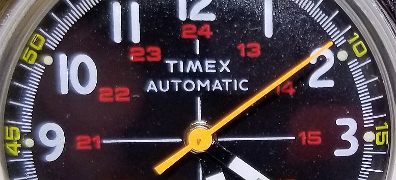
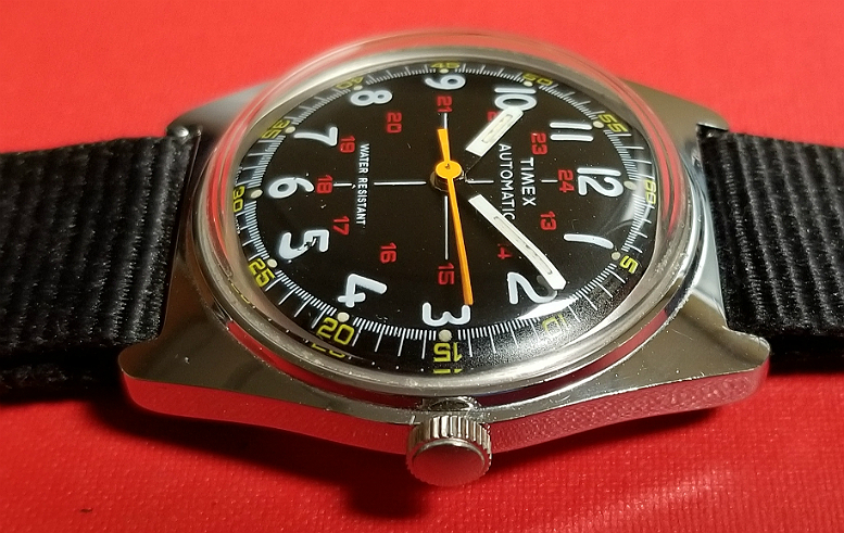
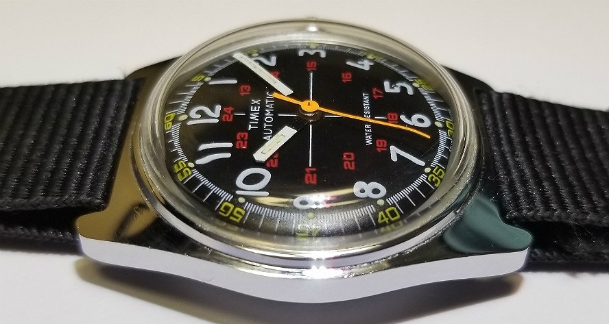
If you count black and white as colors, there are five colors on the dial/hands: black, white, red, yellow, orange.
Below is a picture from a 1977 TIMEX catalog, model 46170. $17.95
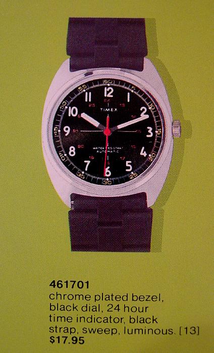
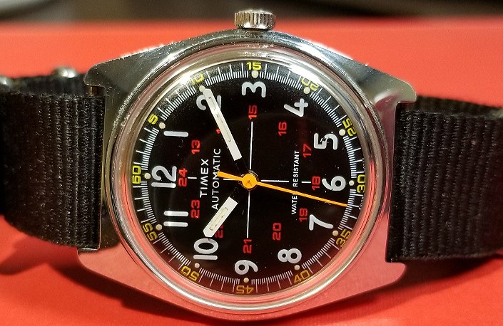
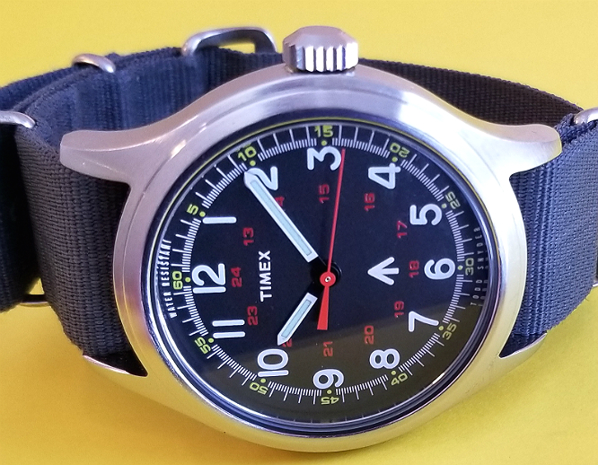
Notice the AUTOMATIC on the 1977 catalog version is by 6, but on mine from 1978, it has moved by 12, right under TIMEX.
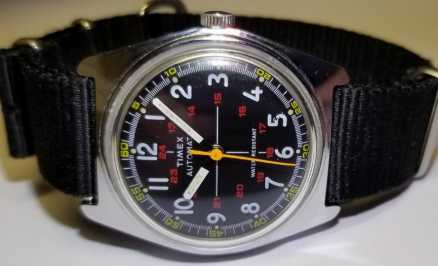
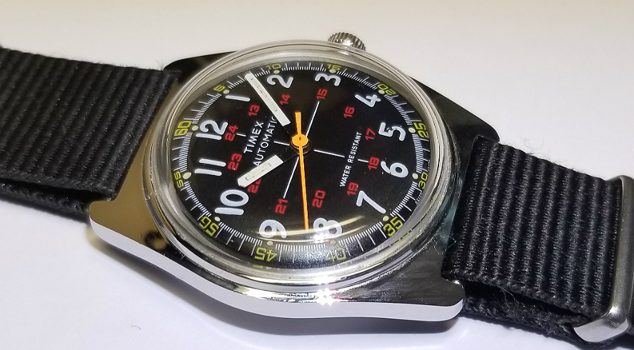
From the catalog pic, it looks like it came with a two-piece black rubber strap. This rubbery strap was common to "sporty" 1970s TIMEX. I have it on an 18 mm black NATO-type 1 piece pull-through strap. The lugs are actually 20 mm, to me the lugs are too wide, and for the size of the case, a 20 mm strap looks too thick. I have this same problem with the 20 mm lug width of the Rolex Explorer. Some people would consider it totally heretical to wear an 18 mm strap with 20 lugs. You can see some of the spring bar showing in this pic I also have some issues with the case design. It does not detract much from my enjoyment of the watch, but I'm aware of this. More on this below.
/end
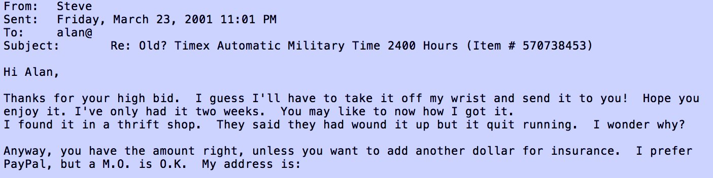
Above, an ancient email. I got this watch from Steve, in 2001, off of ebay, where else. He had found it in a thrift shop. They thought it was broken because it stopped running, but they didn't realize it's an automatic. I think he probably got it for almost nothing, and the auction went for $38.50. I was delighted.
The markings at the lower edge of the dial are partially covered up by the edge of the case, but you can see it's from 1978, movement 107, and model number 46170.
It's really a great dial. But take a look at the case. At the upper and lower lateral edges, instead of gracefully scooping inwards towards the watch (like the case of the classic Camper) it continues without any real deviation. The lugs are too thick, to me. If it had that graceful appearance of the lugs, and 18 instead of 20 mm for the lugs, they would have hit a home run.
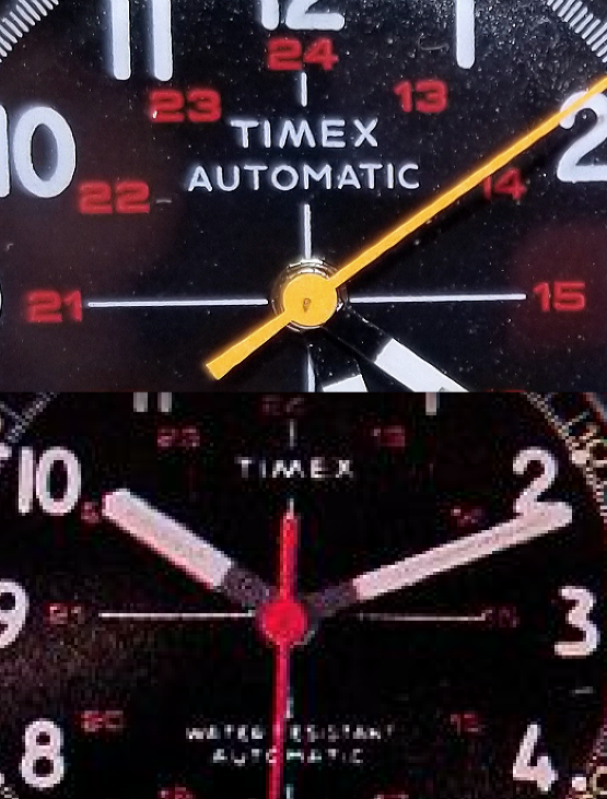
Now take a look at this watch. It is a modern re-issue of the 1970s military Viscount, by TIMEX in collaboration with designer Todd Sndyer. The watch was initially released, along with two other TIMEX, as part of a re-issue series, in March 2016. It really is a superb modern re-creation, and you can learn more about it here.
The dial reproduction is excellent. There are minor differences between the two dials, which you can read about it you like at the above link. The watch overall is superb.
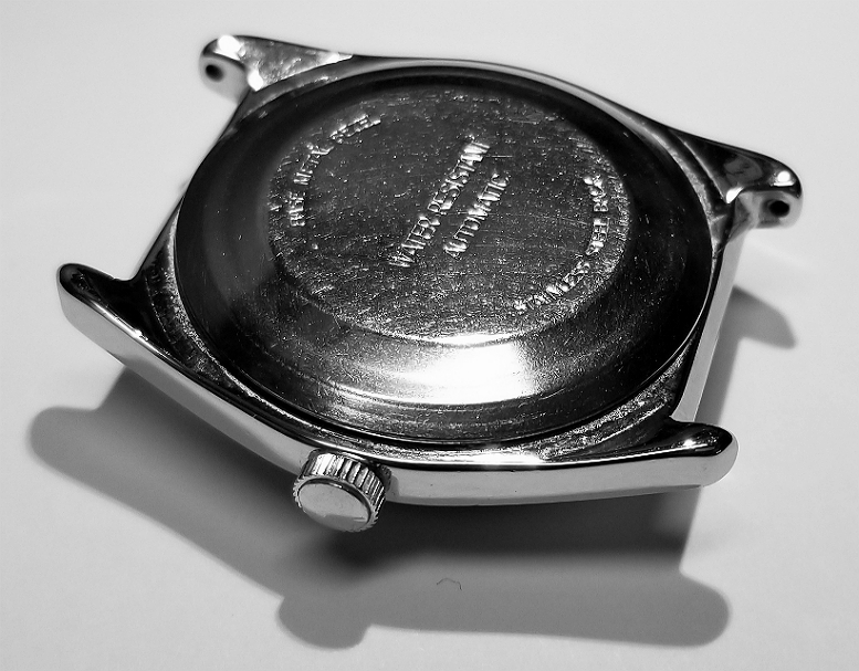
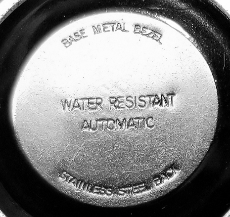
Back of the watch. Notice how the caseback is taller, more "domed" than other watches, to accomodate the space taken up by the automatic rotor. Also the disproportionate lug-width to case-diameter ratio is evident here. Lugs width just too big! Below, stamped some of the usual info.
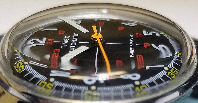
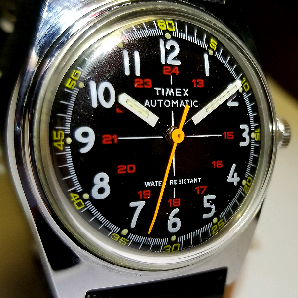
Nice acrylic crystal. I realized I haven't said that much about the dial. Maybe this isn't the best photo for that. But notice once again all the color. This contributes to making this a less than ordinary 1970s TIMEX. Minutes / second numbers in yellow at edge, 5 hash marks for each second, commensurate with the high-beat 107 caliber movement, large "macaroni" style 1-12 hours in white. 13-24 hours in red, in the same sort of "squareish" font as the yellow numbers. Two perpendicular white lines intersecting at the center post form a sort of "cross." Black dial with a slightly granular surface. AND AN ORANGE SECONDS HAND.
Notice the "floating hands" effect, where the proximal portions of the hour and minute hands are black, so the white-painted parts appear floating. This may be more than aesthetic. It might increase conspicuity and speed of time reading, and such design is found on aircraft clocks/dials, and on some proper military wristwatches.
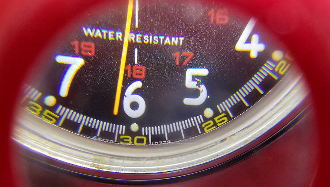
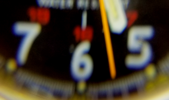
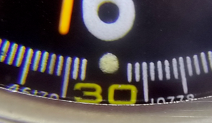
As seen through the jeweler's loupe. I needed this to get a decent photo of the markings below the 6. I just held the lens/aperature of my phone's camera up against the eyepiece of the loupe. Notice also in this pic that there has been deterioration of the paint at the 5, and to a much lesser extend, at 6. Bit of flaking. Fortunately this has remained stable over the years I've owned the watch.
Well, thanks for reading. I hope you will like it. If you have any thoughts or comments on the watch, or this review, please feel free to contact me. Alan
What is a "viscount." I didn't know this but I just looked it up, and a viscount is a non-hereditary noble position in British society, somewhere above a baron, but below an earl. (Wikipedia.)