Q-TIMEX 1978 REISSUE
Another essentially flawless re-creation of a vintage Timex, for modern times.
Hi, this is Alan. Thank you for reading, and for your interest in these pages. My contact information is at the bottom.
Here is a really beautiful Timex, released April 2021, a reissue of a 1978 Q-TIMEX QUARTZ. Made using modern materials and manufacturing methods, and designed with meticulous attention to the original details, it is a stunning example of how perfectly a decades-old watch design can be re-created in our current times. Timex has made other reissues in recent years, all of which were very good, and this one may be one of the best.
end//
The case is now steel instead of plated chrome, the band is leather instead of plastic, and of course the movement is different. And there is one dial difference (that I think most will agree is an improvement). If you want to see an original in excellent condition, see this page by Knut.
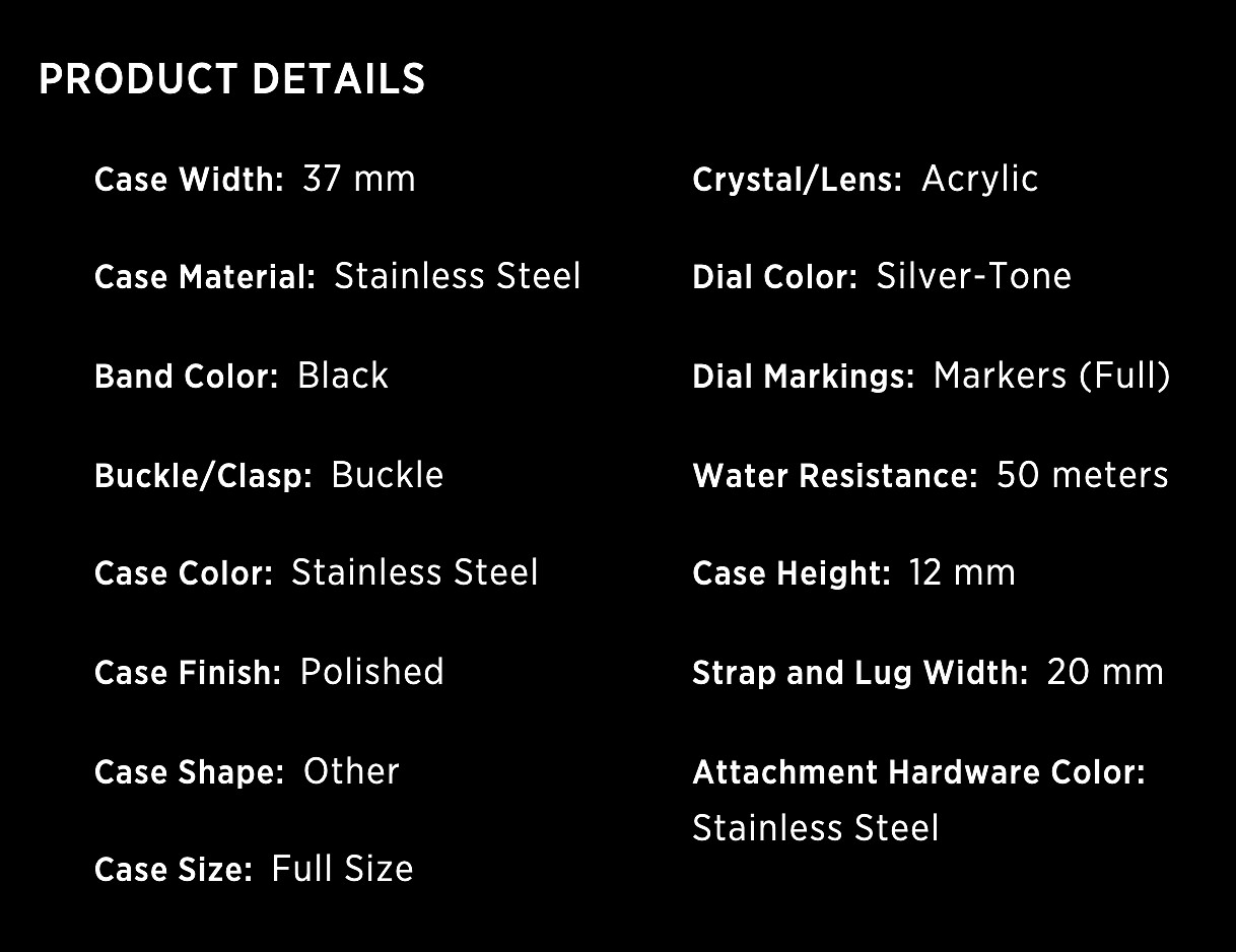
First, here are some of the specifications of the watch. (From timex.com website).
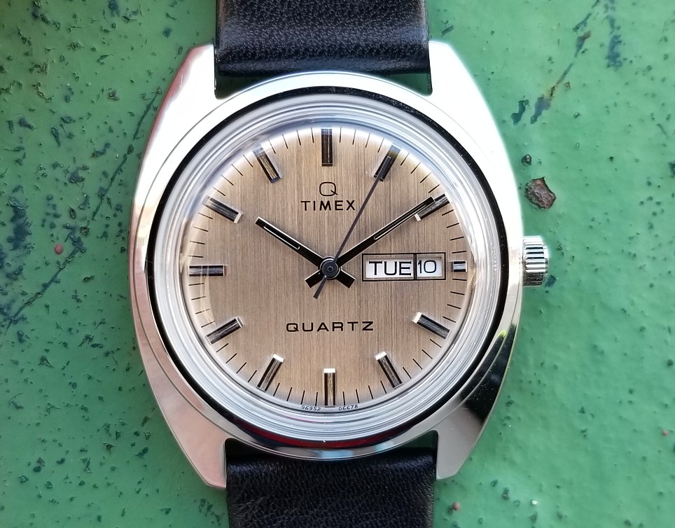
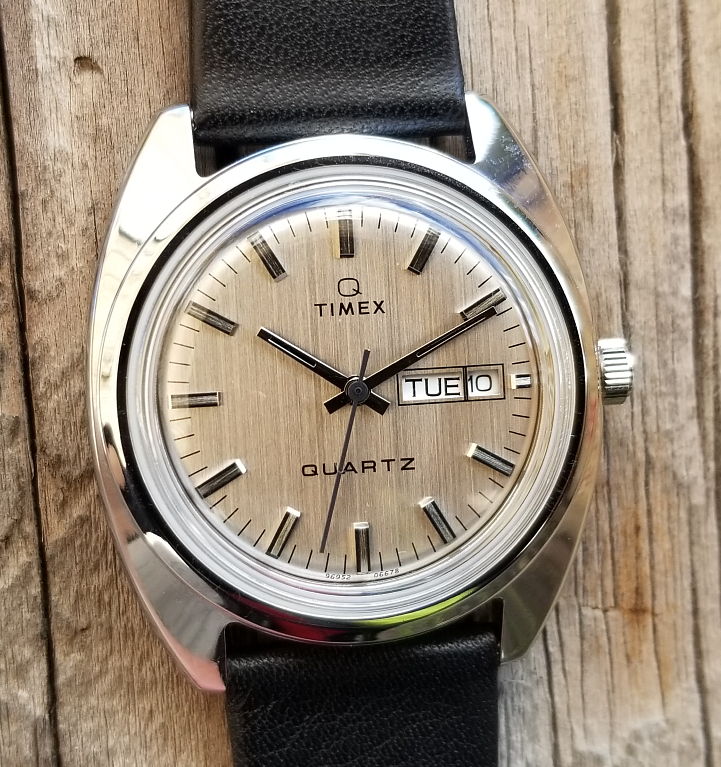
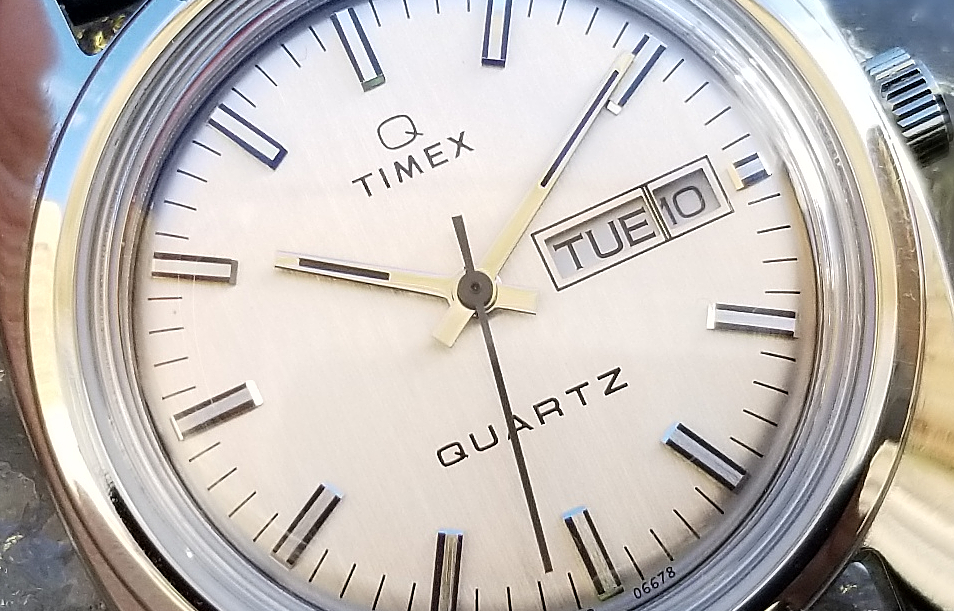
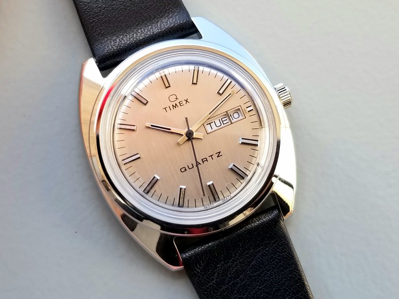
The dial looks silver in most brighter light conditions, but can sometimes look subtly "champagne" like in this pic.
The metal dial has fine vertical striations which sometimes are visible and at other times not so much.
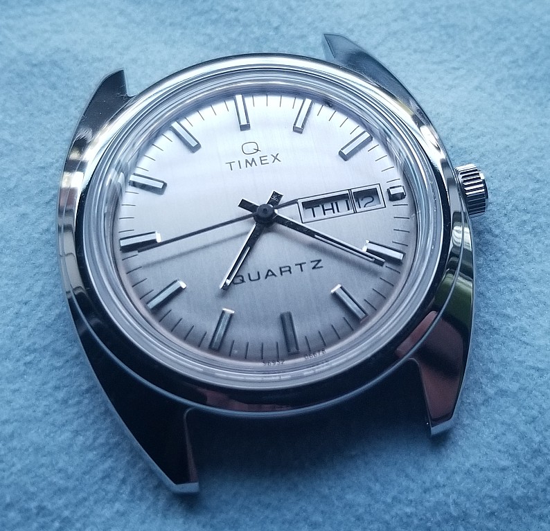
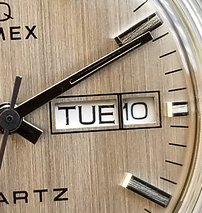
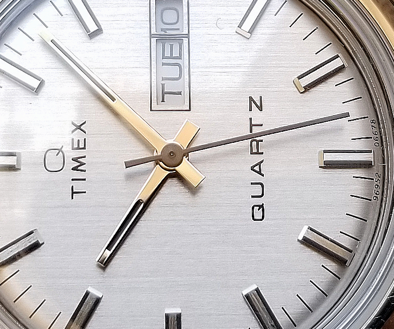
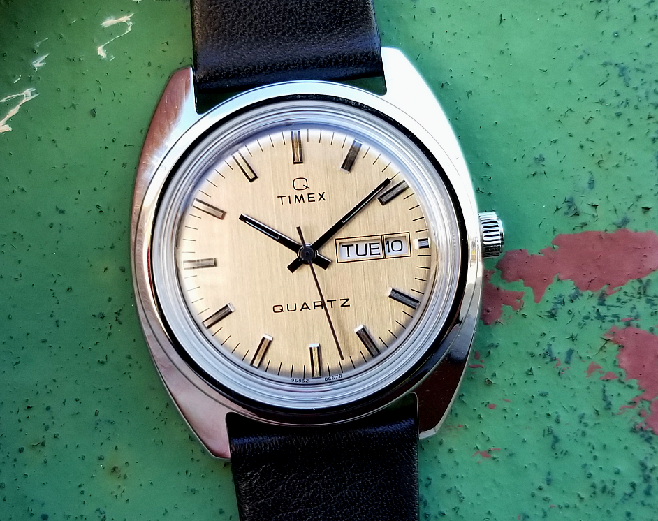
Let's took a close look at the dial in this large image. The hands read easy, with the help of a black stripe down the enter, and a totally black seconds hand. The hour markers are black along their sides, and have faceted ends, to create tiny sparkly light reflections, Each hour marker has a sort of textured surface between the black parts.
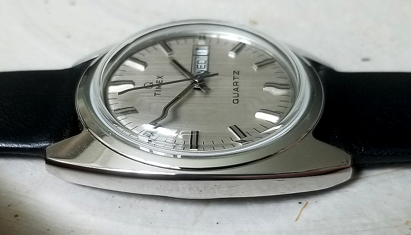
The 37 mm polished steel case is very nice. Substantial without being overly thick, and without having any of the "extreme" features of some of the Seventies watches, UFO, etc.
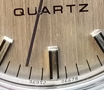
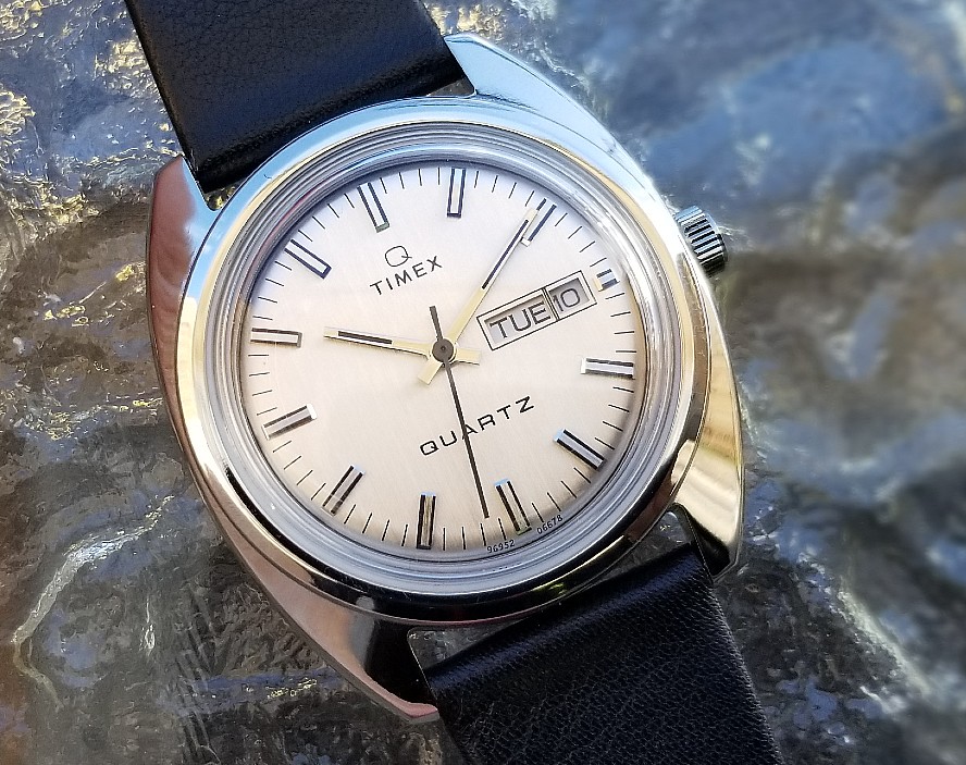
This part brings me a lot of joy. So thoroughly did they want to re-create the original watch, that they included the original dial code at the bottom, 96952 06678. It's totally "unnecessary" in that the numbers don't relate the the present, but it's great that they thought to keep them.
96952 is the model number, 066 is for movement 66 (the zero needed as a place-holder for consistency, as some movement numbers were three digits,) and 78 refers to the date of manufacture, 1978. (The actual model number of the reissue is TW2U87900ZV).
I first saw this inclusion of an archaic dial code on the November 2017 reissue of a 1965 Timex Marlin model. Here is a close-up photo of that 2017 reissue. (If you want to see the full review of that reissue, here is the page.)
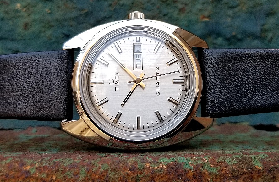
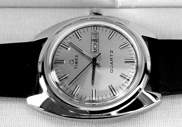
Another view having some of a "champagne" color.
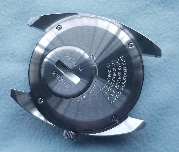
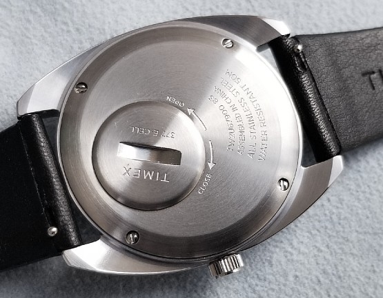
Case with the strap removed (20 mm lugs). Caseback is secured with four screws, but you'll never need to open the back unless it needs servicing. The battery can be easily changed by turning the cap of the battery hatch counterclockwise, replacing the battery, and replacing the cap. This, of course, was original and was designed such that no special tools were needed, only a coin was needed to turn the cap. Another feature that made Timex a value. The user could change out the battery on their own, without having to go to a specialist shop, and pay their prices. There is also 377 stamped on the cap, to remind you of the type of battery that goes in.
The model number TW2U87900ZV is also listed on the back, and the number 83. This number indicates that the watch was made in November 2020. It was released in April 2020. Such differences between production and release date are not at all uncommon. Water resistant to 50 meters.
Close look at the case shows a raised, round "bezel" close the crystal.
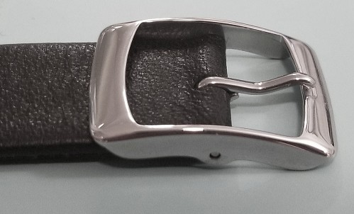
I can't even complain about the strap! it's leather, not stiff, drapes nicely on the wrist. Not overly thick, and integrates well with the case. Has a subtle grain, and is not totally matte, but not shiny. The buckle! Timex called this a "crown to buckle" reissue, and indeed it is with this beautiful period buckle, in steel.
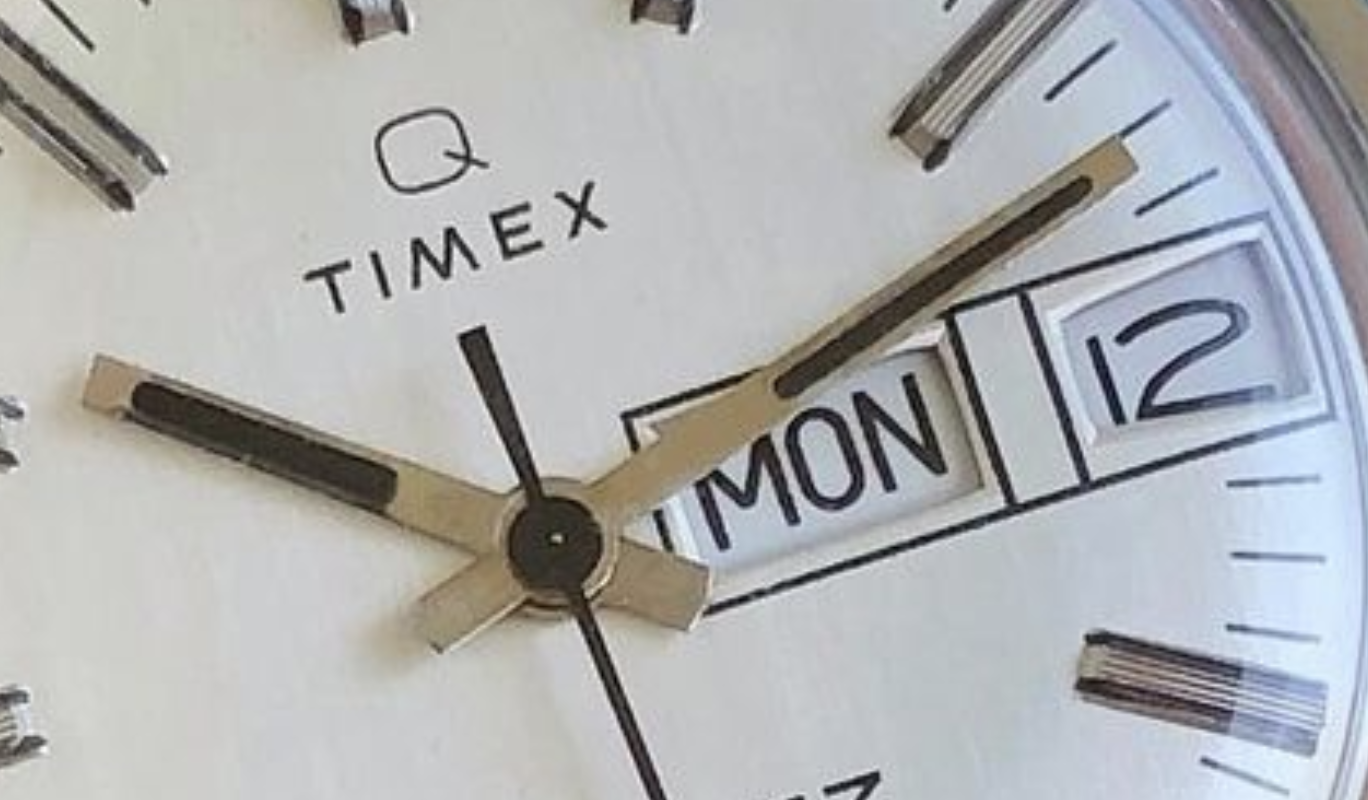
I mentioned that there was a dial difference. Above reissue, below original. I didn't notice it myself, but it was pointed out to me that there was a wider gap between the day and date windows, in the original. It's pretty clear from the pictures. Maybe there was a technical requirement for the wheels underneath to be that much apart, necessitating the separation. Also notice the "lateral flaring" of the window for the date, in the original, not done on the reissue. (One other dial detail that was omitted in the reissue is GREAT BRITAIN at the bottom and I'm kind of glad they did that. Nothing against GREAT BRITAIN, but it looks less cluttered without it.) Below picture by Knut, of his watch.
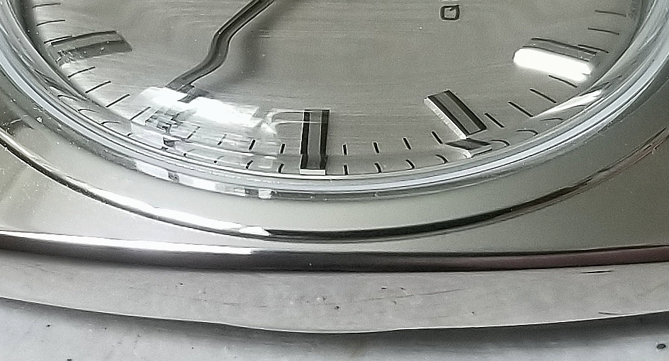
The crystal! Timex calls this a "period-correct" acrylic domed crystal, and indeed it is. I love this two low-angle pic, as it really shows the shape of the crystal and how the edges re-direct the light and creates such patterns. It also shows the case from a different perspective, including the "bezel" at the edge of the crystal,
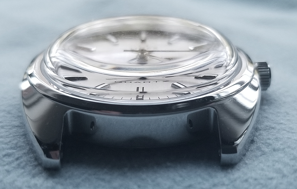
You can see the light-catching facets really well this pic.
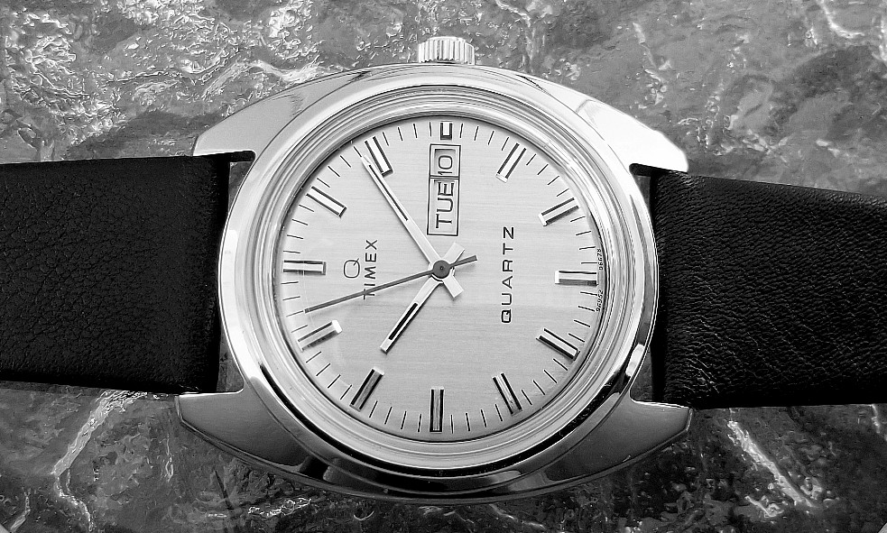
Sometimes I like to de-saturate the picture, remove all color. While it's not a representation of what it looks like in "real world" conditions, sometimes it can help to better appreciate forms and shape, and overall design, without the added element of color.
Wow. What more to say. No complaints!
The reissues continue to impress with the faithfulness of design, select upgrades where it really matters--like the steel case and leather strap--along with the quality of the materials and manufacturing.
The Q-TIMEX 1978 REISSUE is a fine watch, and truly a pleasure to wear, elegant and not overdesigned, and at 37 mm, it's a size that most people could accommodate.
Thank you for reading.
I hope you will like it,.
Alan
Website: Alan's Vintage Watches