TIMEX Print Advertisement, 1952
This may be the best TIMEX ad of all time.
I will show the whole ad, and then enlarged views of certain parts.
Hi, this is Alan. Contact information below.
This ad is very interesting, to me. The magazine ad is from Sept 1952. I don't know from which magazine. It would have been approximately two years since US TIME introduced the TIMEX line of watches. Sometime in 1950 (exact month unknown to me,) after five years intensive R & D, US TIME introduced "The TIMEX," and then began heavily marketing it. This ad has a lot going on.
/end
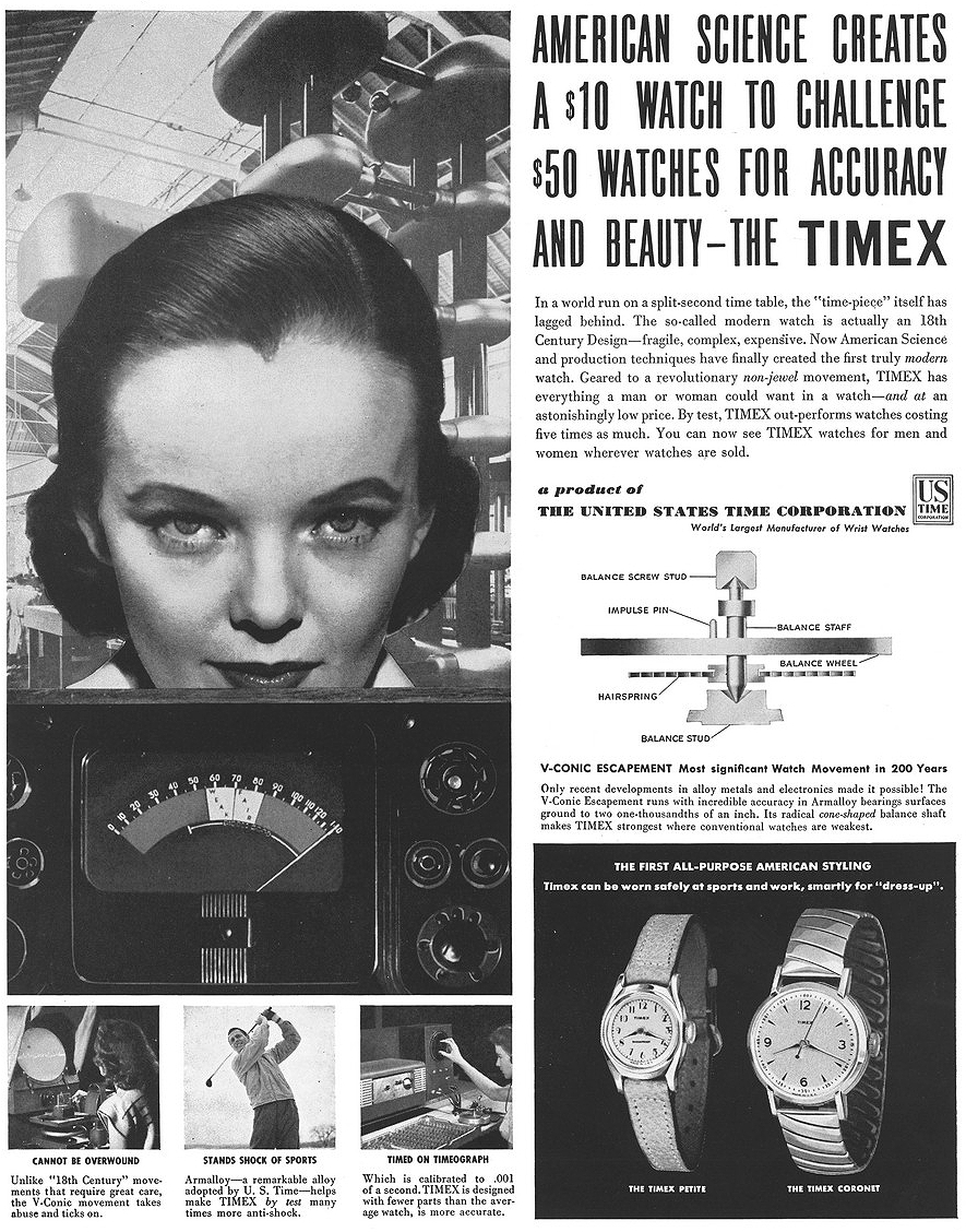
Let's look at the main copy of the ad. Here, they describe the qualities and advantages of "THE TIMEX," the "first truly modern watch." Here, as in other ads, they spare no jabs at the mainstream, conventional watch industry, dominated mostly by Swiss companies as well as by American companies emulating the Swiss model. Certainly, watches were made in many other places, but it seems that the jabs were directed at Swiss and traditional American houses.
Calling those Swiss watches "so-called modern," they made sure to point out that the basic design that those watches followed was derived from the 18th century. They make sure to point out that those watches are expensive, fragile and complex. Expert-level 1952 trolling, haha.
"AMERICAN SCIENCE" is very interesting, to me. "The Timex Corporation," as we know it today is a huge multinational. In 1952, US TIME did have markets and some production outside the US, but from what can tell, it still had mostly an "American vibe," as far as the innovation, the factories, and most of the marketing. Plus, this was a period of postwar optimism (post-bomb, if you want to talk about science and engineering) that many Americans, though certainly not all, were riding. So, it was entirely "in character" for US TIME (as with many other companies at the time) to make sure to show the self-described American-ness of the science and engineering.
I will return later to this dominant, central image of a woman with penetrating stare, with a background of those electric dynamos or whatever. Just take a look at this image, and have a think about it.

Here is nice diagram, with accompanying description. Anyone old enough will remember when print and television advertisement were often dominated by the evidence that their product is worthy of your time and money. Often this was in the form of diagrams like this, expert testimonials (doctors telling people to smoke!), scientists wearing white coats, experiments and demos, and other means to explain, with science, why you should buy their product or service.
Of course this "evidence" comes from the company, so it may be exaggerated, misleading, or in some cases completely fabricated. In other cases, hopefully many, the evidence will be real. Regardless of the integrity of the evidence, it was a time when American believed in, and valued science. Even if it was not explicitly stated as such, to many American, the success in defeating fascism during WWII was probably largely regarded by the collective consciousness as in part a triumph of Western (Allied) science and technology. This may have encouraged the use of "scientific evidence," in advertising.
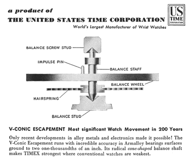
So, with this in mind, let's examine this portion of the ad. I'll reprint it, so you don't have to keep scroling up and down. It shows a partial cut-away diagram of probably the "most important" part of the watch movement, the balance and escapement. The studs are in cross-section, show how the conical balance staff tips rest in their conical depressions, but the rest of the diagram are drawn as a true side view. US TIME does not mince words, declaring the V-CONIC escapement as the "Most significant Watch Movement in 200 years." That's an amazing thing to say, really. They go on to tell us that this 200 year movement is possible because of recent developments in material science and electronics, calling the whole thing "radical," and emphasizing how they are strong where others are weak.
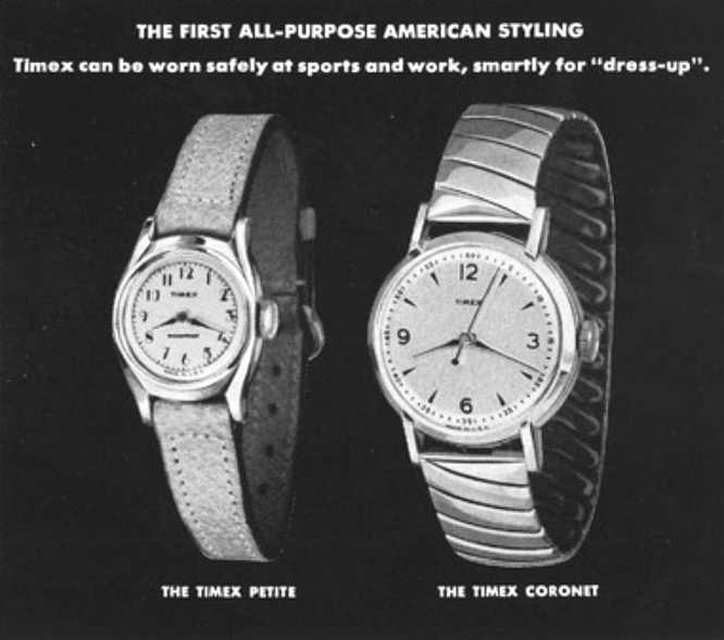
Two watches are featured in the ad, the women's PETITE on a leather strap, and the men's CORONET on a stretchy bracelet. Again, AMERICAN is mentioned, with respect to styling, and there is emphasis on both durability, versatility and style, "smart," "dress-up," etc.
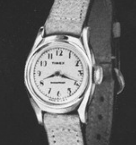
Mag view of the PETITE. I believe I have this watch! Or something very similar. The below watch is mine, and looks identical to the pictured watch, except the lettering below the 6 is missing. I assume it says SHOCKPROOF. But it is same size, same case and crown, and identical lettering for the hours, identical hands. Mine runs, but is about 20 minutes slow in 24 hours, but for a watch that in 2018 is 66 years old, and may not have ever had any service or interval lubrication, to be running at all after SIXTY-SIX years to me is kind of amazing. I've found many examples like this.
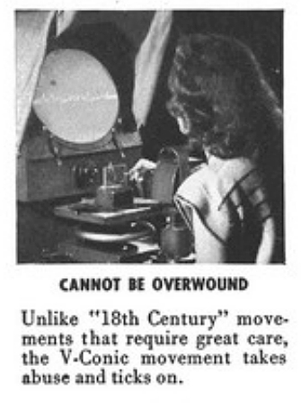
Inset photo and caption. Shows a woman looking at an oscilloscope. WHAT AD IN 2018, FOR ANY ORDINARY CONSUMER PRODUCT, SHOWS ANYONE LOOKING AT AN OSCILLOSCOPE. I assume this is a device that might time the accuracy of the TIMEX, or it may have had something to do with the R & D that led up to the TIMEX. Not sure. But regardless, it aims to create an association with "the TIMEX," and science.
Also, haha, once again, they make sure to remind us that their competitors' products are still mired in the "18th century."
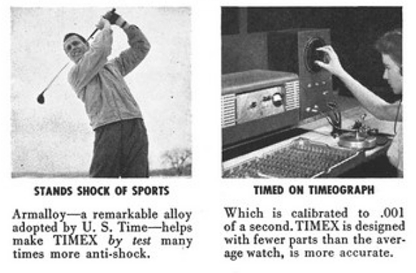
I looked up Armalloy. Sometimes spelled Armaloy. It seems to be a trade name for a type of alloy rich in chromium, that is brittle but very hard. It does not appear to be a name or formulation owned by US TIME, but I guess they licensed its use. Armalloy, being very hard, allowed the conical tips of the balance staff to rotate back and forth with little wear, apparently. I don't know if that means the tips of the staff also had to be made from Armalloy. My thoughts are, if the metal of the tips of the staff were made from a more malleable and softer metal or alloy, they would wear down against the harder bearings. But I'm not certain. Anyway, here they show a golfer wearing a TIMEX, to show that the balance and escapement can take the shock of repeated accelerations/decelerations encountered while playing golf.
The other image shows an operator using a TIMEOGRAPH, showing that the TIMEX is callibrated to 1/1000ths of a second. I'm not sure what exactly this means, but it's clear that they are describing it as a remarkable feature of the watch.
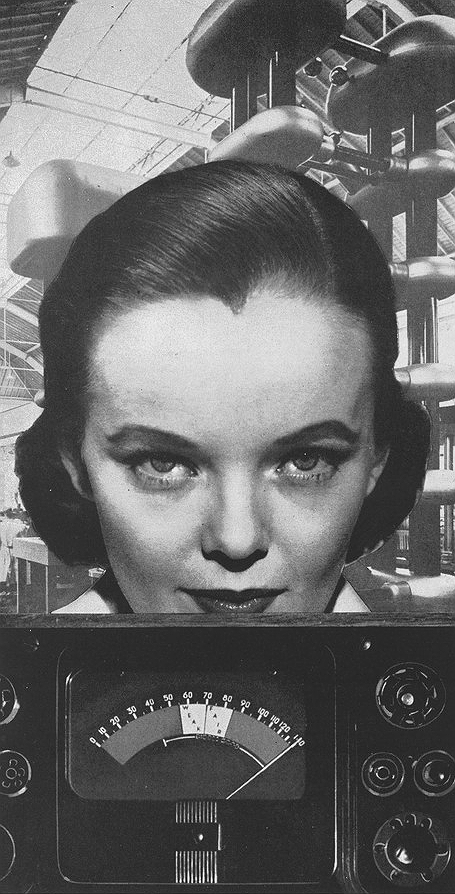
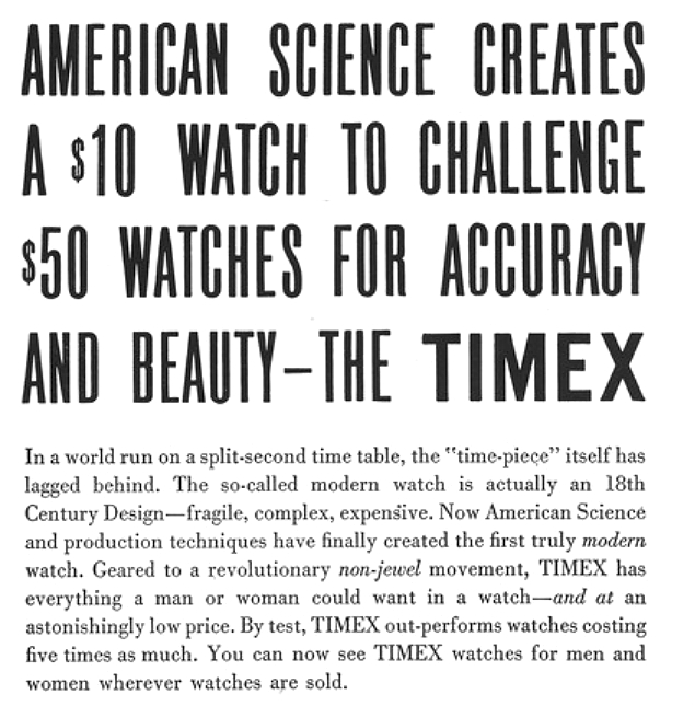
The largest, and most visually dominant image in the ad is the photo of a woman with a fairly intent gaze, staring straight at the audience, with those "transformer towers" in the background. The photo of the woman and the electric towers are placed above a photo of some box-like electric read-out meter/device.
By many "standards of beauty," both in 1952 and today, I believe the woman would be considered to have attractive features. It would be therefore easy to write off this part of the ad as trying to get the reader's attention, keep them from turning the magazine to the next page, by including a prominent photo of an attractive woman. And I would be surprised if that dynamic played no part in the design of the ad. But I believe there is more. She has to me a kind of gravitas, a kind of "dignified seriousness." She may be smiling, but barely. And certainly it is not the obvious and often exaggerated smile commonly seen in ads from that era, showing people "having a good time" in the setting of using a product, happily consuming food, or in social settings of a bunch of people smiling to show how great the product or service is. She seems imbued with a more serious intention, and this may be in keeping with the scientific, and frequently technical nature of the ad.
And then those "electric towers," in the background. I wish I knew what these were called. Transformers? Tesla towers? Induction coils? I have no idea, but I am virtually certain they were intended to lend "an aura of modern science" to the overarching themes of this ad. They may look sort of vintage sci-fi to us today, but be assured that in 1952 they were meant to be symbolic of the then current frontiers of science.
And to me, the woman looks like she's in charge of the transformers. She looks like the scientist. I'm not saying there is or should be a certain expected appearance or of a scientist. But in the setting of this specific ad, rich in scientific explanations, diagrams, and testing tools, a serious looking person standing in front of a few million volts of whatever, well, I see them as the scientist.
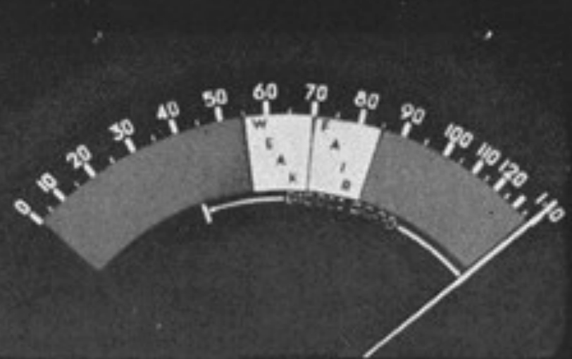
Below the woman, there is the device, with a meter. See above for full pic. It looks like there are sockets where you can plug in vacuum tubes, on both front sides. This meter is kind of interesting. It is clearly not a simple arithmetic scale. Look how the distance between 60 and 70, ten units, is much greater than the distance between 110 and 120, also ten units. And at the other end of the scale, the distance between 10 and 20 is shorter a distance than between 60 and 70, but longer than between 110 and 120. Does anyone know the math that describes this scale? Also WEAK and FAIR are in the center from 55 to 85. It shows the needle at maximum, 140 units of whatever, clearly "The TIMEX" is well above fair. If anyone knows what this device is, please let me know.

Thank you for reading.
I hope you will like it.
If you have any other thoughts about this ad you'd like to share, please feel free to contact me.
Contact:
Website: Alan's Vintage Watches.