1940s "larger size" Ingersoll Mickey Mouse Watch
"Pre-TIMEX" watch from US TIME, using the earlier #20 movement.
Hi, this is Alan. Contact info at the bottom. Thanks for reading.
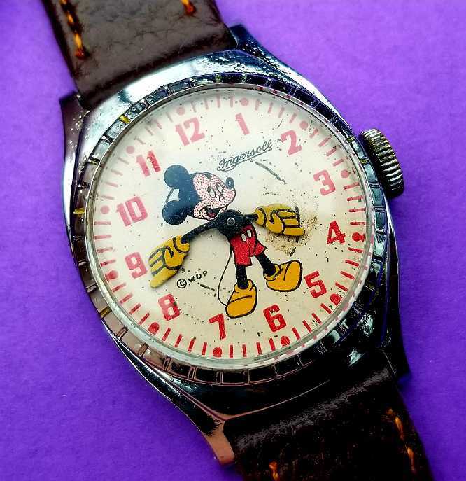
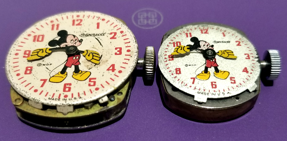
Here is the larger version of two similar-appearing 1950s Mickey Mouse wristwatches from US TIME / INGERSOLL. I'll show some comparison pictures of both, along with some reference object, so you can see the relative sizes. Of all the MIckey Mouse watches, it is my favorite, for reasons I'll describe.
end/
Like every one of these "character watches" from this era and before, whether Disney, Looney Tunes, or others, these were inexpensive watches made with inexpensive materials, inexpensive unjewelled movements and finishes. After all, children don't fuss about finishes and jewels, and parents would be more likely to buy a watch for a rough & tumble kid if it weren't expensive. But where these kind of "shine," if you ask me, is where it counts, the appearance of the dial and hands. Which is what the kid would be most into.
I'm not saying the dial printing is like a high-end sort of thing that you'd get at Omega, but the lines are sharp, the colors are bright and vivid, and the Mouse is happy. I would think kids would find these features appealing.
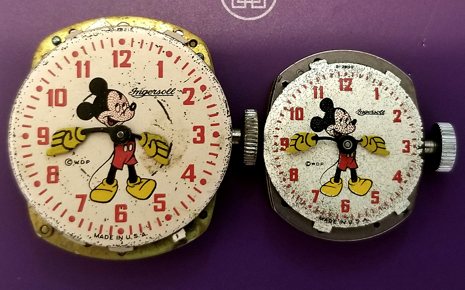
Here is the watch alongside its smaller sibling, above and below. Lots of wear to the smaller one. Both signed Ingersoll on dial. Same lettering for the numerals. Crown are about the same diameter. The small one seems to have a thicker crown.
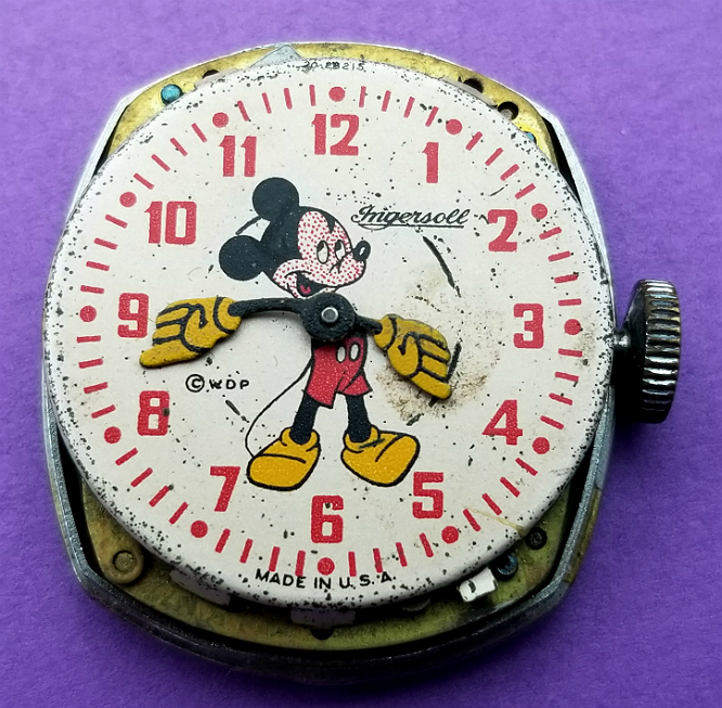
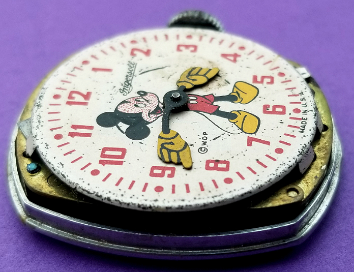
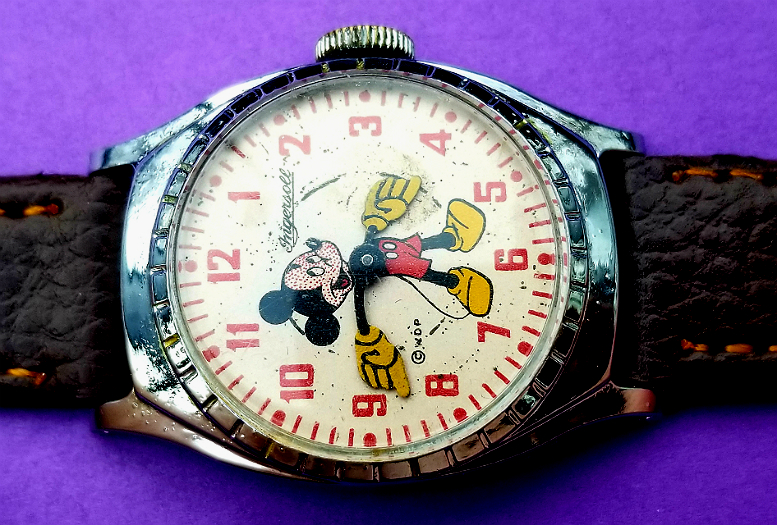
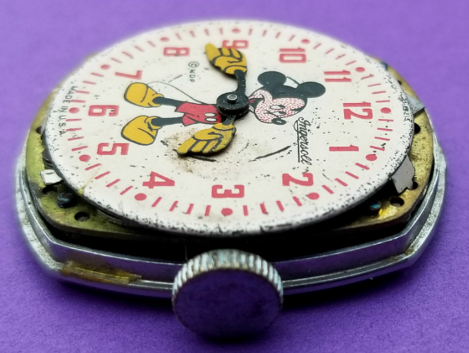
Moderate wear to the dial. In particular, notice the discontinuous circle where the undersurface of one of the hands, probably the hour hand, has chronically rubbed off some of the dial paint, from contact. I kind of like that effect, but I am partial to concentric circles.
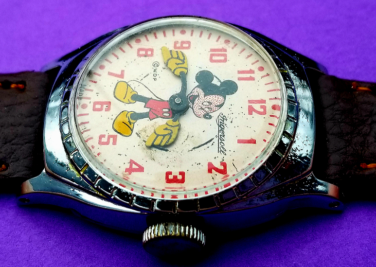
I particularly like the lettering style chosen for the hours. As well as the color. In fact the choice of red for the hours and peripheral hash/dot marks is what makes (in my opinion) what would otherwise be a good dial (if say, they were black) a great dial.
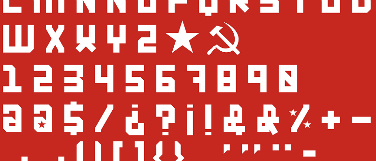
The lettering style reminds me of the kinds of letterings you'd sometimes see on old Soviet propaganda posters. Now, I'm not saying I think it's the same lettering, or even that they are "similar" from the perspective of a typography expert. But I am saying the one reminds of of the other. I'm allowed to be reminded of something and not be wrong about it. What do you think (see below pic).
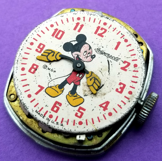
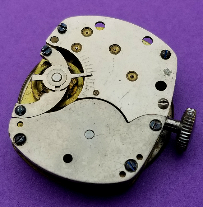
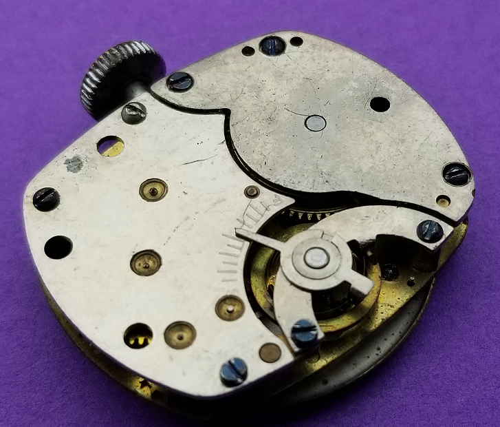
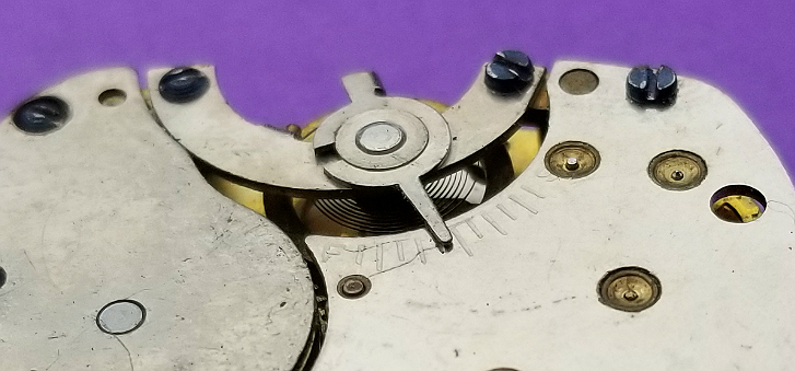
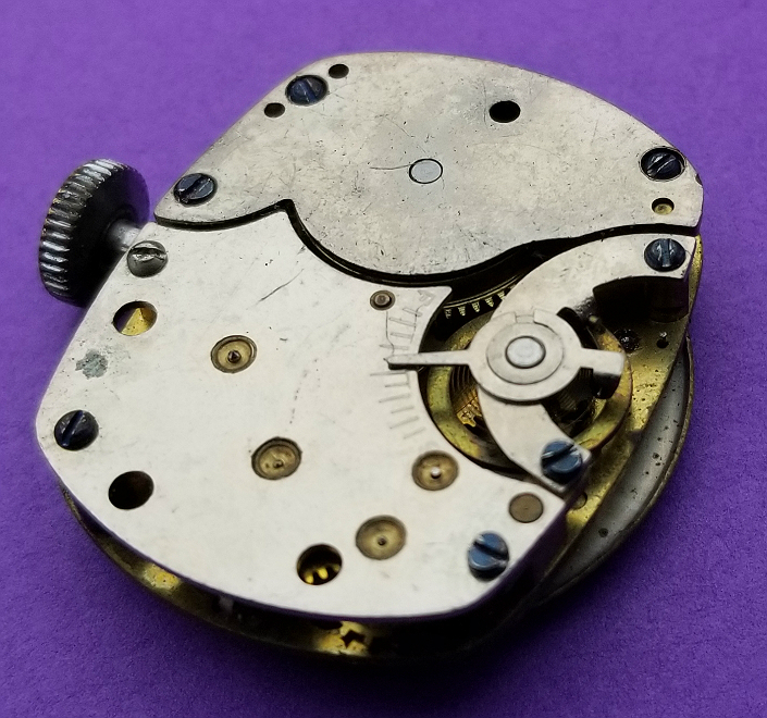
I'll come back to the dial, but I want to show the movement here. It is Ingersoll movement 20, from 1940s. You can see, like all movements from US TIME and other inexpensive watch manufactures, it's not in any way a decorated movement, and not a finished movement. We are looking at the "back plate" of the movement. Unlike later US TIME / TIMEX movements, the plate on this INGERSOLL is made up of two pieces which are joined together, or really just held next to each other which a curved interface. Like two curved parts and a point. I think the larger curved part follows the curve of the mainspring barrel which is directly underneath. Balance to the left, made from brass, and is held in by a kind of semilunar strut or support. Several screws, one of them might release the stem of the crown, but I'm not sure.
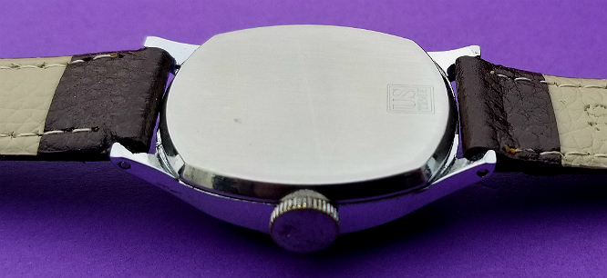
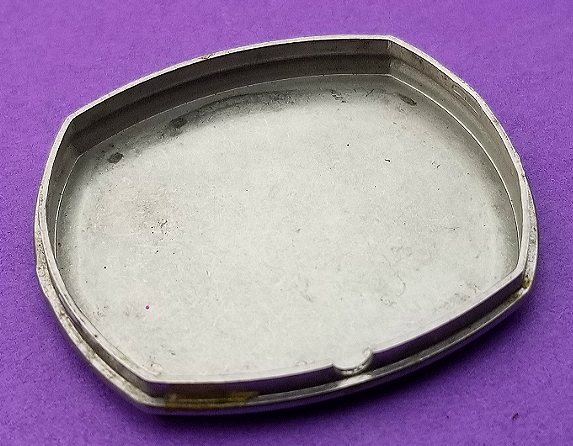
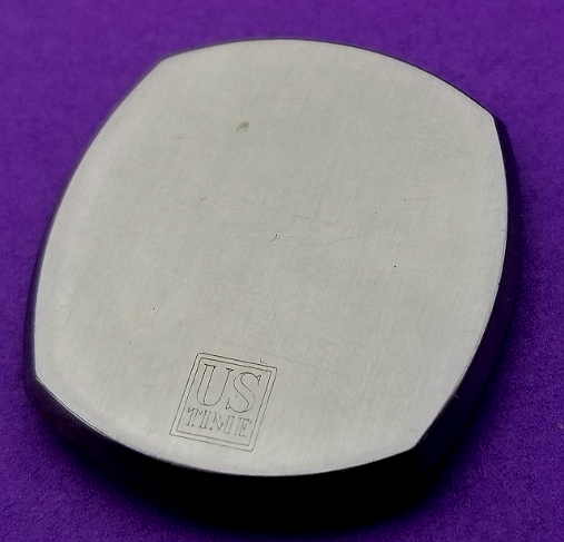
Inside of the snap-on caseback, probably steel. Rounded notch on the side for the stem.
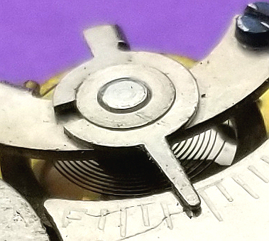
Nice look at the hairspring, and the FAST / SLOW regulator.
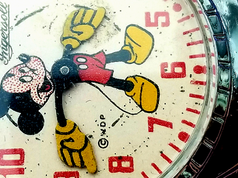
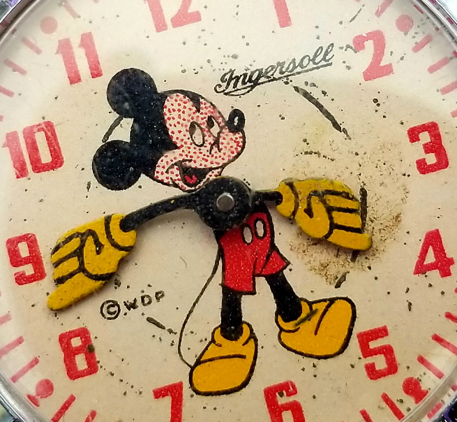
A really close look at the great colors and decent artwork on the dial. Notice the tiny speckles on the face of Mickey Mouse. I have written about these before, on this page about a smaller version of this with very similar identical dial. These dots look very similar, and I believe are designed to create the same effect, to the "Ben Day" dots in newsprint and comic books. These were also exploited in some of the Pop artworks of Roy Lichtenstein. It is interesting in that even though solid coloring of a dial was possible (look at all the other solid colors) they chose to use this process for the face. My kid said the mouse has chicken pox. I thought measles.
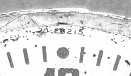
In very small lettering, very difficult to see is a dial code at the top. It looks like "20" before the dash mark. This indicates movement model 20, as in this Wiki page. Dates this watch to the 1940s.
Not the original strap. It's brand new 2019, but has the older style of exposed stitching that has sort of become "retro" in not just watchbands, but clothing (but was actually a sign of cheaper production in both clothes and watches, but now you actually pay more for it.) So I think the red stitching helps tone with the color of the watch. The original one I'm pretty sure was bright red patent leather, which to me is like fake leather (I know it's not; the backing/base ls leather, but the shiny surface part is pretty much chemical coating.)
Caseback with the stamp of the US TIME logo used at the time. I really like that old logo. This watch was likely produced in the 1940s, having the movement #20, which was replaced by the #21 movement circa 1950s. It's worth remembering that "INGERSOLL" was a brand name of watch, produced by the company US TIME. Even after the TIMEX name appeared on watches, you still saw INGERSOLL watches, maybe even until the 1970s.
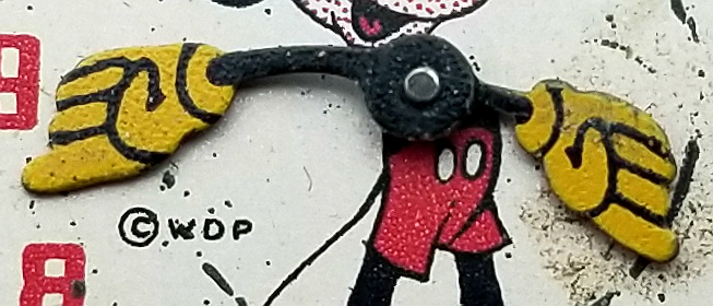
Mickey Mouse appears to have three fingers and a thumb, for a total of 4 digits on each hand.
The WDP is for Walt Disney Productions.
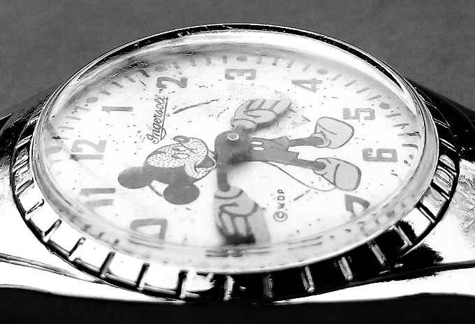
Crystal seems pretty good. Had some scratches which buffed out alright. I'm not sure if it's the original crystal, or if it's been replaced at some point. Also, a good look at those "ridges" along the bezel.
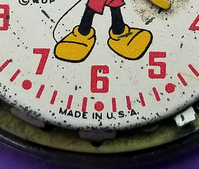
MADE IN U.S.A
And those "Soviet-style red numerals," haha.
One last look at the US TIME movement number 20. I think this is a significant movement, in that it appears to be "the last" major US TIME movement before the "new watches" with the TIMEX brand came out in 1950. It is believed that all of these "TIMEX" watches had the number 21 movement, which had the new technology that had been undergoing perfection for 5 years, the V-CONIC escapement with its balance and balance studs made from a chromium-based alloy called "Armalloy."
I consider this to be a kind of "pre-TIMEX" movement.
1940s INGERSOLL / US TIME Mickey Mouse watch with a great dial. My favorite of all the Mickey Mouse watches. A 1940s "pre-TIMEX" US TIME watch with movement #20.
Thanks for reading.
I hope you will like it.
Alan
Contact:
Website: Alan's Vintage Watches
